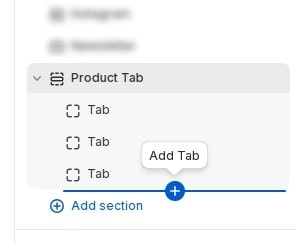
How to add section Product Tab to website
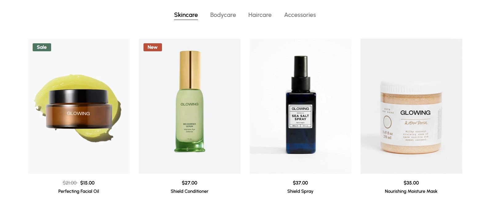
Featured products from hand-picked collections.
In the theme editor (Customize), Add section
Product Tab.
How to add new tab to section
Each block will be 1 tab. You can add tab by adding block.
After adding the new block, You can configure the tab according to your requirements.
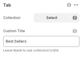
- Collection : Select the product collection to display the current tab.
- Custom Title : Enter collection custom title.
Configure section Product Tab
Tabs Settings
In the theme editor (Customize), click section
Product Tab then locate Tabs Settings. Here you can make the necessary configurations.
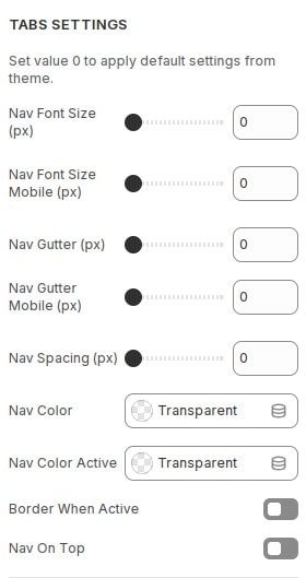
- Nav Font Size (px) : Configure font size for tabs. Set value 0 to apply default settings from theme.
- Nav Font Size Mobile (px) : Configure font size for tabs on mobile. Set value 0 to apply default settings from theme.
- Nav Gutter (px) : Configure the spacing between tabs. Set value 0 to apply default settings from theme.
- Nav Gutter Mobile (px) : Configure the spacing between tabs on mobile. Set value 0 to apply default settings from theme.
- Nav Spacing (px) : Configure the spacing between tabs and products. Set value 0 to apply default settings from theme.
- Border When Active : Turn on border for the currently active tab.
- Nav On Top : Turn on if you want the tab to appear after the heading section. Note: section needs to enter heading.
Product Card Settings
- In the theme editor (Customize), click section
Product Tabthen locate Product Settings. Here you can make the necessary configurations. - If the default value is set, the configuration in
theme settingswill be applied. See instructions for configuring theme settings for product card.
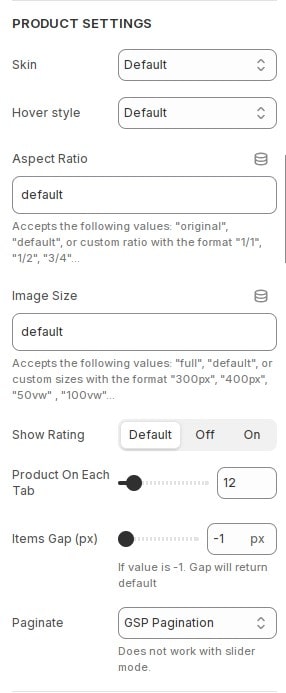
- Skin : Choose skin for product card.
- Hover style : Select image effect when hovering.
- Aspect Ratio : Configure aspect ratio for card images.
- Image Size : Configure image size for card images. See more about the sizes attribute .
- Show Rating : Show product rating. For this option to work you need to install the review app. See instructions.
- Product On Each Tab : Configure the number of product each tab displayed.
- Items Gap (px) : Configure the distance between card items.
- Paginate : Configure pagination for section product.
Product Card Style
In the theme editor (Customize), click section
Product Tab then locate Product Style. Here you can make the necessary configurations.
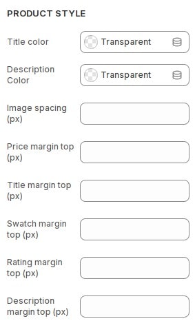
- Title color : Configure color for product card title.
- Description Color : Configure color for product card description.
- Image spacing (px) : Configure spacing for image product.
- Price margin top (px) : Configure margin top for price product.
- Title margin top (px) : Configure margin top for title product.
- Swatch margin top (px) : Configure margin top for swatch product.
- Rating margin top (px) : Configure margin top for rating product.
- Description margin top (px) : Configure margin top for description product.
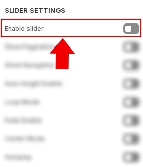
Build layout section
Layout slider
You can display block layout grid or slider.If you want to use layout slider see Section Slider Layout
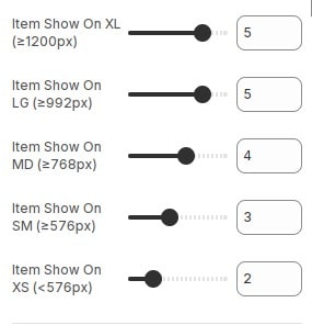
Layout grid
If you use layout grid.At the settings section, You can configure items to display on 1 row for each screen device.
Other configurations of section
You can see the documentation for other section configurations such as: Heading, container, background, animation, padding...