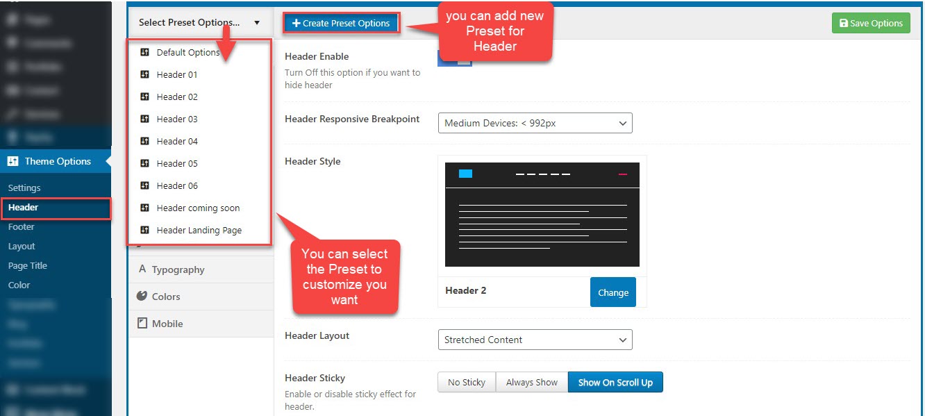
The header is probably one of the first things you will want to set up on your website. The header consists of a series of elements such as logo, navigation menu, social icons and contact information. The theme is provided with several options to customize the header and its content. All these elements, such as colors, fonts, images, etc. can be customized without touching any code
You can view this video to take a general look about Header:
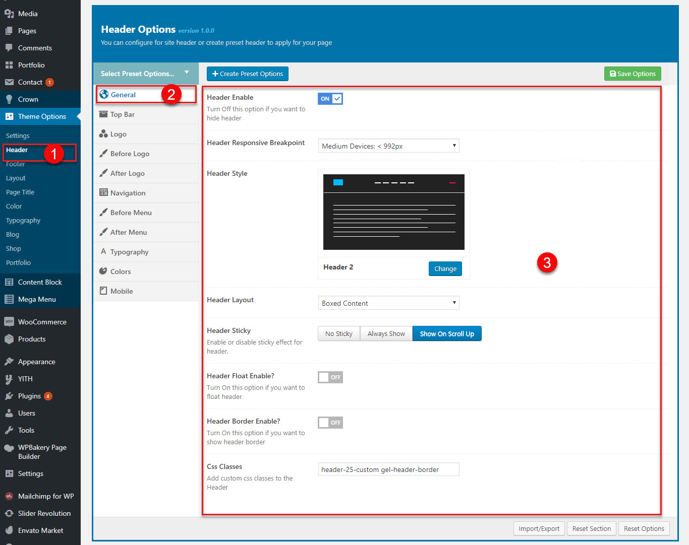
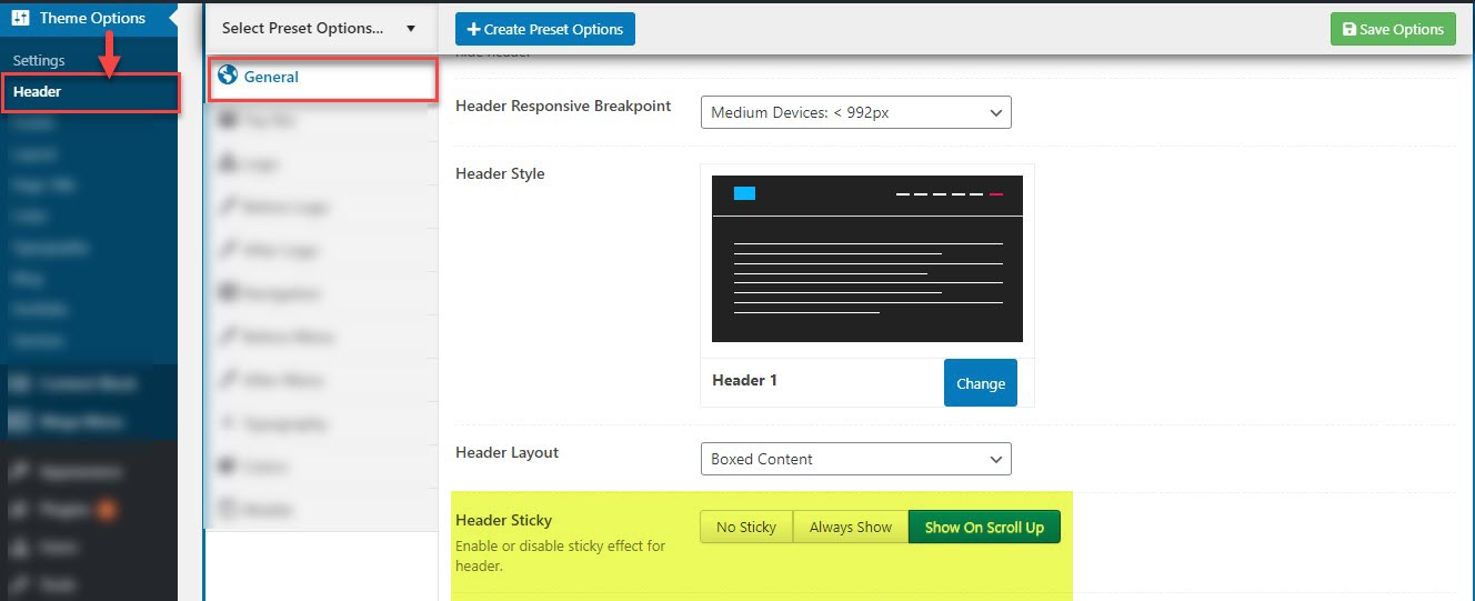
General in Header
In this section, you can customize all options related to the header such as turn on/ turn off header, header style etc.
| General Settings | Description |
|---|---|
| 1. Header Enable | Two options: on,off so that you can display header or not If you select "on", you have bellow options |
| 2. Header Responsive Breakpoint | Controls when the desktop header changes to the mobile header. Accepts a numeric value in pixels (px). For example: Larget devices < 1200px. |
| 3. Header Style | You can change header styles |
| 4. Header Layout | You can change the boxed content layout or stretched content layout |
| 5. Header Sticky | You can select sticky header or not or show on scroll up |
| 6. Header Float Enable? | You can select float header or not |
| 7. Header Border Enable? | You can select border for header if you want. |
| 8. Css Classes | You can enter your CSS classes for the header. |
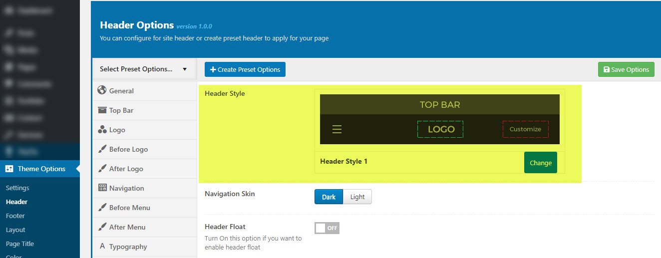
3. How select the Header Style
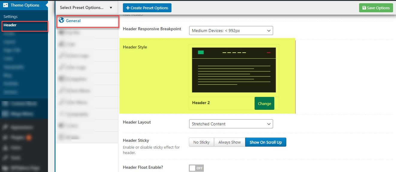
Step 1 : Navigate to Theme option >> Header >> General >> Header Style
Step 2 : Select to Header Style : choose from Header 1 to Header 26
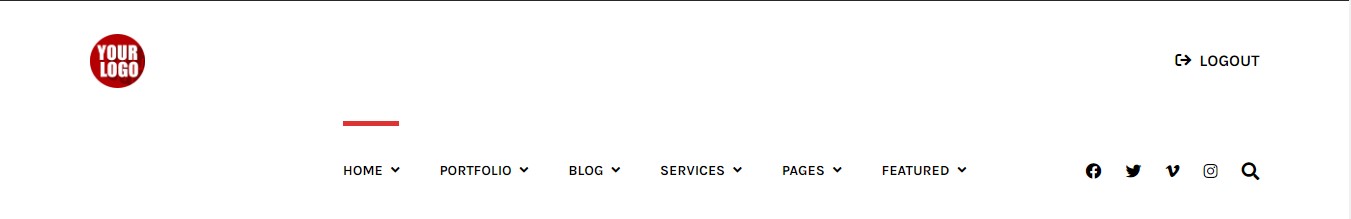
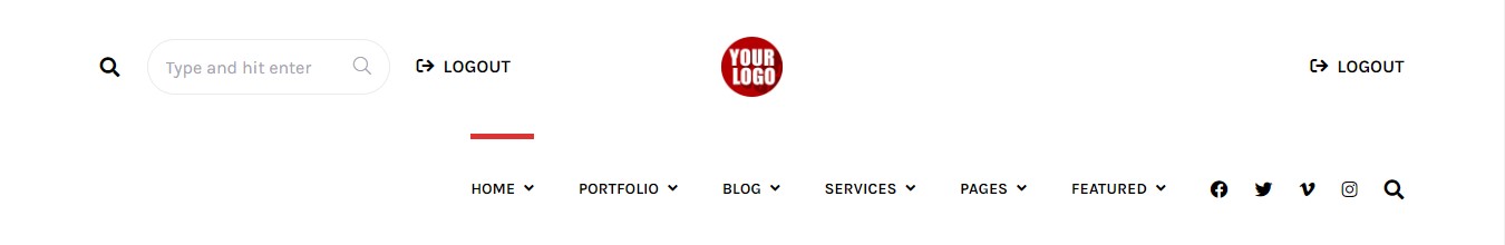
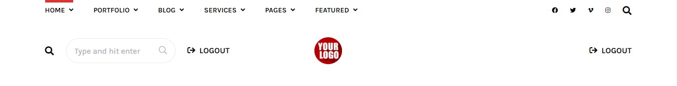
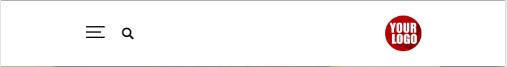
Header 1
Below is an example of how you can setup the Header 1

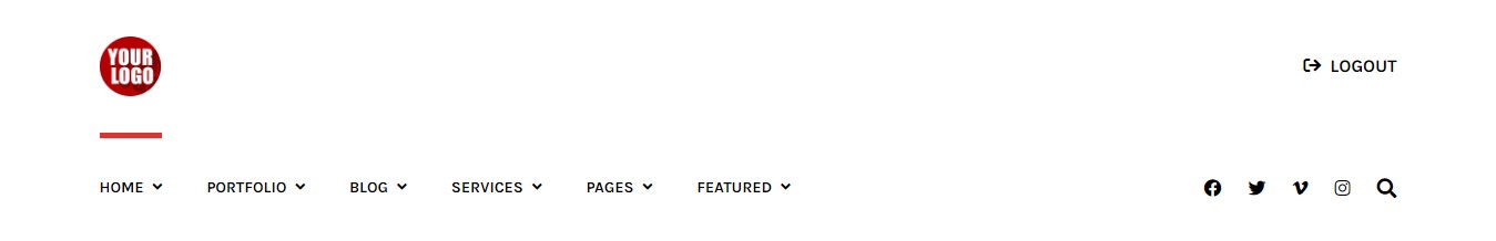
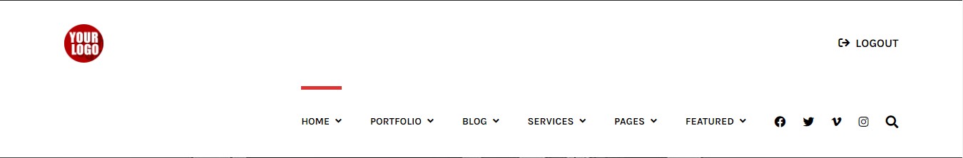
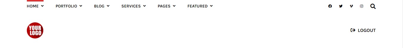
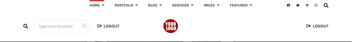
Header 2
Below is an example of how you can setup the Header 2

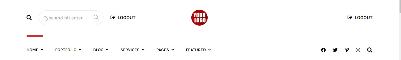
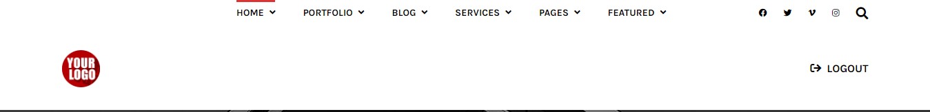
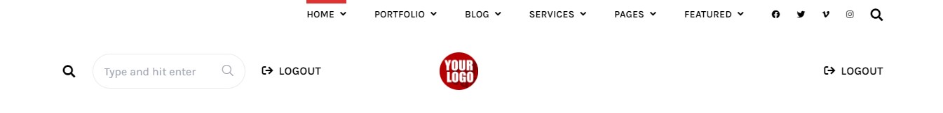
Header 3
Below is an example of how you can setup the Header 3

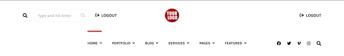
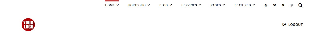
Header 4
Below is an example of how you can setup the Header 4
Header 5
Below is an example of how you can setup the Header 5
Header 6
Below is an example of how you can setup the Header 6
Header 7
Below is an example of how you can setup the Header 7
Header 8
Below is an example of how you can setup the Header 8
Header 9
Below is an example of how you can setup the Header 9
Header 10
Below is an example of how you can setup the Header 10
Header 11
Below is an example of how you can setup the Header 11
Header 12
Below is an example of how you can setup the Header 12
Header 13
Below is an example of how you can setup the Header 13
Header 14
Below is an example of how you can setup the Header 14
Header 15
Below is an example of how you can setup the Header 15
Header 16
Below is an example of how you can setup the Header 16

Header 17
Below is an example of how you can setup the Header 17

Header 18
Below is an example of how you can setup the Header 18

Header 19
Below is an example of how you can setup the Header 19

Header 20
Below is an example of how you can setup the Header 20

Header 21
Below is an example of how you can setup the Header 21

Header 22
Below is an example of how you can setup the Header 22

Header 23
Below is an example of how you can setup the Header 23
Header 24
Below is an example of how you can setup the Header 24
Header 25
Below is an example of how you can setup the Header 25
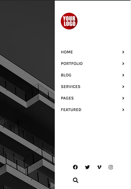
Header 26
Below is an example of how you can setup the Header 26
4. How select the Header Layout
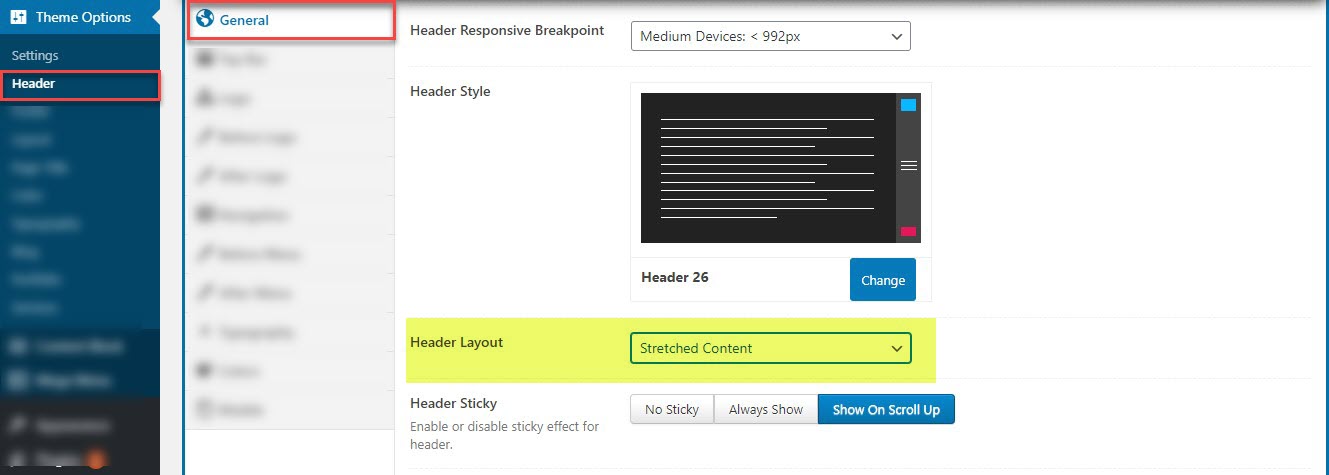
Step 1: Navigate to Theme option >> Header >> General >> Header Layout
Step 2: Select Layout and choose from:
1. Boxed Content: boxed designs consist of setting clearly defined boundaries for the header of the page
2. Stretched Content : differs from a boxed one because you can use the entire screen to showcase the elements of your header
Boxed Content Layout
Below is an example of how you can setup the Boxed Content layout

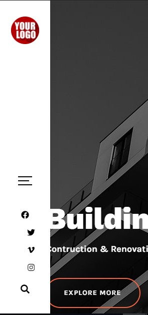
Stretched Content Layout
Below is an example of how you can setup the Stretched Content layout

4. How select the Header Layout
To enable the Sticky Header navigate to Theme option >> Header >> General >> Header Sticky
Top Bar
G5 Core allows you to display an extra bar on top of the header where you can display the navigation menus, the social icons, the custom HTML etc. The top bar is divided in two areas left and right. To enable the Top Bar navigate to Theme option >> Header >> Top bar locate the switch button to enable it as you see in the image below:
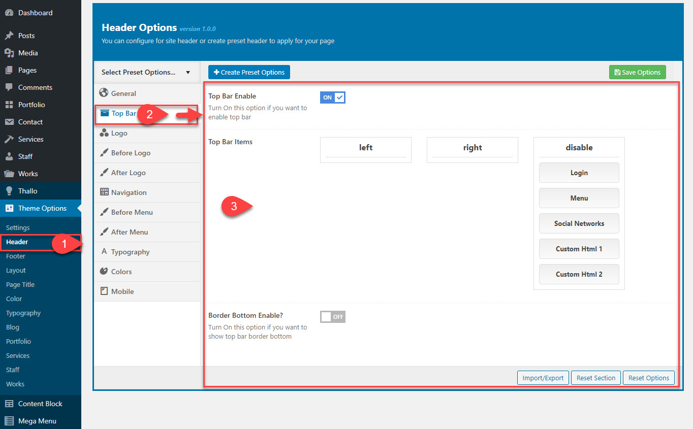
| Top bar Settings | Description |
|---|---|
| Top Bar Enable | Two options: on,off so that you can display header or not If you select "on", you have bellow options |
| Top Bar Items | You select 3 option: Left, right and disable If you drag and drop the item in left position or right position or disable the items |
| Border Bottom Enable? | You can turn on/off border bottom |
- Logo : Upload your custom logo site that will be displayed on all pages for desktop and laptop devices.
- Sticky Logo : Upload the logo for sticky header (The sticky logo dislays after you scroll page).
You can upload your logo in image file version in any height: G5 Core provides you setting to adjust your logo size on desktops, sticky logo.
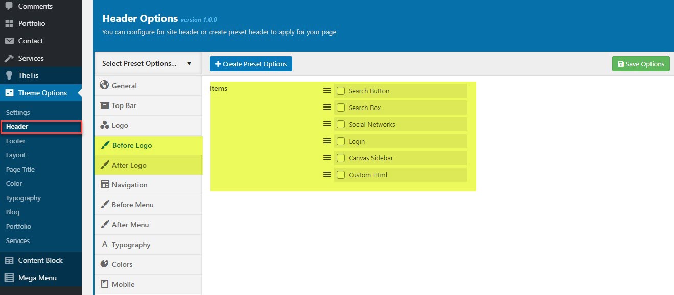
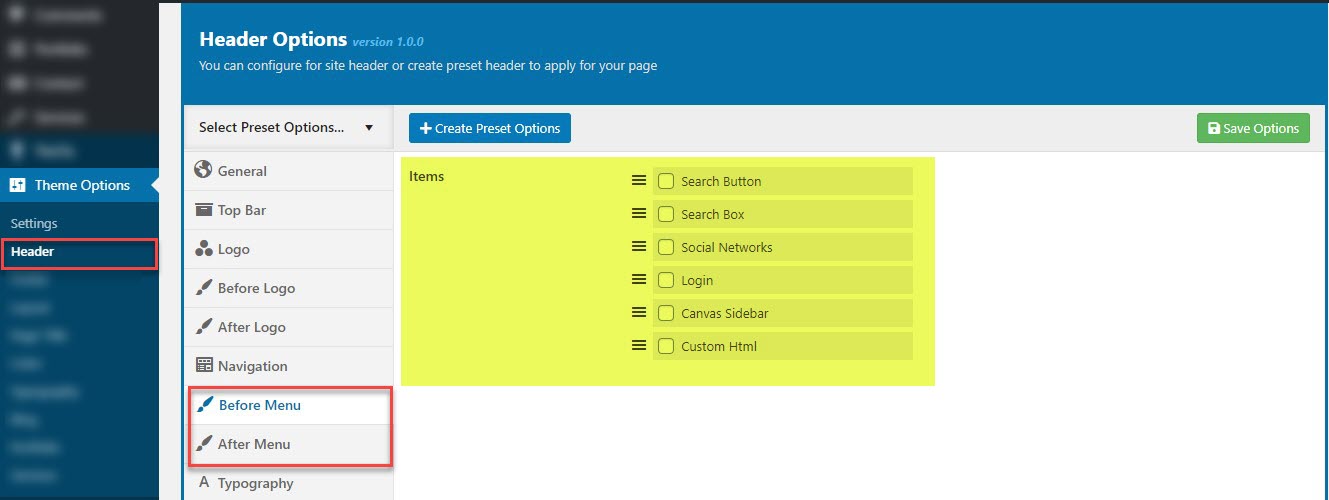
Before logo and After logo setting
The items before logo and after logo consists of a series of elements such as search button, search box, social networks, login and canvas sidebar.
The G5 Core is provided with several options to customize the header and its content. Navigate to Theme option >> Header >> Before logo and After logo locate the switch button to enable it as you see in the image below:
Before you set in this section, you go to Theme option >> Header >> General >> Before Menu & After Menu to view the postion of logo.
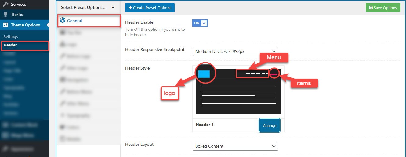
(1) The blue box is logo position
(2) The white lines are items of menu position
(3) The pink line is item which you can add as you want
You can determine the position of the item relative to the logo, if the logo is center of the header, you can add items Before logo and After logo
Before logo and After logo options available
Search Button: After you enable the search button. You can click in the search button to open popup form for searching
Search Box: You can enter the key word in the box search
Social Networks: G5 Core allows you to display your Social account in the header. The header social icons are available
Login: You can have login/logout button for customers
Canvas Sidebar: is the part of navigation strategy. The sidebar is initially moved out off the screen and out of view as well.
Custom HTML: You can add HTML code for button, href etc.
Navigation
The navigation section provided along with the theme allow you to customize your navigation elements. You can choose for each customizable area border, menu items spacing and submenu transition. Please follow the information below to know more about navigation settings.
Navigate to Theme option >> Header >> Navigation to set the navigaton
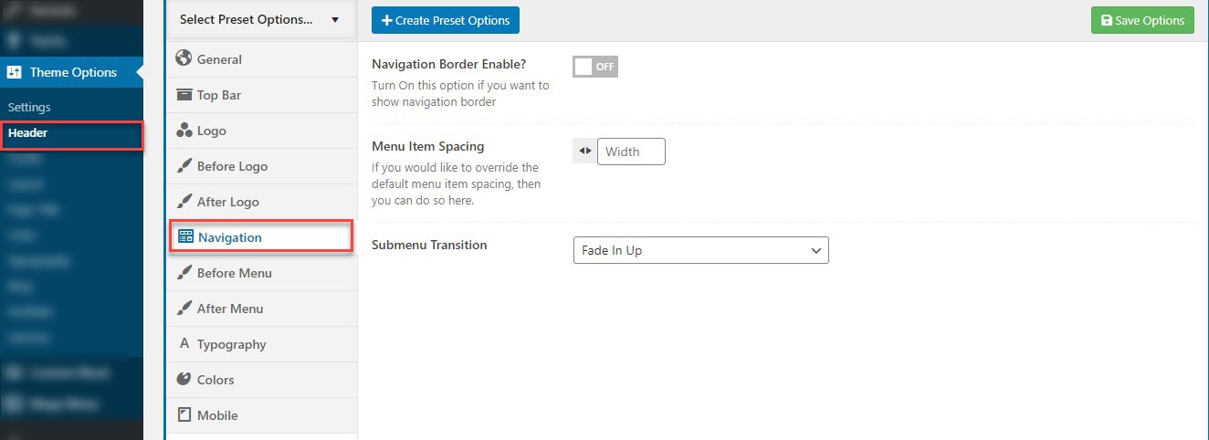
Navigation options available:
Navigation Border Enable: can enable the border for the navigation
Menu Item Spacing: You can enter the spcing for menu items
Submenu Transition: You can choose the transition for sub-menu
Before menu and After menu setting
Navigate to Theme option >> Header >> Before Menu and After Menu locate the switch button to enable it as you see in the image below. You can add items the same as before logo and after logo
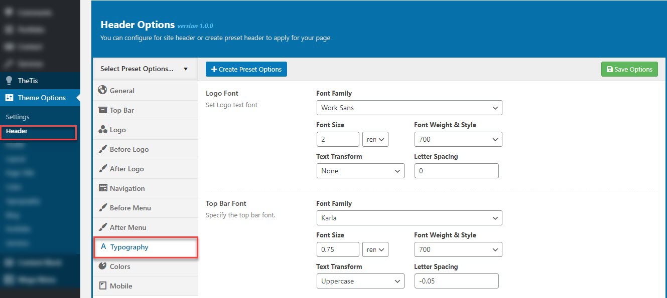
Typography
The typography module provided along with the theme allow you to customize your header. You can choose for each customizable area font family, weight and style, subsets, text transform, size and letter spacing. Please follow the information below to know more about menu typography settings.
To customize the Logo, Top Bar, Menu and Sub Menu typography navigate to Theme option >> Header >> Typograpy and use the font options available in the image below.
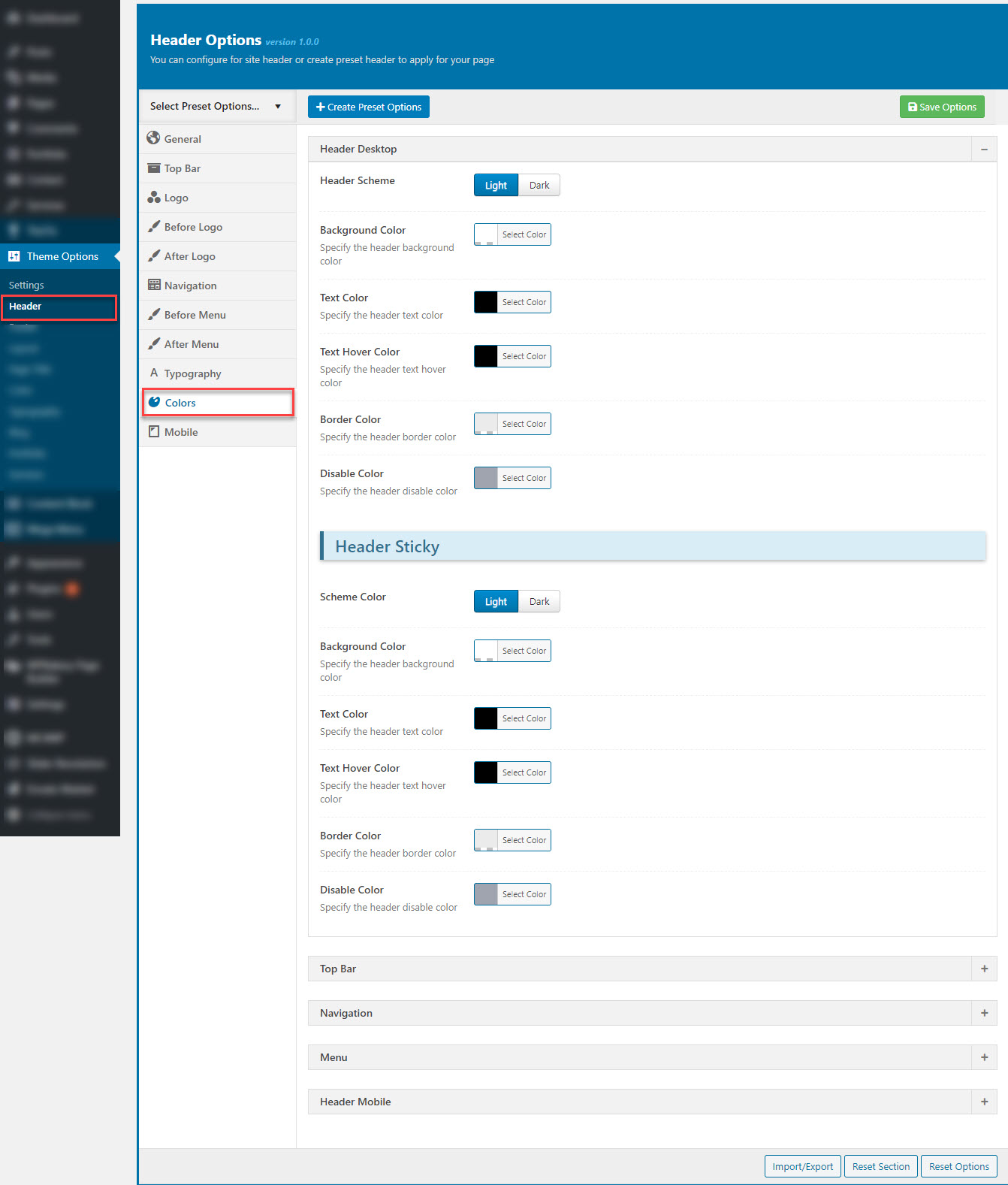
Color
Navigate to Theme option >> Header >> Color to customize the header colors.
This section is used to customize colors the Header Desktop, Header Mobile: Header Sticky, Top Bar, Navigation, Menu.
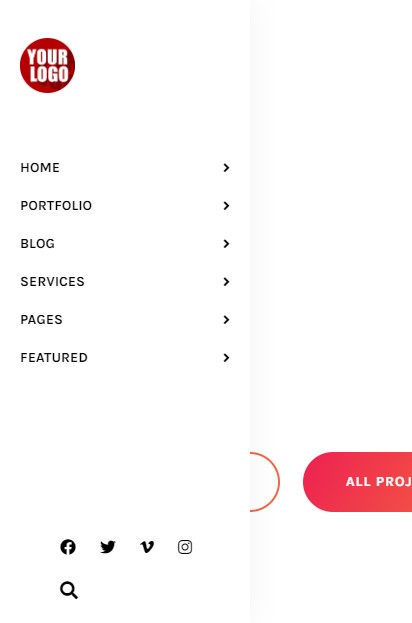
Mobile
The mobile menu is available on top corner of your page when you navigate the website with a tablet or a smartphone.
Navigate to Theme option >> Header >> Mobile to customize all elements in the menu mobile.
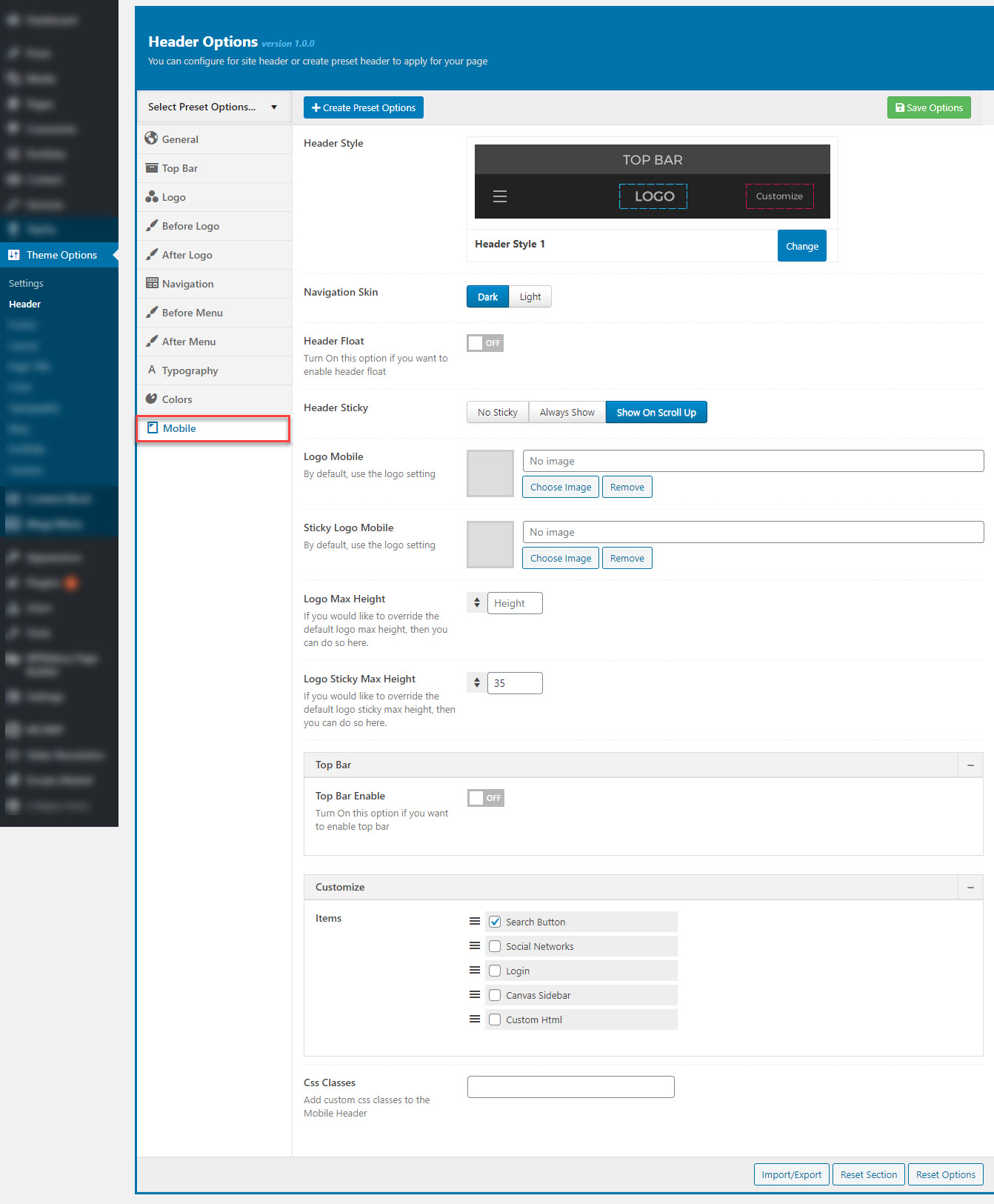
1. How select the Header Style in Mobile :
Step 1: Navigate to Theme option >> Header >> Mobile >> Header Style
Step 2: Select to Header Style: choose from Header 1 to Header 3
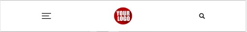
Header 1
Below is an example of how you can setup the Header 1
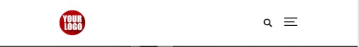
Header 2
Below is an example of how you can setup the Header 2
Header 3
Below is an example of how you can setup the Header 3
2. How set the Logo in Mobile :
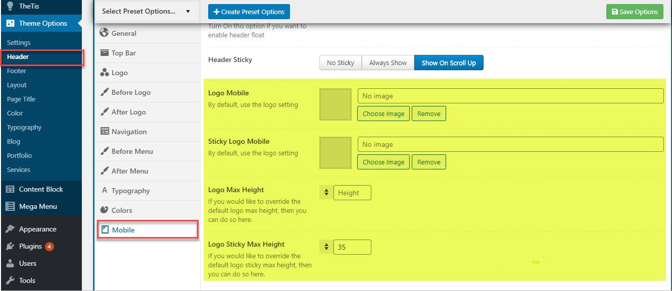
Mobile Logo: Upload your custom logo site that will be displayed on all pages for mobile devices.
Sticky Logo Mobile : Upload the logo sticky header (Sticky logo displays after you scroll page).
Logo Max Height: You can upload max height for the logo in mobile
Logo Sticky Max Height: You can upload max height for the logo in the sticky header
3. How set the Top bar in Mobile :
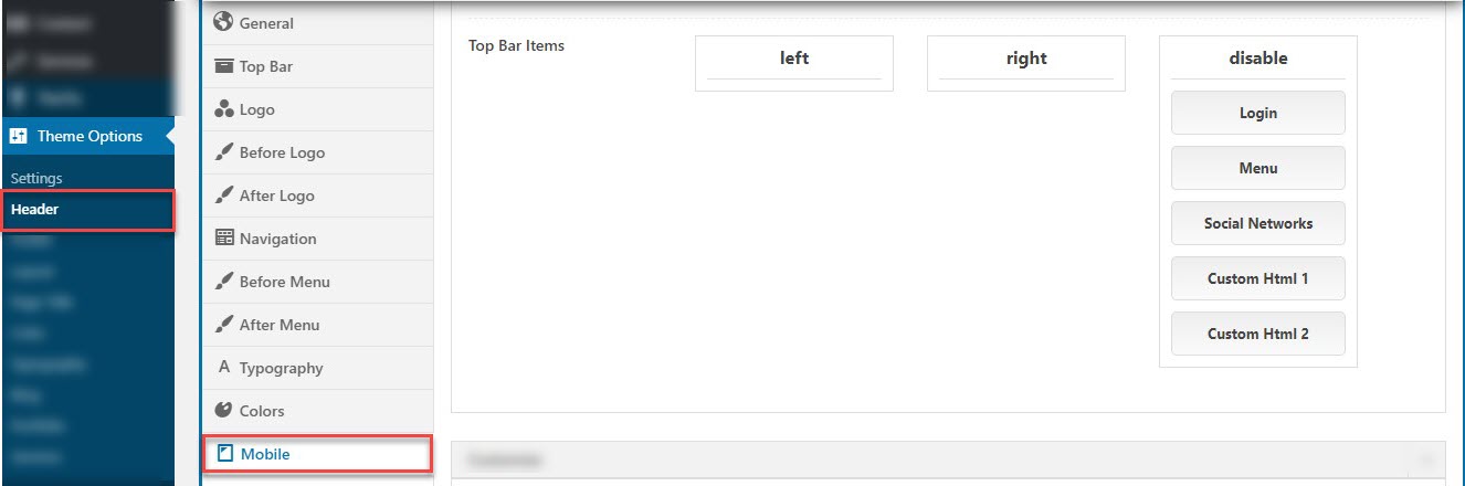
The top bar is divided in two areas left and right. You can drag & drop the items to the left top bar, right menu or you drag & drop to Disable column to disable the items
II. Per-Page Setting
If you must alter the main header for a specific page or post you can do that via the Meta box located in the page editor screen. Have a look below:
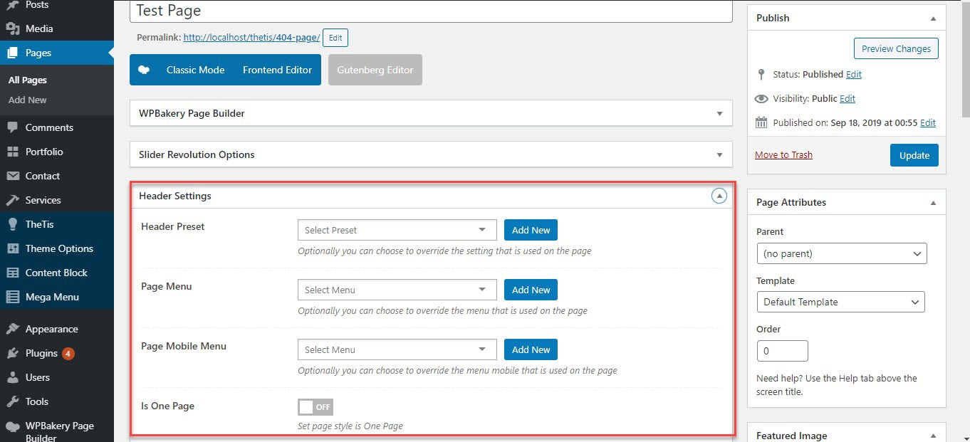
This is Header preset setting: