WORDPRESS SETTINGS
You can adjust WordPress settings as follows:
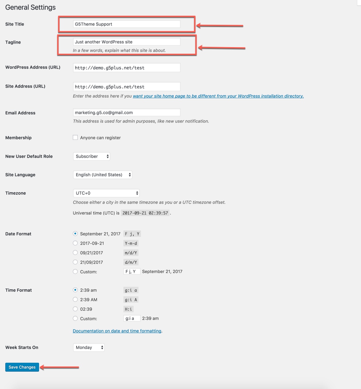
Step 1 – You can set Site Title, Tagline in Settings → General
Step 2 – You can set Blog pages show at most in Settings → Writing
Step 3 If you installed PEPPER Demo Data, you don’t need to create a new Home Page, you just need to choose from the list Home Pages that were automatically created from the demo content. You can select Front Page displays in Settings → Reading. Select A static page and Choose any homepage as you want from the dropdown for Front page
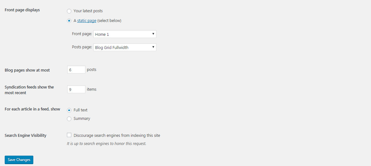
Click Save Changes
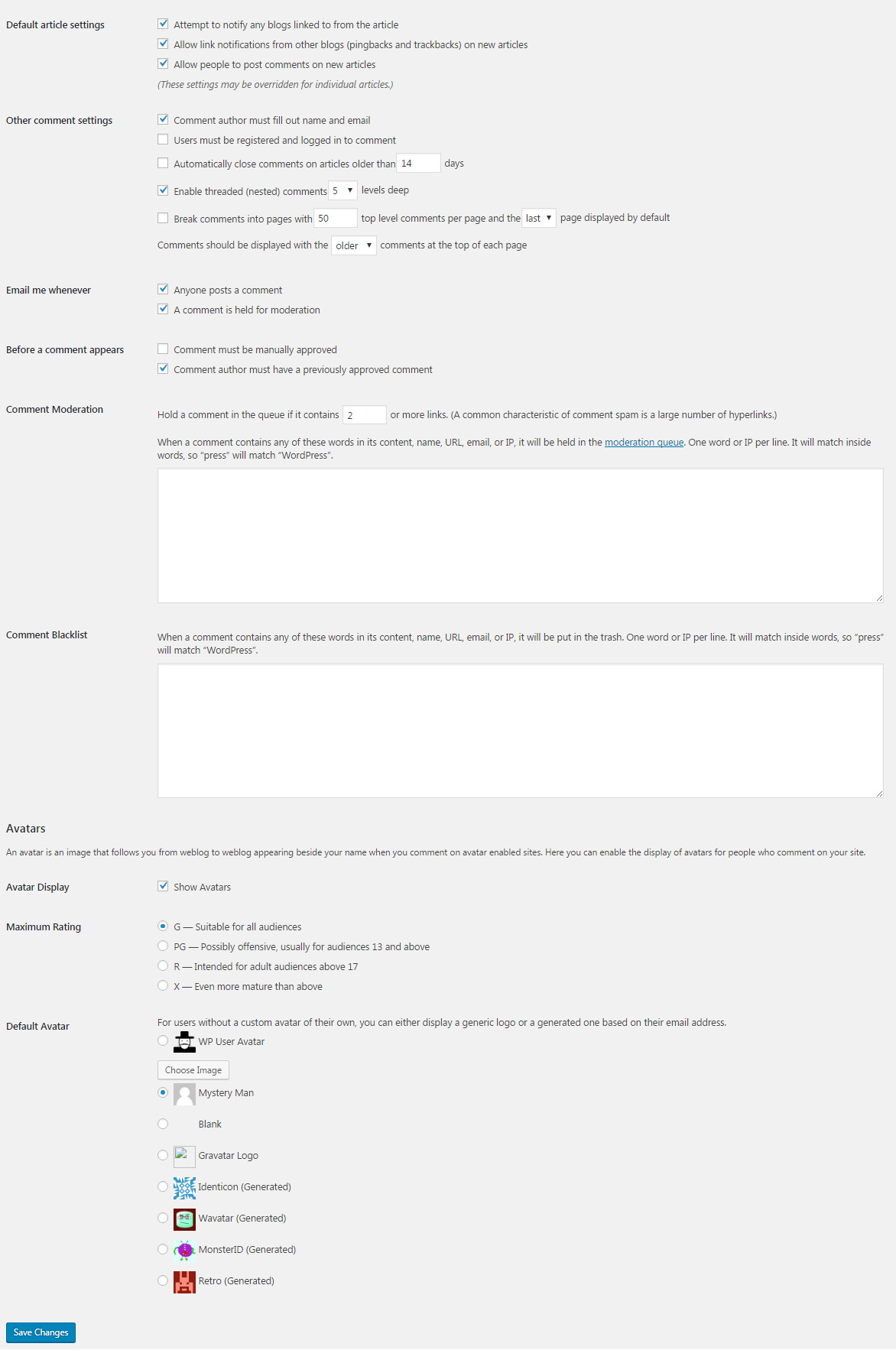
Step 4 – You can set Discussion settings in Settings → Discussion
Step 5 – You can change Image sizes in Settings → Discussion
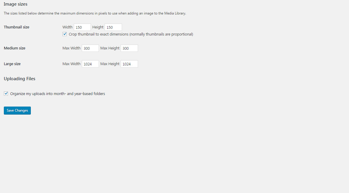
We used the following sizes on our demo sites:
- Thumbnail size: 150 x 150
- Medium size: 300 x 300
- Large size: 1024 x 1024
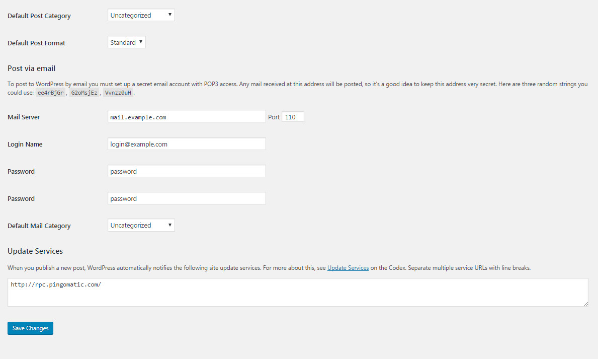
Step 6 – You can set Permalink in Settings → Permalink
PAGE SETTINGS
Page Settings is one of the Pepper's features that located within each page and post. Page Settings will only affect the individual page you change them on and overrides options set in the Theme Options and Preset (If this page/post applied any preset).
You could consult our guide on How G5Them Options work for more details about the relationship between Theme Options, Preset and Page Settings
PAGE SETTINGS IN PAGE
From WP-dashboard, navigate to Page → Add New.
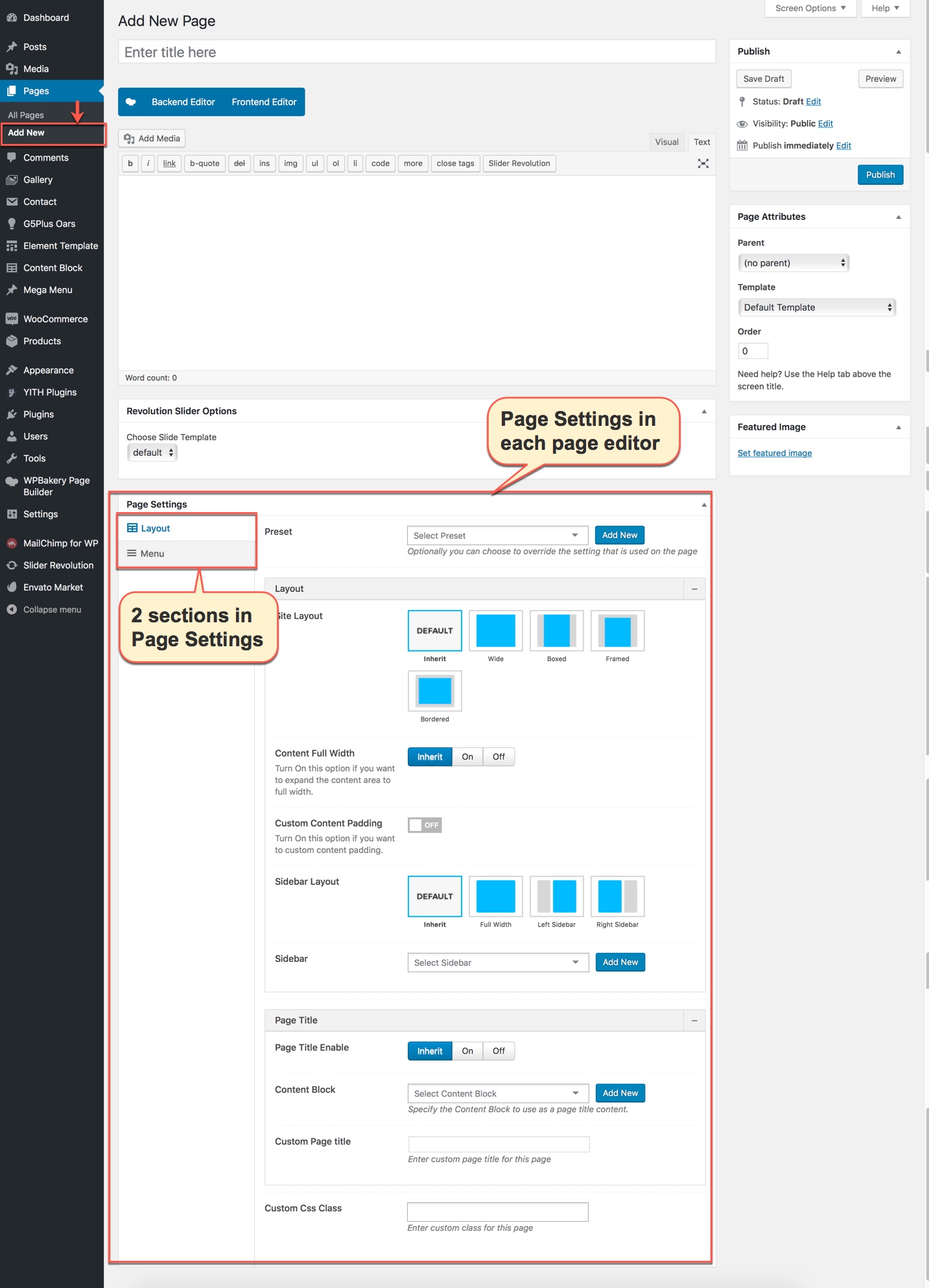
Page Settings
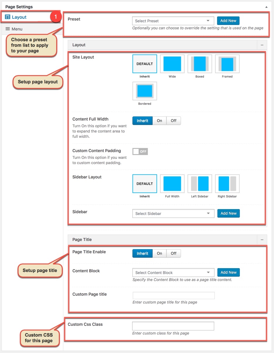
Page Settings that located within each PAGE has 2 sections: General and Menu section.
General Option
General section
Menu Option
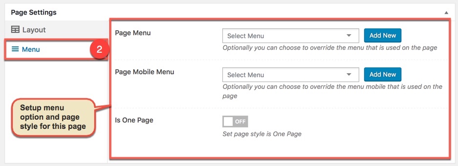
Menu section
Any option that was set to be Default or Customize Off means that it will use the value of equivalence option you have set in Preset (if this page apply any Preset) or Theme Options. Insert a different value to override the Preset/ Theme Option value.
Preset and Page Options will use the Theme Options value if left empty or if the value is default. They will override Theme Options if any other value is entered. This setup gives users maximum flexibility for setting a global theme option, then being able to override it on a page/post/shortcode basis
POST SETTINGS
From WP-dashboard, navigate to Post → Add New.
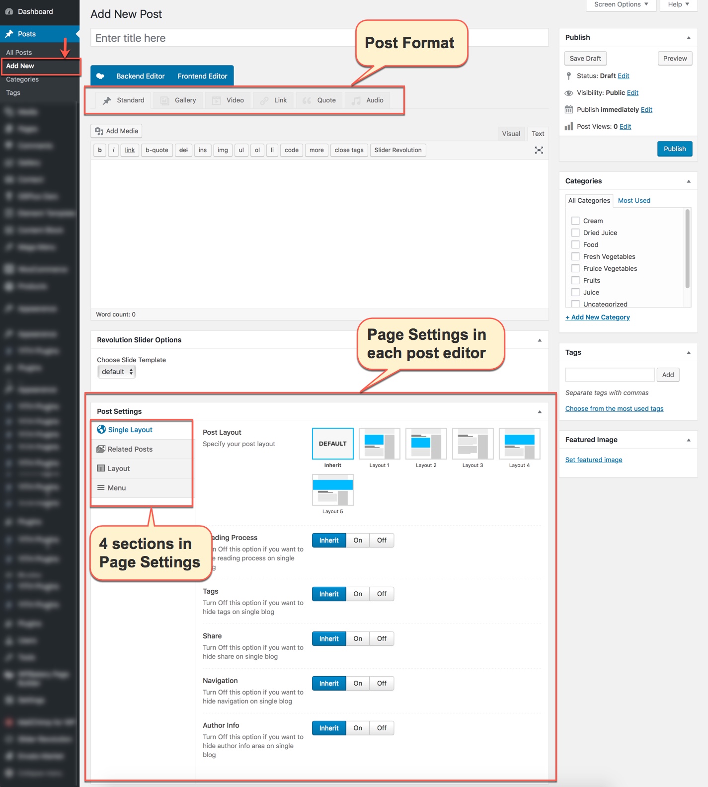
Post Settings that located within each POST has 4 section: General section, Menu section, Single Post section and Related Posts section. General and Menu section is similar to Page Setting in Pages, and Post Settings in Posts have 2 more sections for post settings as below:
Single Post
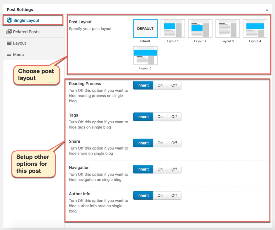
Single Post section
Related Posts
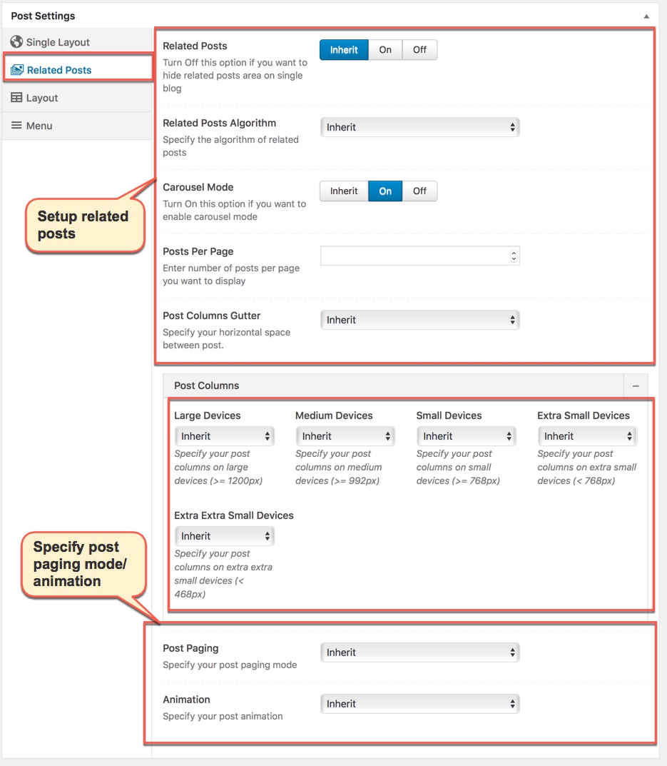
Related Posts section
Any option that was set to be Default or Inhirit means that it will use the value of equivalence option you have set in Blog panel in Theme Options. Insert a different value to override the Theme Option value.
POST FORMAT
Post formats are used to style and display a post according to a specific content. Pepper theme supports all Post Formats other than the "Standard" post format. Let's see how to use post formats from your post editor.
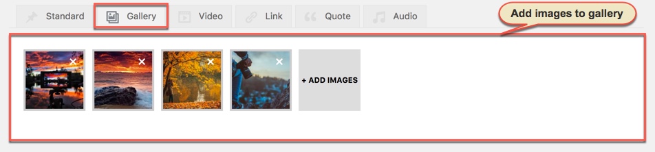
Setup your post normally and add images to gallery by upload or choose from media library.
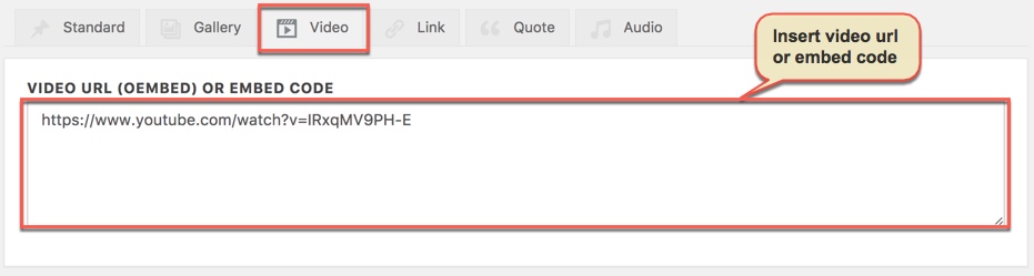
Setup your post normally and set a featured image, then copy the embed code of the video from YouTube, Vimeo or any other site that WordPress supports Embed for that site. Paste the code in the Featured Video Code field.
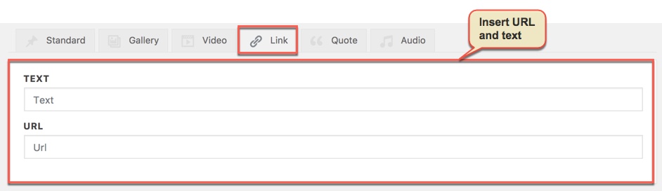
Setup your post normally and add URL and Text to fields. Adding link post format is like normal/standard post format but the theme automatically links the featured image to the URL
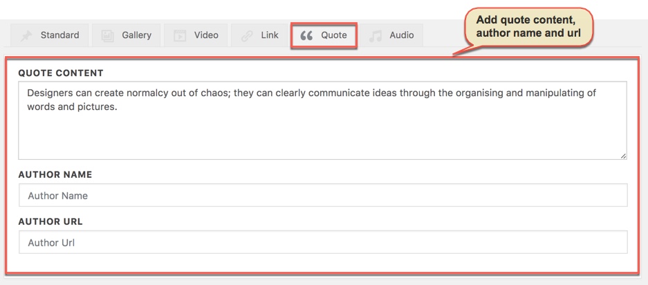
Setup your post normally and add content to quote content field, author name field, author url field.
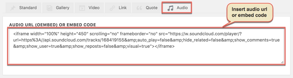
WordPress supports embedding into posts by default .Setup your post normally and add audio URL into the Audio Code field to place audio player in top of post page.
PRESET
Preset are Options that were set beforehand to facilitate use, it will override settings in Theme Options on all pages/posts applyed it. pepper Demo Data also has many demo presets which lets you create WordPress pages very easily.
Video guide on How to use Preset
Preset Options
From WP-dashboard, navigate to G5Plus pepper → Theme Options.
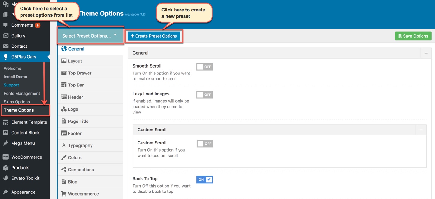
Goto Preset from dashboard
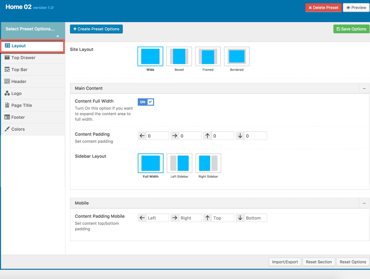
1. Manage all presets: From the interface of Theme Options, you can manage all presets list, choose a preset to edit/delete or preview it on the frontend
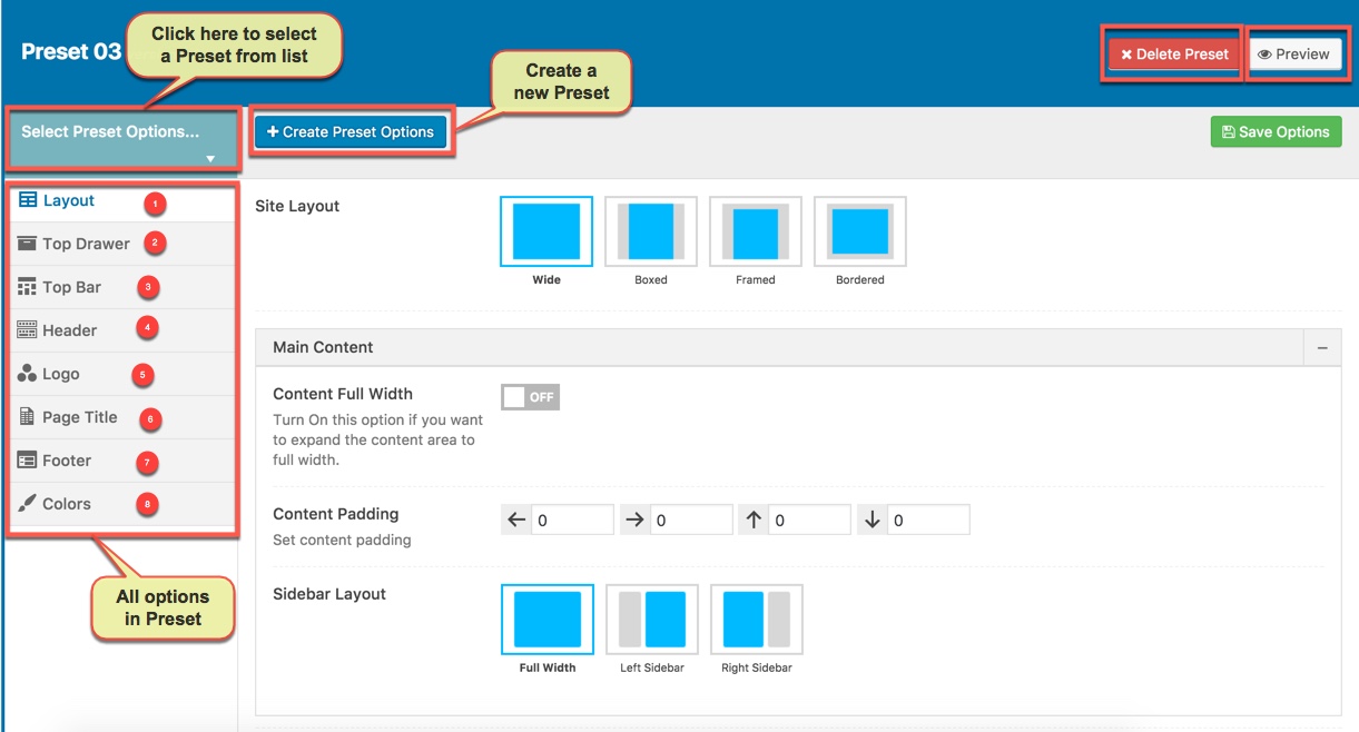
Manage all presets
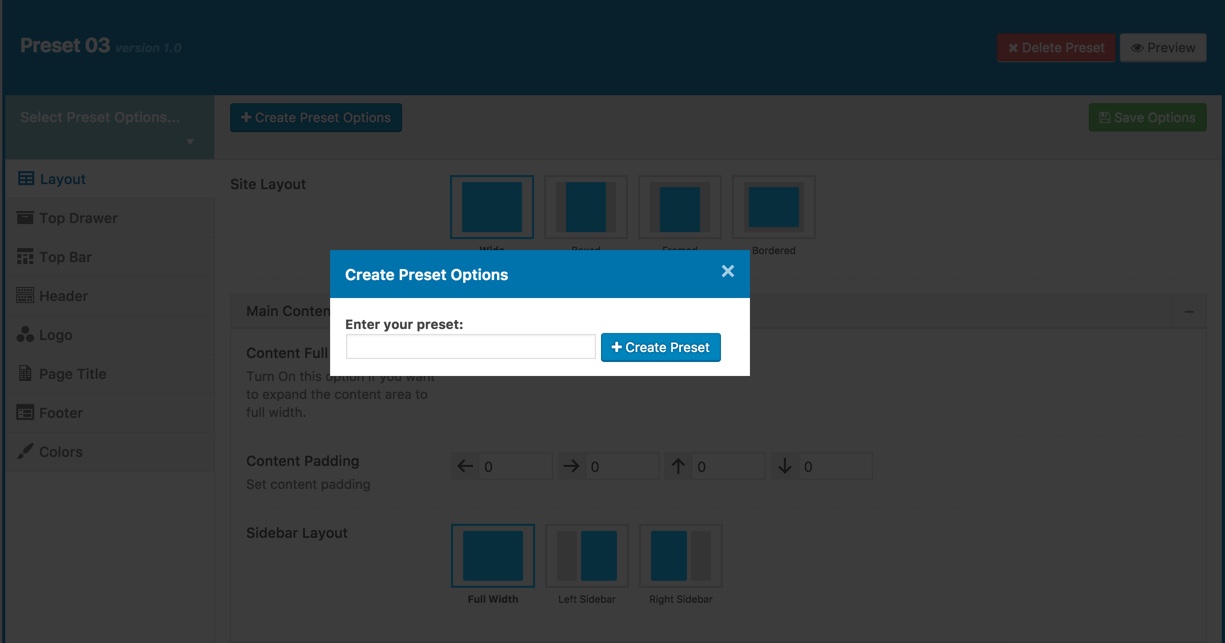
Create a new Preset
2. Preset Setting: Preset Setting in Theme Options is a option that you can choose a Preset to apply for each page type (404 page/blog/woocommerce)
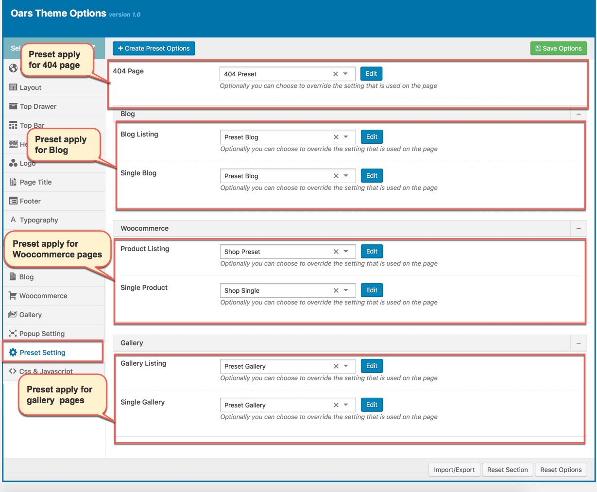
Preset Setting in Theme Options
Apply Preset to Page/Post
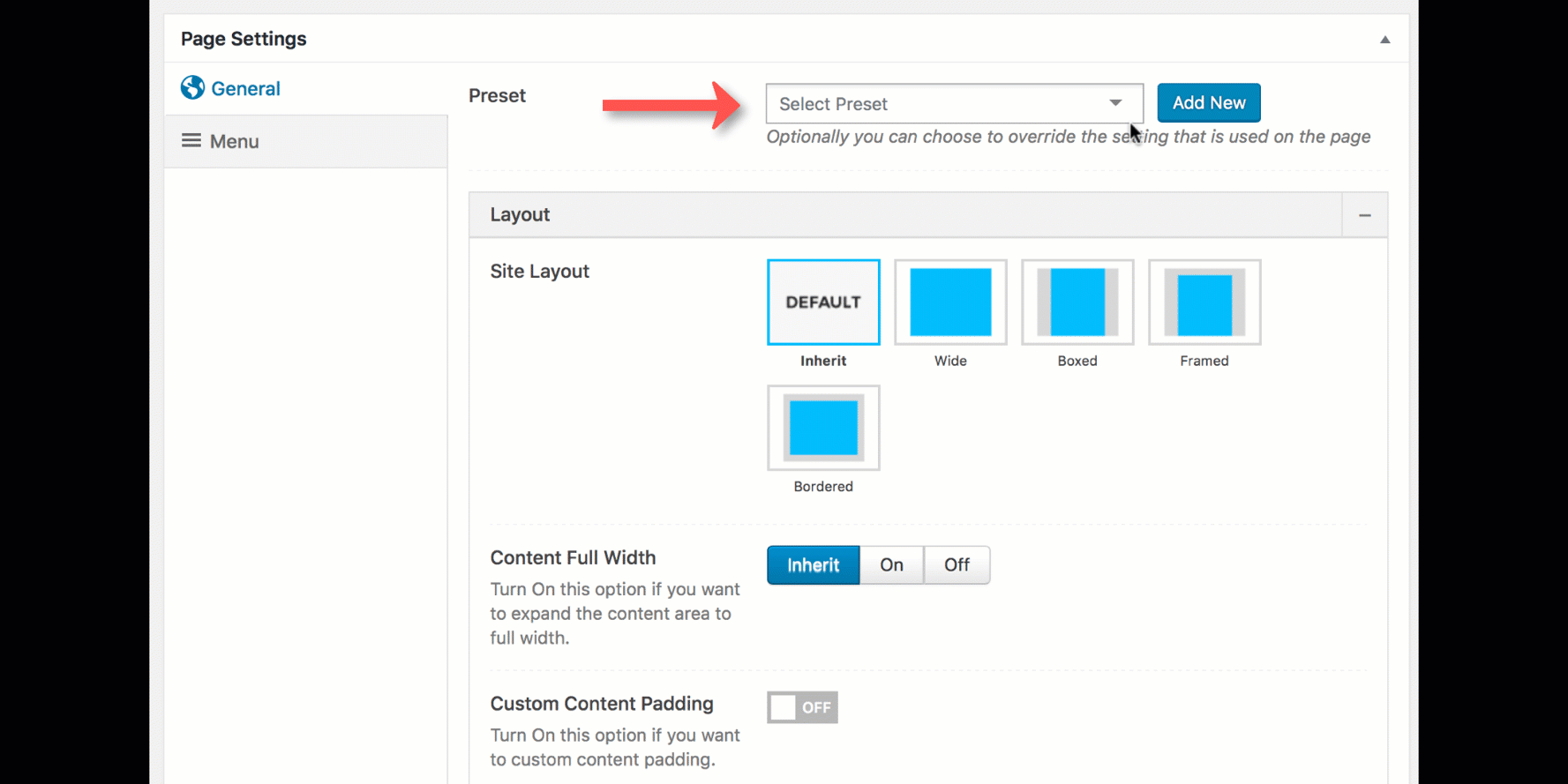
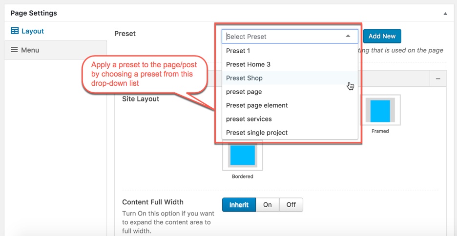
When you create a new page/post or edit a page/post, you can choose a preset from drop-down list then apply the preset to the page/post. All settings in the preset will be applied for this page/post and override settings in Theme Options. You can also Edit or Add New Preset by click on buttons next to drop-down list.
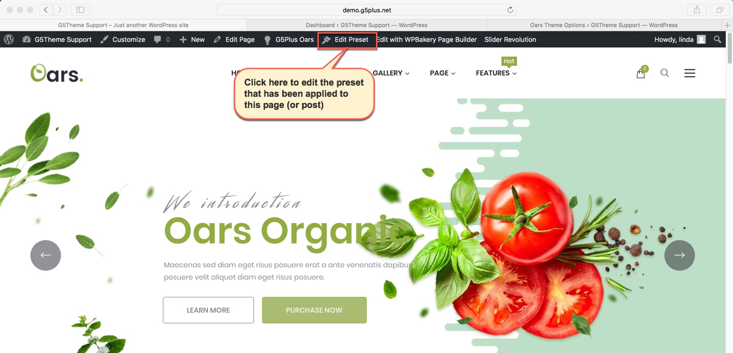
From a page that has been applied a Preset on the frontend, you can edit the Preset by clicking to Edit Preset button
NOTE: Preset and Page Settings will use the Theme Options value if left empty or if the value is default. They will override Theme Options if any other value is entered. This setup gives users maximum flexibility for setting a global theme option, then being able to override it on a page/post/shortcode basis. You can consult our guide on How to use Preset for more informations.
You can set the following Options for the Preset you are currently editing:
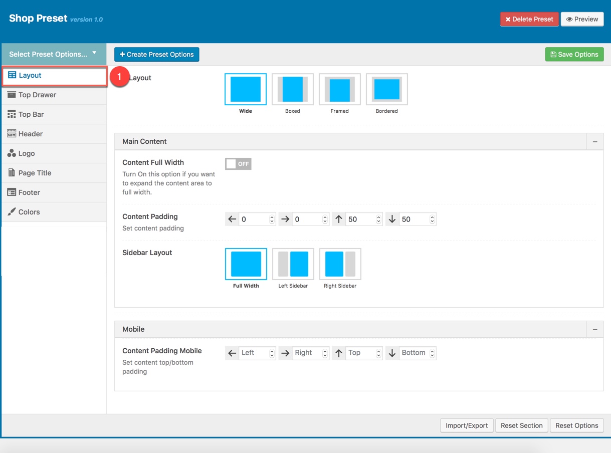
PAGE LAYOUT
This option is used for setting Page Layout in a Preset. It will overwrite Page Layout settings in Theme Options. Any option is set to "Default" which means they will take on the global options set in Pepper theme Options
Page Layout Options for the Preset:
| Attribute | Description |
|---|---|
| Size Layout | You can set layout: WWide, boxed, framed, bordered |
| Main Content | |
| Content Full width | Enable/Disable option that expand the content area to full width |
| Content Padding | Set content padding |
| Sidebar layout | Select widget area to display as sidebar |
| Sidebar | Select sidebar to display or add new a sidebar |
| Sidebar width | Set width for the page sidebar: small (1/4) or large (1/3) |
| Sidebar Sticky | Set enable sidebar sticky for the page sidebar |
| Sidebar Mobile | Set enable sidebar on the mobile |
| Sidebar Mobile Canvas | Set enable sidebar on the mobile |
| Content Padding Mobile | Set content top/bottom padding mobile. Do not include units (empty to set default) |
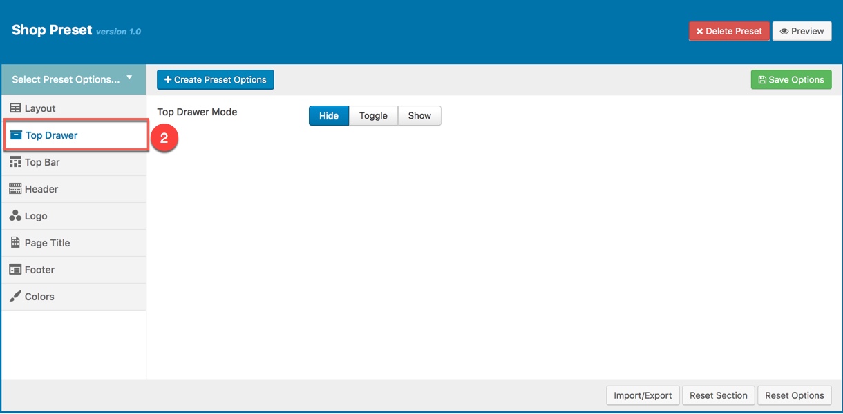
TOP DRAWER
This option is used for setting Top Drawer in a Preset. It will overwrite Top Drawer settings in Theme Options. Any option is set to "Default" which means they will take on the global options set in Pepper theme Options
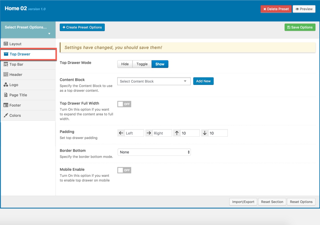
Top Drawer Options for the Preset:
| Attribute | Description |
|---|---|
| Top Drawer Mode | Set type of top drawer: 'Hide', 'Show', 'Toggle'. |
| Content Block | Select Content Block from list to use as a top drawer content. |
| Top Drawer Full width | Set status: On if you want to expand the content area to full width. |
| Padding | Set Padding space for top drawer included: padding-left, paaging-right, padding-top, padding-bottom. |
| Border bottom | Set the border bottom mode: none, full, container |
| Mobile enable | Set mobile enable:on, off |
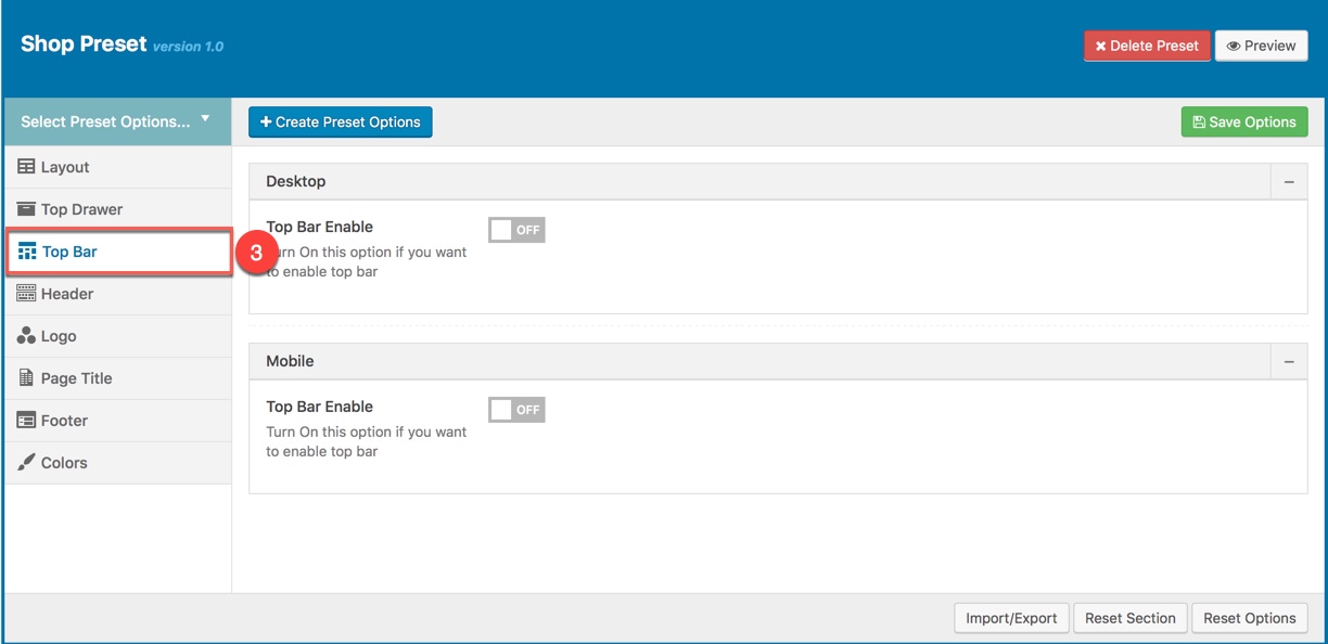
TOP BAR
This option is used for setting Top Bar in a Preset. It will overwrite Top Bar settings in Theme Options. Any option is set to "Default" which means they will take on the global options set in Pepper theme Options
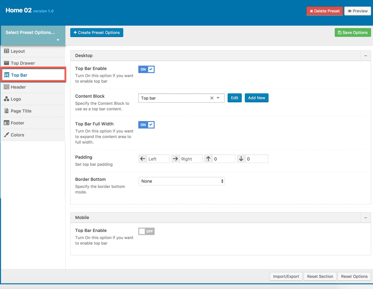
Top Bar Options for the Preset:
| Desktop | |
| Top Bar Enable | Enable/Disable Top Bar |
| Content Block | Set type to use as a top bar content. |
| Top Bar Full Width | Enable/Disable option that expand the content area to full width |
| Padding | Set Padding space for website include: padding-left, paaging-right... |
| Border bottom | Set the border bottom mode: none, full, container |
| Mobile | |
| Mobile enable | Set mobile enable:on, off |
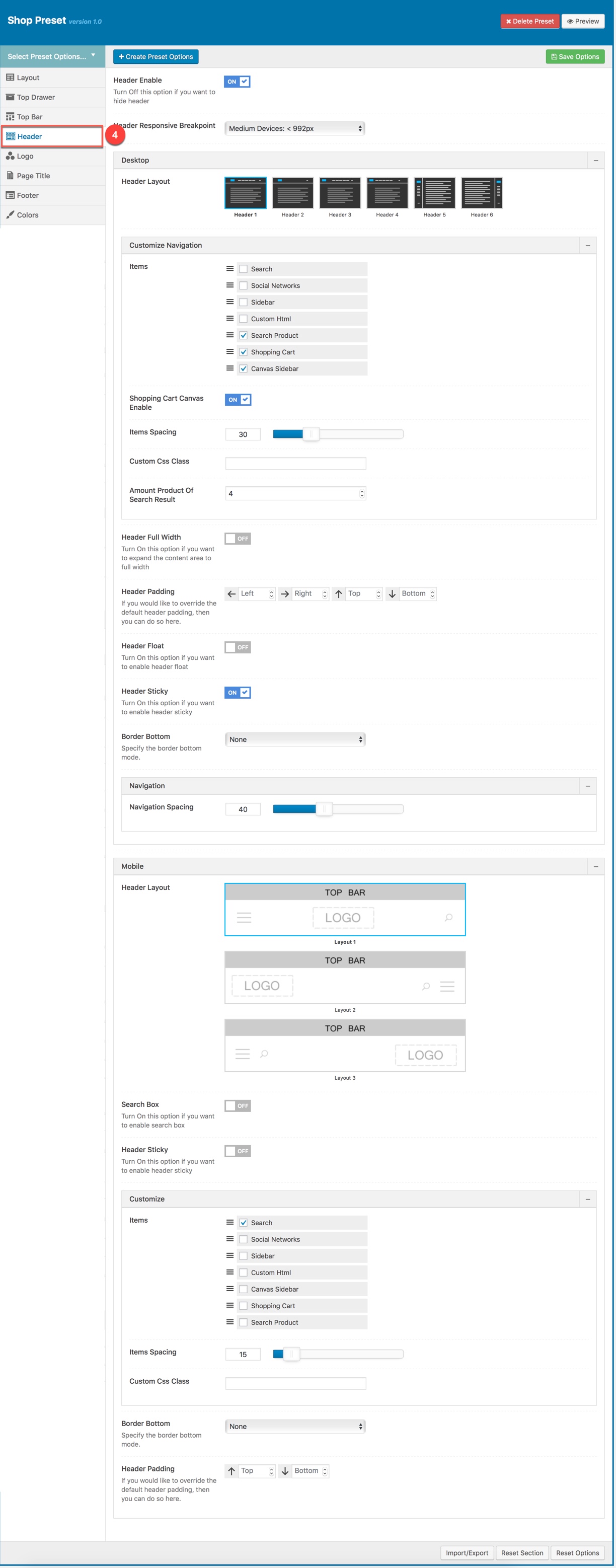
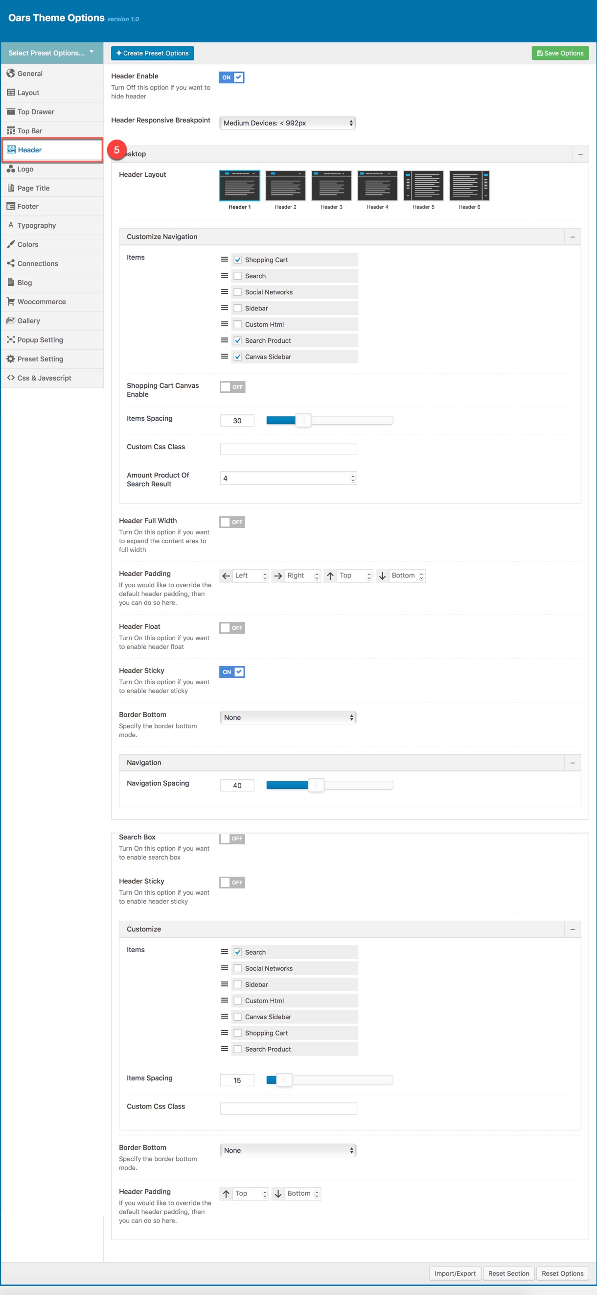
HEADER
This option is used for setting Header in a Preset. It will overwrite Header settings in Theme Options. Any option is set to "Default" which means they will take on the global options set in OARS Theme Options
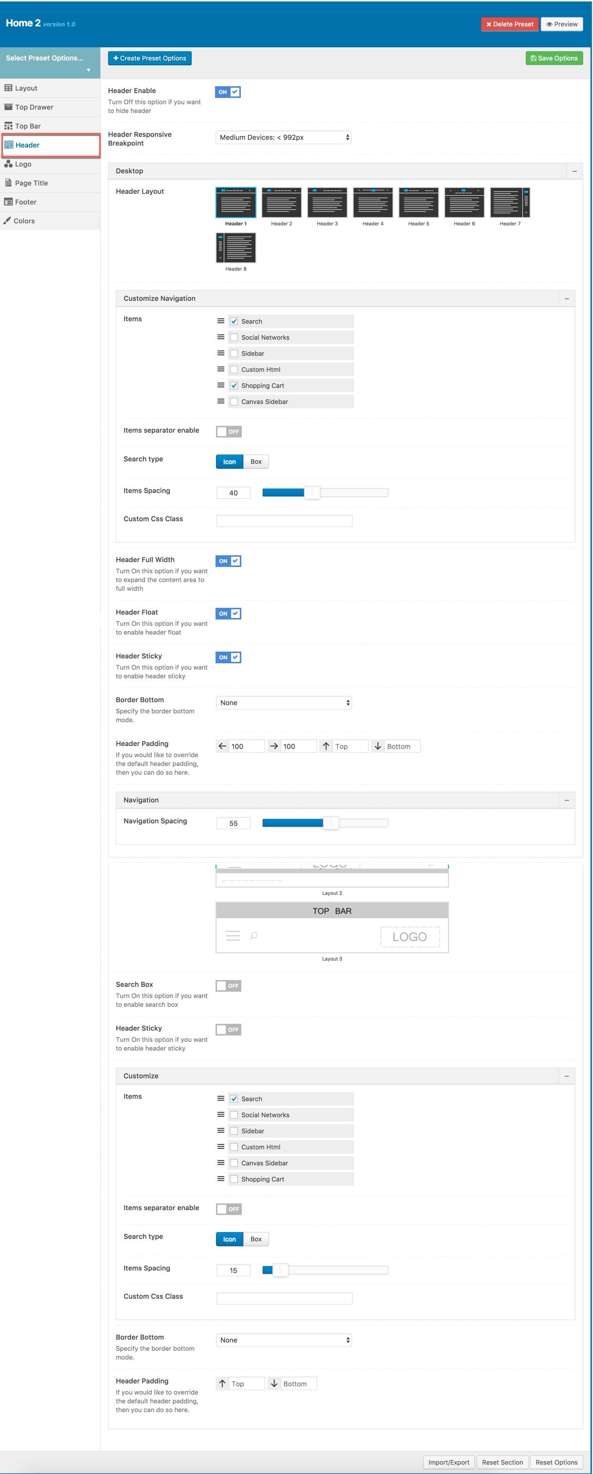
Description of Header Options for this Preset
| Attribute | Description |
|---|---|
| Header Enable | Set enable/disable of header |
| Header Responsive Breakpoint | You can response with 3 screens of devide |
| Header Layout | Set layout of header in Desktop |
| Customize Navigation | Set navigation, space between them and you can add CSS if you want |
| Header Full Width | Set enable of full width header |
| Header Float | Set enable float for header |
| Header Sticky | Set sticky mode for header:on, off |
| Border bottom | Select Header border bottom, include: None, Full Border, Container Border |
| Header padding | Set Padding top/bottom for Header area. If selected default will take value in Theme Options |
| Navigation Style | Select Navigation Style between 2 styles. |
| Navigation Spacing | Set Navigation Spacing(px) by draging scroll bar . |
| Page Header Mobile | |
| Header Mobile Layout | Set layout fot header mobile. |
| Header Float | Turn On/Off this option if you want to enable/disable header float |
| Mobile Header Search Box | Set visible for search box by turning on/off option. |
| Header mobile sticky | Set sticky mode for mobile header. |
| Customize | Add items, space between them and custom CSS (if you want) |
| Border bottom | Set border bottom: Full, container, none. |
| Header padding | Set header padding space |
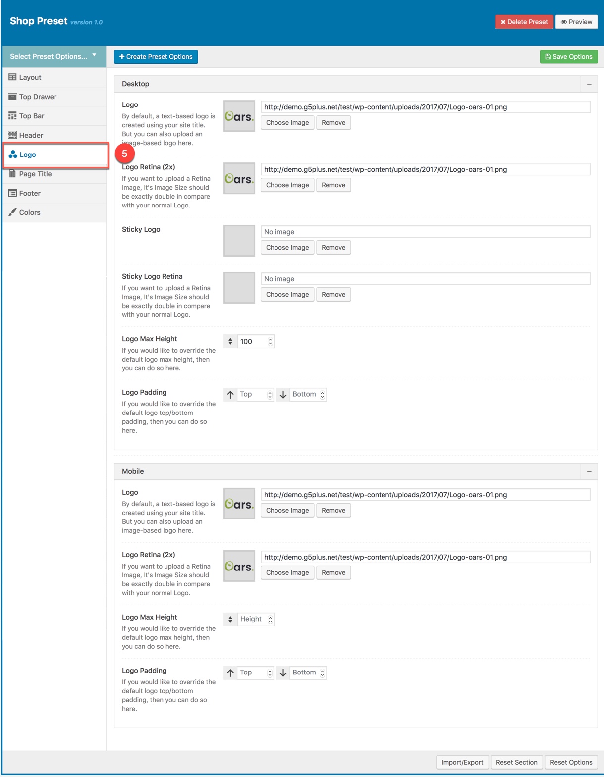
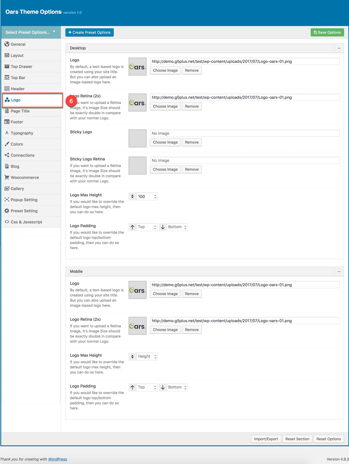
LOGO
Logo panel has all options for you to setting how logo display on pages that are applied this preset. It will overwrite Logo settings in Theme Options. Any option is set to "Default" which means they will take on the global options set in OARS Theme Options
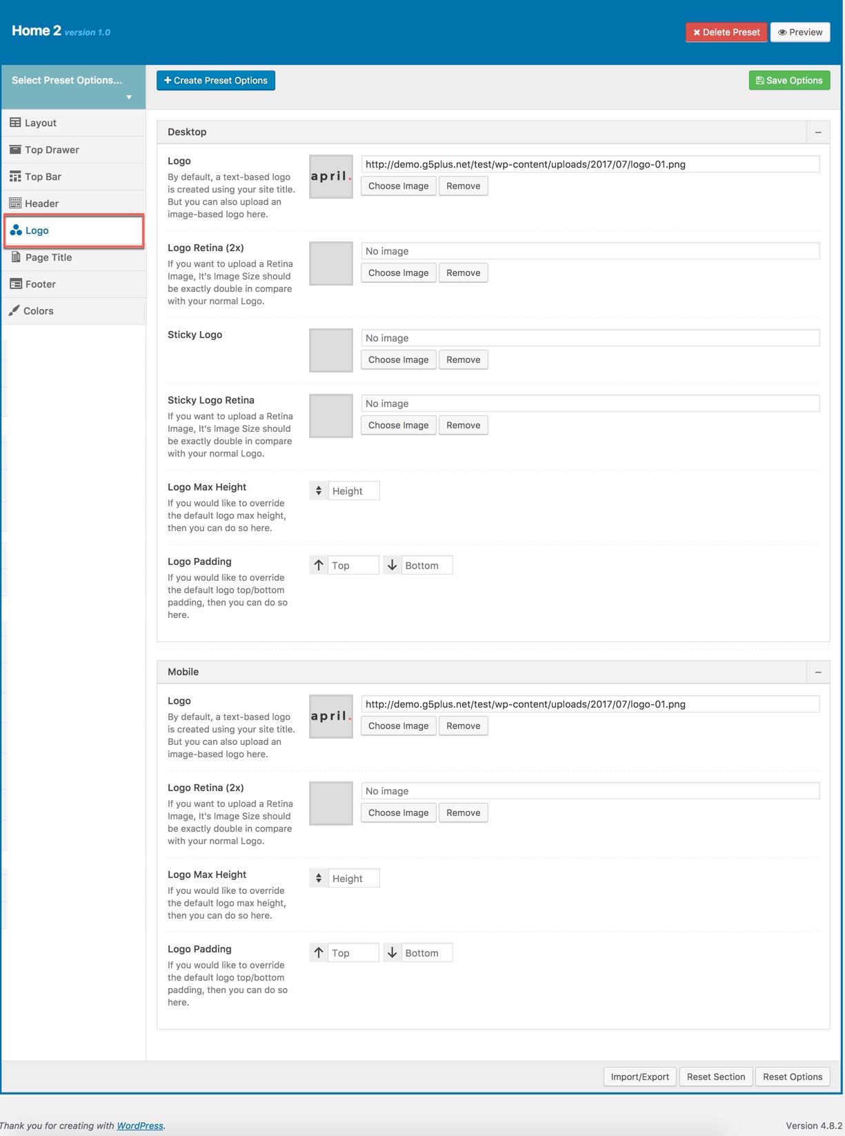
You can set the following Logo Options for the Page you are currently editing:
| Attribute | Description |
|---|---|
| Logo Desktop | |
| Logo | Upload header logo if you want custom header logo for page used this preset. |
| Logo Retina | Upload Header Logo Retina for retina if you want custom Header Logo Retina for page used this preset |
| Sticky Logo | Upload logo sticky if you want custom logo for page used preset. |
| Sticky Logo Retina | Upload logo sticky for retina if you want custom logo retina for page used this preset |
| Logo max height | Set max height for logo, if leave empty will take value in Theme Options |
| Logo padding | Set padding for logo, if leave empty will take value in Theme Options |
| Logo Mobile | |
| Logo | Upload logo if you want custom logo mobile for page used this preset. |
| Logo Retina | Upload logo mobile for retina if you want custom logo retina for page used this preset |
| Mobile Logo Max Height | Set max height for logo mobile, if leave empty will take value in Theme Options |
| Mobile Logo Padding | Set padding top/bottom for logo, if leave empty will take value in Theme Options |
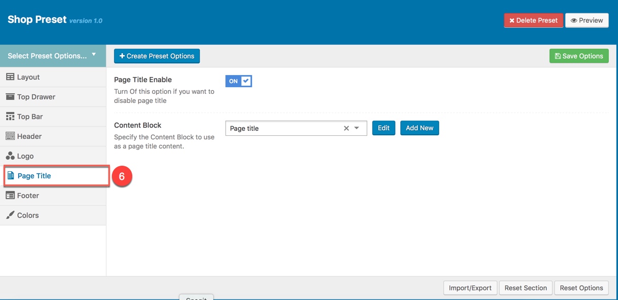
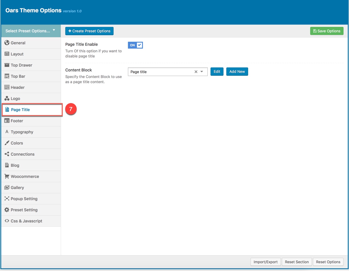
PAGE TITLE
This option is used for setting Page Title pin a Preset. It will overwrite Page Title settings in Theme Options. Any option is set to "Default" which means they will take on the global options set in Pepper theme Options
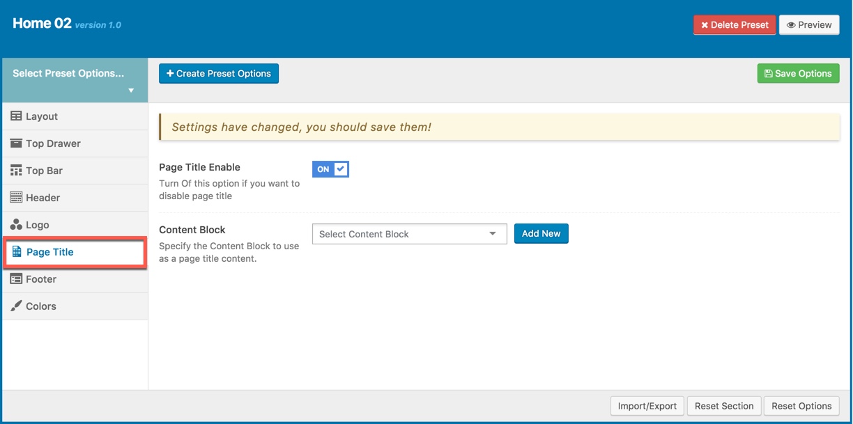
You can set the following Page Title Options for the Preset you are currently editing:
| Attribute | Description |
|---|---|
| Show/Hide Page Title? | Set visible of Page Title, if selected default will take value in Theme Options |
| Content Block | Set Content Block have been built for Page Title from list |
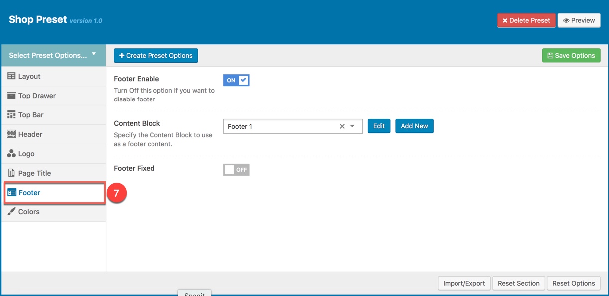
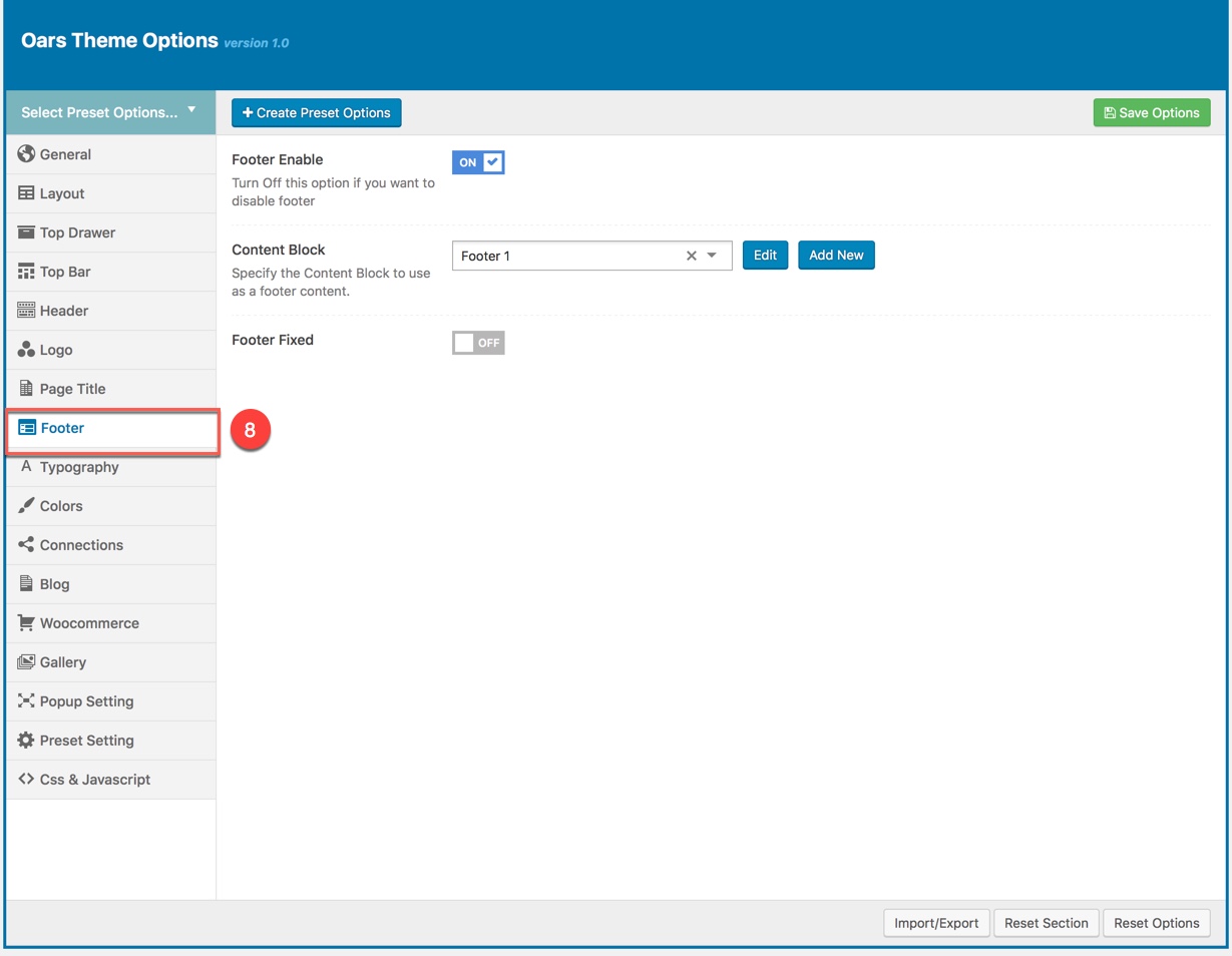
FOOTER
This option is used for setting Footer in a Preset. It will overwrite Footer settings in Theme Options.
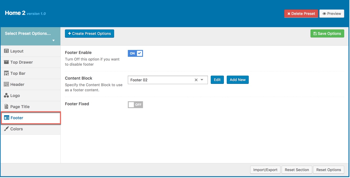
You can set the following Footer Options for the Page you are currently editing:
| Attribute | Description |
|---|---|
| Footer Enable | Set visible of footer, if selected default will take value in Theme Options |
| Content Block | Select content block for footer |
| Footer Fixed | Set Footer Fixed: on or off |
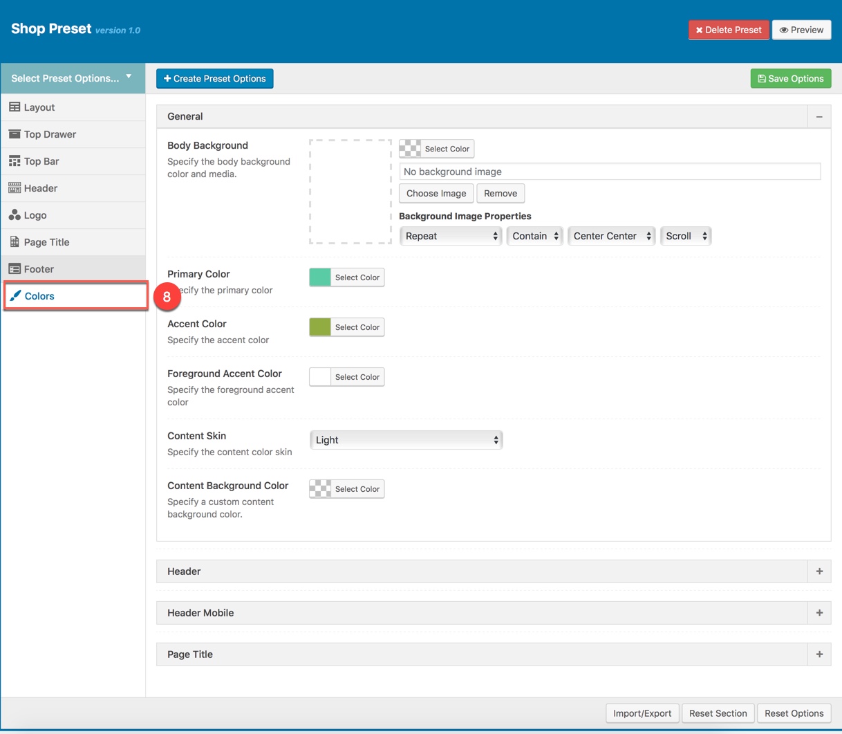
COLORS
This panel is used for setting Colors in a Preset. From here you can custom and change color options for each area on page (pages are applied this preset). You can custom and choose custom color skin to display here. Please consult Skin section for more details.
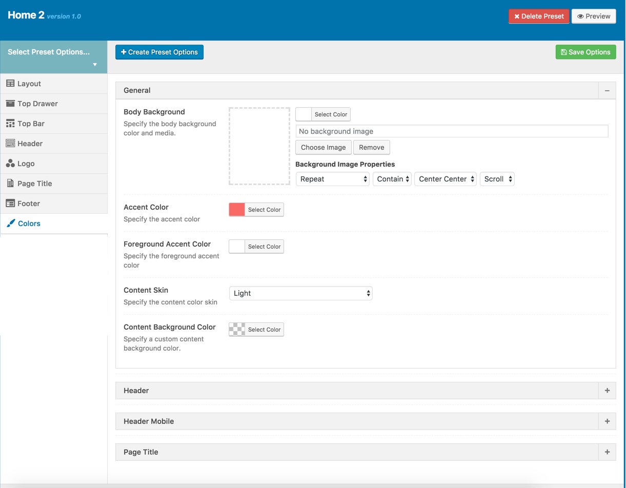
Color Options :
| Attribute | Description |
|---|---|
| General | |
| Body Background | Customize the body background color and media |
| Accent Color | Customize color for Accent Area |
| Foreground Accent color | Customize Foreground Accent color |
| Content Skin | Select the content color skin |
| Content Background color | Select Background color |
| Header | |
| Header Skin | Specify the header color skin from skins list |
| Header Background Color | Specify a custom header background color |
| Header Sticky Skin | Select the skin to display as header sticky from skins list |
| Header Background Color | Specify a custom header background color |
| Header Mobile | |
| Header Mobile Skin | Select the Header Mobile color skin from skins list |
| Header Mobile Background Color | Specify a custom Header Mobile background color |
| Page Title | |
| Page Title Skin | Select the Page Title color skin from skins list |
| Page Title Background Color | Specify a custom Page Title background color |
Use Preset Example
Examples in this documentation just a glimpse of what you can achive by using renewal options in the Pepper theme. Let's discover pepper by your own!
Example using Preset to setup the full width Woocommerce shop page (as this site)
Step 1: Create a new Preset named Shop then setup options for the Preset that will be applied for Woocommerce shop page.
8 separates of Preset options will be setup as below:
Step 2: Apply the preset named Shop Preset for Woocommerce Product Listing in Theme Options.
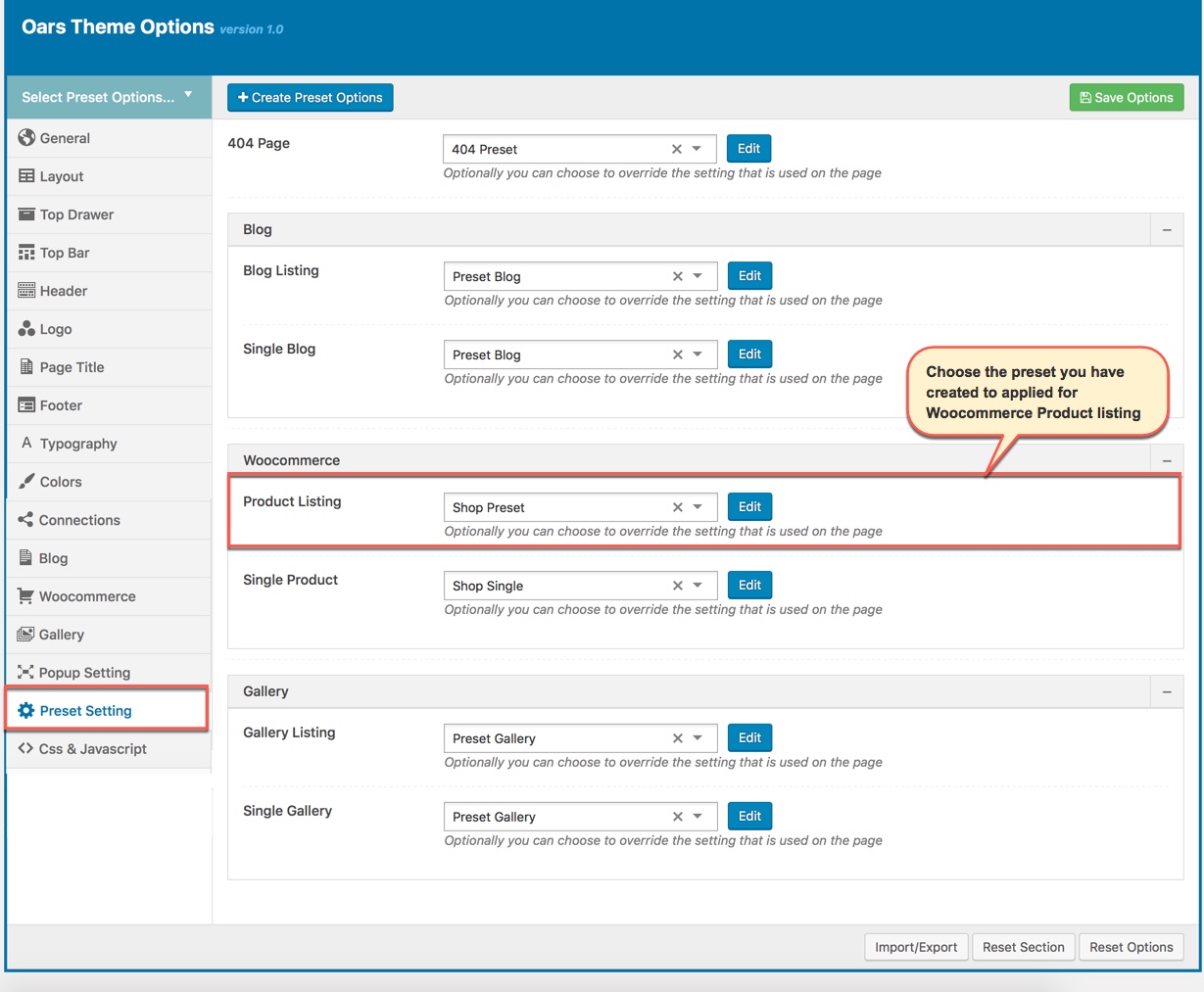
Apply Preset to each page types in Theme Options
Do not forget to setup for Woocommerce elements in Theme Options (Please consult Woocommerce option in Theme Options) and main Woocommerce Settings. And the screenshot below is your result:
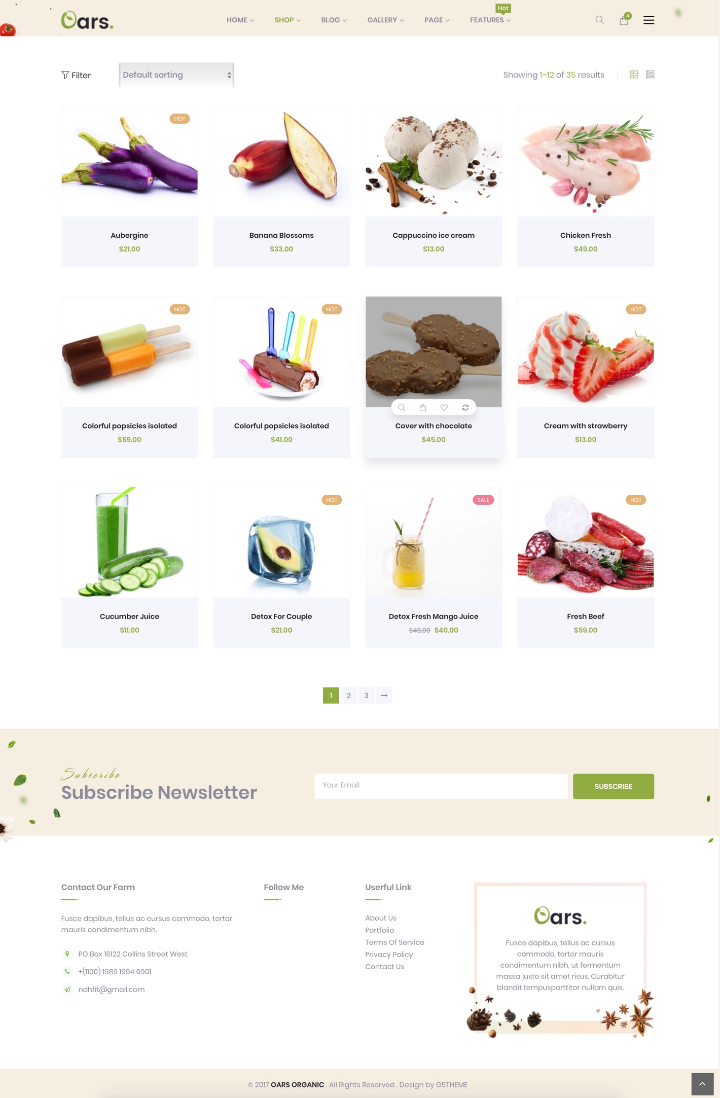
Woocommerce Shop Page fullwidth on the frontend
Note: As mentioned above, you can also apply Preset to each Page/Post if you want.
When you create a new page/post or edit a page/post, you can choose a preset from drop-down list then apply the preset to the page/post. All settings in the preset will be applied for this page/post (override settings in Theme Options).
Apply Preset to Page/Post
From a page that has been applied a Preset on the frontend, you can edit the Preset by clicking to Edit Preset button
THEME OPTIONS
Theme Options located in WP Dashboard → G5Plus Pepper → Theme Options includes all global options that affect your entire website. These options can be overwritten by setting options in Page Settings (or Preset) with any page custom Page Settings (or apply Preset).
By clicking on the Theme Options menu, you'll be able to change all settings that affect to entire your website.
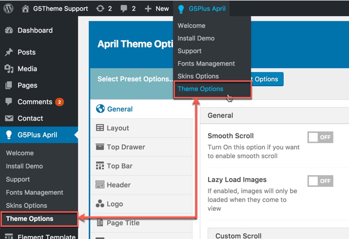
Goto Theme Options from WP dashboard
Theme Options are logically organnized into tabs, each tab contains all the options for that specific area within your site.
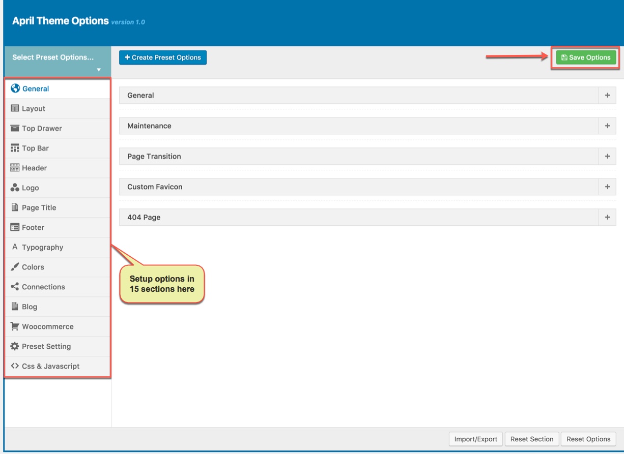
15 sections to setup in Theme Options
With OARS, we integrated Preset to Theme Options, so you can also goto WP Dashboard → G5Plus OARS → Theme Options to manage all Preset by create new or edit/preview/delete any preset from list.
Navigate to Preset Options
You could consult our guide on How to use Theme Options and How to use Preset for more detail about How to use Theme Options properly on your website.
We highly encourage you to explore the theme options and experimentwith what all the available options can do.
GENERAL
General tab is divided into a few sections. Asides from the Install demo Data section mentioned above, there are a few important sections for you to customize your layout.
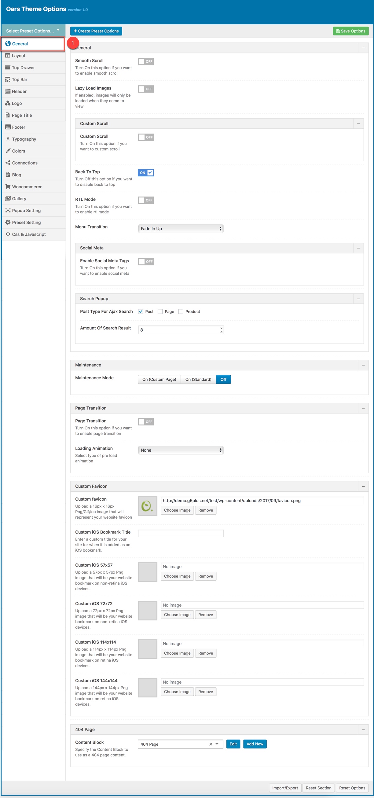
Page Layout Options:
| Attribute | Description |
|---|---|
| Smooth scroll | Set Smooth scroll status: on, off |
| Lazy Load Image | Set Lazy Loadd Image status: on, off. If enabled, images will only be loaded when they come to view |
| Custom Scroll | Set Custom Scroll status: on, off |
| Back to Top | Set Back to Top status: on, off |
| RTL Mode | Set RTL Mode status: on, off. For languages that read from right-to-left unlike English which is left-to-right, switch RTL smode, as long as you it's in your language and uses the correct locale. |
| Menu Transition | Set status: Fade on, Fade off, Fade in Up, Fadein dowwn... |
| Social Meta | Set Social Meta Tags status: on, off |
| Search Popup | Set Search Popup status: on, off |
| Maintenance | Set Maintenance Mode: On(Custom Page), On(Status Page), Off |
| Page Transition | Set Page Transition status: on, off |
| Custom Favicon | Set Custom Favicon with each screen size |
| 404 Page | Set Content Block and content for 404 page |
PAGE LAYOUT
Layout Options has all options for setting site layout (pls read infomation below each option for more details)
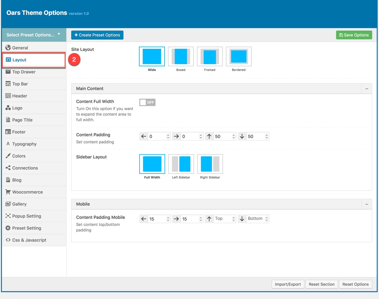
You can set the following Page Layout Options for the Preset you are currently editing:
| Attribute | Description |
|---|---|
| Site Layout/td> | You can select one of 4 layouts: Wide, boxed, framed, bordered |
| Main Content | |
| Content Full width | Enable/Disable option that expand the content area to full width |
| Sidebar layout | Select widget area to display as sidebar |
| Sidebar | Select sidebar to display or add new a sidebar |
| Sidebar width | Set width for the page sidebar: small (1/4) or large (1/3) |
| Sidebar Sticky | Set enable sidebar sticky for the page sidebar |
| Mobile | |
| Sidebar Mobile | Set enable sidebar on the mobile |
| Sidebar Mobile Canvas | Set enable sidebar on the mobile |
| Content Padding Mobile | Set content top/bottom padding mobile. Do not include units (empty to set default) |
TOP DRAWER
Top Drawer contains all options for setting Top Drawer area. In pepper demo Data, Top Drawer has been hiden by default and Top Drawer area have had any widget yet. So if you want to enable Top Drawer please read carefully infomation below each option for more details.
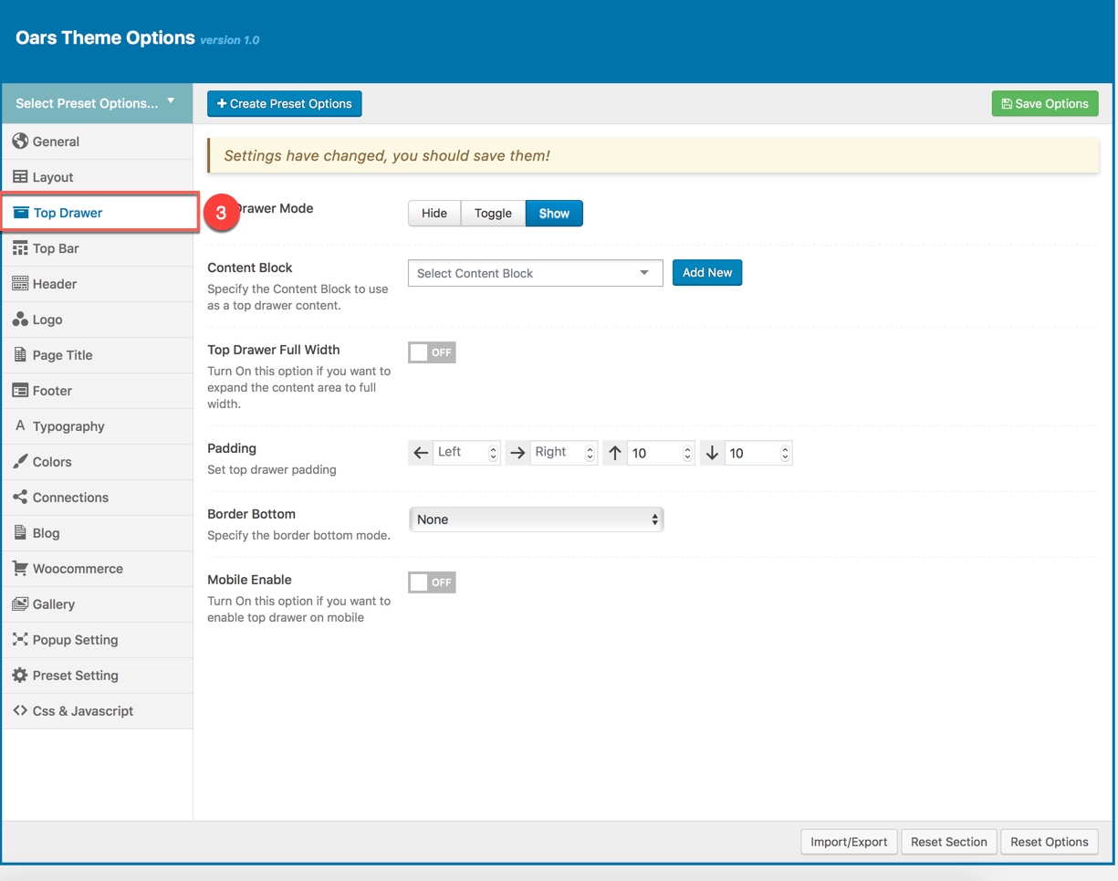
Description of Top Drawer Options
| Attribute | Description |
|---|---|
| Top Drawer Type | Set type of top drawer: 'Disable', 'Always Show', 'Toggle'. If selected default will take value in Theme Options |
| Content Block | Set type to use as a top drawer content. |
| Top Drawer Sidebar | Set Sidebar for top drawer sidebar, if not selected will take value in Theme Options |
| Top Drawer Full width | Set Page Transition status: on, off |
| Padding | Set Padding space for website include: padding-left, paaging-right... |
| Border bottom | Set the border bottom mode: none, full, container |
| Mobile enable | Set mobile enable:on, off |
TOP BAR
Top Bar contains all options for setting Top Bar area. You can use Content Block to display as Top Bar
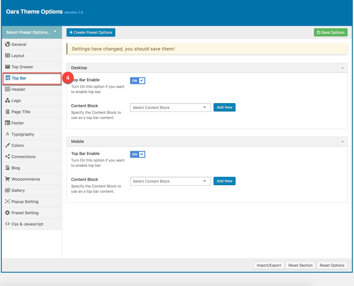
Descriptions of Top Bar Options:
| Desktop | |
| Top Bar Enable | Enable/Disable Top Bar |
| Content Block | Specify the content block to use as a top bar content on Desktop. |
| Mobile | |
| Mobile enable | Set mobile enable:on, off |
| Content Block | Specify the content block to use as a top bar content on Mobile. |
HEADER
Header contains all options for setting Header Area such as Layout, Header Top/Bottom Padding.. and customize Header Area (pls read carefully infomation below each option for more details).
Description of Header Options
| Attribute | Description |
|---|---|
| Header Enable | Set enable of header |
| Header Responsive Breakpoint | You can response with 3 screens of devide |
| Header Layout | Set layout of header in Desktop |
| Customize Navigation | Set navigation, space between them and you can add CSS if you want |
| Header Full Width | Set enable of full width header |
| Header Float | Set enable float for header |
| Header Sticky | Set sticky mode for header:on, off |
| Border bottom | Select Header border bottom, include: None, Full Border, Container Border |
| Header Above Border Bottom | Select Header Above Border Bottom , include: None, Full Border, Container Border |
| Header padding | Set Padding top/bottom for Header area. If selected default will take value in Theme Options |
| Navigation Height | Set Navigation Height(px). Do not include unit. |
| Navigation Spacing | Set Navigation Spacing(px) by draging scroll bar . |
| Page Header Mobile | |
| Header Mobile Layout | Set layout fot header mobile. |
| Menu Drop Type | Set drop type for menu mobile: 'Dropdown Menu', 'Fly Menu'. |
| Mobile Header Search Box | Set visible for search box. |
| Header mobile sticky | Set sticky mode for mobile header. |
| Customize | Add items, space between them and custom CSS (if you want) |
| Border bottom | Set border bottom: Full, container, none. |
| Header padding | Set header padding space |
LOGO
Logo contains all options for setting how logo display on page (pls read carefully infomation below each option for more details).
Description of Logo Options
| Attribute | Description |
|---|---|
| Logo Desktop | |
| Logo | Upload header logo if you want custom header logo for page used this preset. |
| Logo Retina | Upload Header Logo Retina for retina if you want custom Header Logo Retina for page used this preset |
| Sticky Logo | Upload logo sticky if you want custom logo for page used preset. |
| Sticky Logo Retina | Upload logo sticky for retina if you want custom logo retina for page used this preset |
| Logo max height | Set max height for logo, if leave empty will take value in Theme Options |
| Logo padding | Set padding for logo, if leave empty will take value in Theme Options |
| Logo Mobile | |
| Logo | Upload logo if you want custom logo mobile for page used this preset. |
| Logo Retina | Upload logo mobile for retina if you want custom logo retina for page used this preset |
| Mobile Logo Max Height | Set max height for logo mobile, if leave empty will take value in Theme Options |
| Mobile Logo Padding | Set padding top/bottom for logo, if leave empty will take value in Theme Options |
PAGE TITLE
Page Title has options for setting Page Title. You can select the Content Block to displays as a page title content.
You can set the following Page Title Options for the Preset you are currently editing:
| Attribute | Description |
|---|---|
| Show/Hide Page Title? | Set visible of Page Title, if selected default will take value in Theme Options |
| Content Block | Set Content Block have been built for Page Title from list |
FOOTER
Footer panel contains all options for setting Footer Area (pls read infomation below each option for more details).
| Attribute | Description |
|---|---|
| Footer Enable | Set visible of footer, if selected default will take value in Theme Options |
| Footer Fixed | Set Footer Fixed: On or Off |
| Content Block | Select content block for footer |
TYPOGRAPHY
Typography allows users to specify font properties to display as body font, primary font, menu font... All fonts are managed in Fonts Management custom/upload fonts on website.
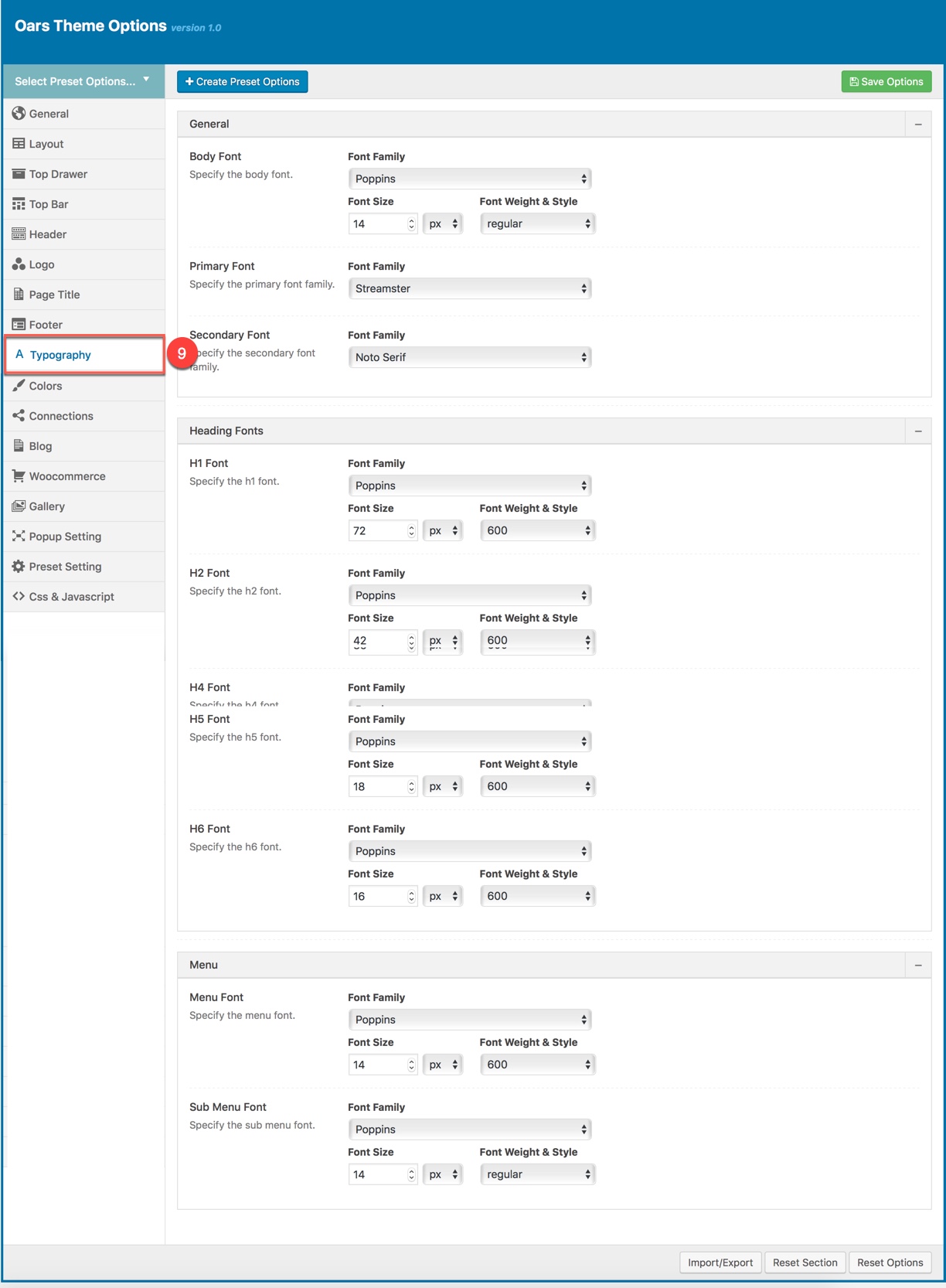
| Attribute | Description |
|---|---|
| General | |
| Body font | Included: Font Family(name of font), Font Size, Font Weight. |
| Primary font | Included: Font Family(name of font) |
| Heading Font | |
| H1 Font | Specify the H1 font (Font family, Font size, Font Weight & Style) |
| H2 Font | Specify the H2 font (Font family, Font size, Font Weight & Style) |
| H3 Font | Specify the H3 font (Font family, Font size, Font Weight & Style) |
| Menu | |
| Menu Font | Specify Font Family(name of font), Font Size, Font Weight for the menu |
| Sub Menu Font | Specify Font Family(name of font), Font Size, Font Weight for the sub menu |
COLORS
Color panel allows users to custom and change color options for each area on page. You can custom and choose custom color skin to display here. Please consult Skin Options section for more details.
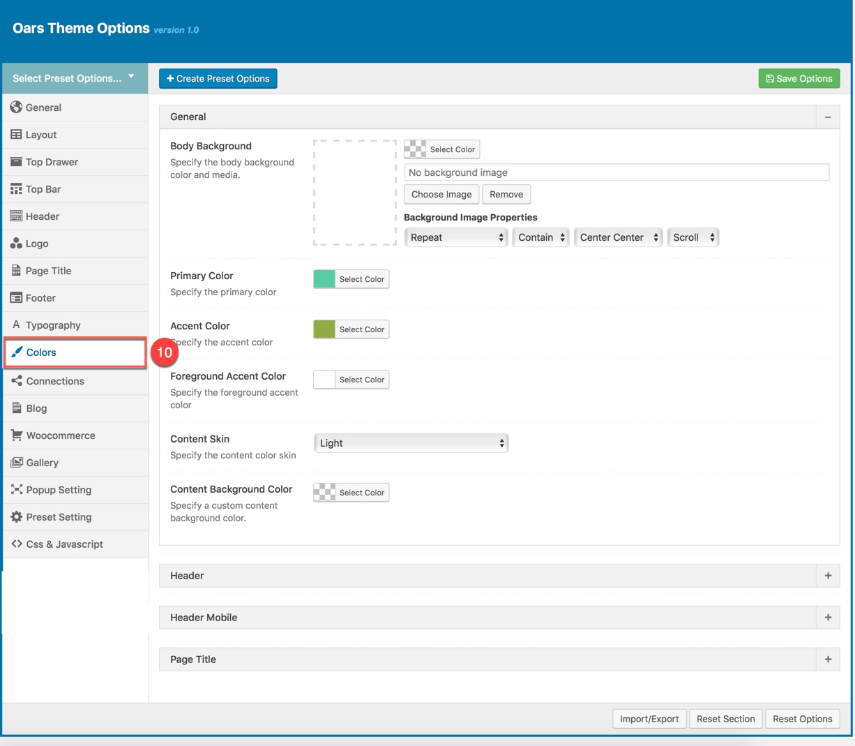
You can set color for each area on page :
| Attribute | Description |
|---|---|
| General | |
| Body Background | Customize the body background color and media |
| Accent Color | Specify the accent color |
| Foreground Accent color | Specify the Foreground Accent color |
| Content Skin | Select the content color skin |
| Content Background color | Select Background color |
| Header | |
| Header Skin | Specify the header color skin from skins list |
| Header Background Color | Specify a custom header background color |
| Header Sticky Skin | Select the skin to display as header sticky from skins list |
| Header Background Color | Specify a custom header background color |
| Header Mobile | |
| Header Mobile Skin | Select the Header Mobile color skin from skins list |
| Header Mobile Background Color | Specify a custom Header Mobile background color |
| Page Title | |
| Page Title Skin | Select the Page Title color skin from skins list |
| Page Title Background Color | Specify a custom Page Title background color |
CONNECTION
Connection contains all options that allows user to share on various social networks which automatically shows up under the content post, an important function that helps promoting your site. You can check the options to decide which network are allowed to share the content of your website on. You can also turn off all options if you don't want your content to be shared at all.
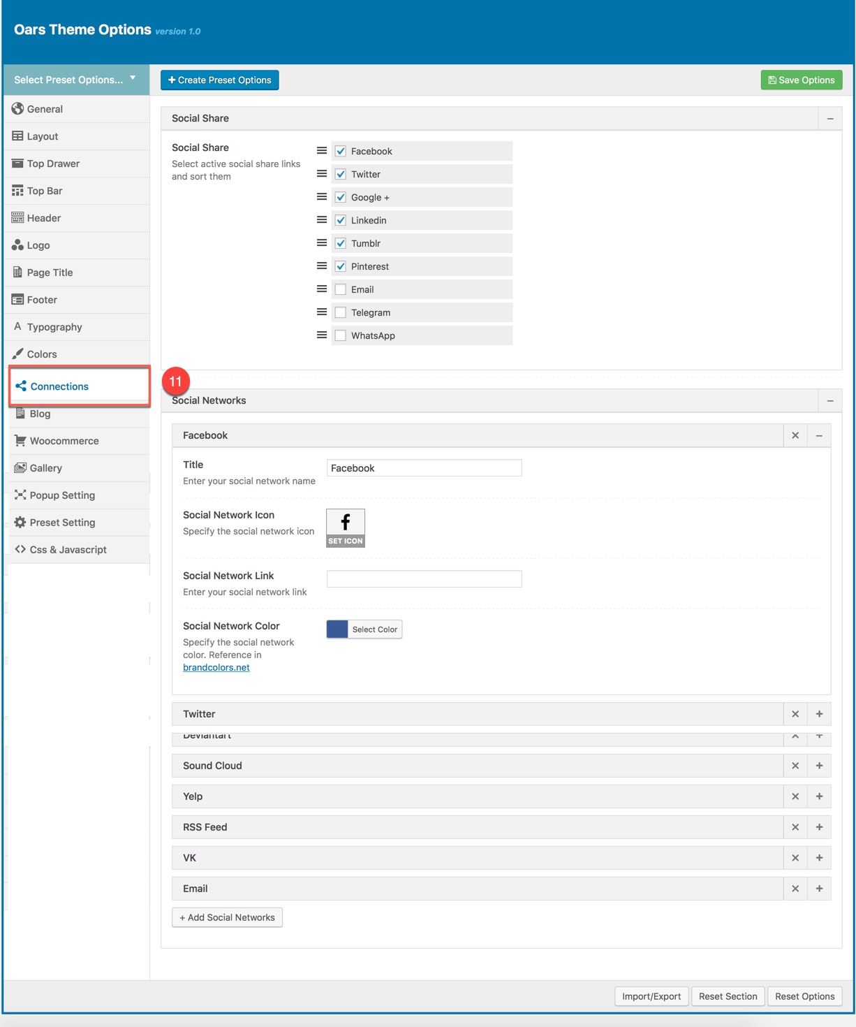
You can set connection for each area on page :
| Attribute | Description |
|---|---|
| Social Share | |
| Social Share | You can select active social share links and sort them |
| Social Network | |
| You can add title, icon, link ad color for icon | |
| You can add title, icon, link ad color for icon | |
BLOG
Blog panel has all options to customize post layout, animation, advertisement... in Blog Listing, Search Listing, Single Blog.
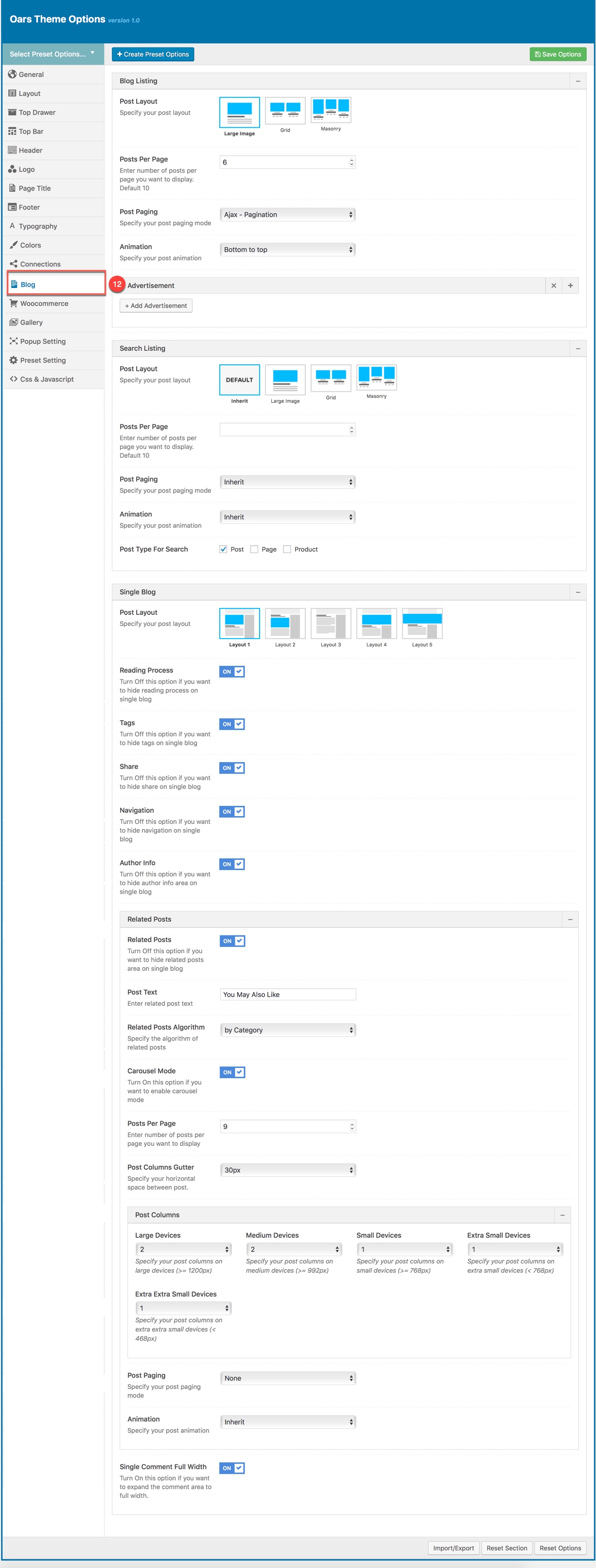
| Attribute | Description |
|---|---|
| Blog Listing | |
| Post Layout | You can select select post layout |
| Show Category Filter | You can Enable/Disable showing Category Filter. |
| Post Per Page | You can enter number of posts per page you want to display. It's 10 by default. |
| Post Paging | You can select post paging mode here |
| Animation | You can select post animation |
| Advertisement | Manage advertisement in Blog listing |
| Search Listing | |
| Post Layout | You can select select post layout for Search Listing page |
| Post Per Page | You can enter number of posts per page you want to display. It's 10 by default. |
| Post Paging | You can select post paging mode here |
| Animation | You can select post animation for Search Listing |
| Post type for search | Select Post Type for search is "Post" or "Page" |
| Single Blog | |
| Post Layout | You can select your post layout |
| Reading Process | if you want to hide share on single blog, you can click "off" |
| Tag | if you want to hide share on single blog, you can click "off" |
| Share | if you want to hide share on single blog, you can click "off" |
| NavigationReading Process | if you want to hide share on single blog, you can click "off" |
| Author Info | if you want to hide share on single blog, you can click "off" |
| Related Post | |
| Related Post | if you want to hide share on single blog, you can click "off" |
| Related Post Algorithm | you can select algorithm by different ways |
| Carousel Mode | if you want to hide share on single blog, you can click "off" |
| Post per page | you can select posts per page |
| Post Columns Gutter | you can select horizontal space between post |
| Post Columns | you can select Large Devices, Medium Devices, Small Devices, Extra Small Devices |
| Post Paging | you can select your post paging mode |
| Amination | you can select your post amination |
WOOCOMMERCE OPTIONS
This options section allows you to style the general appearance of the WooCommerce elements on the site (please read carefully infomation below each option for more details). The Woocommerce plugin is required to be installed and activated in order to be able to customize Woocommerce elements.
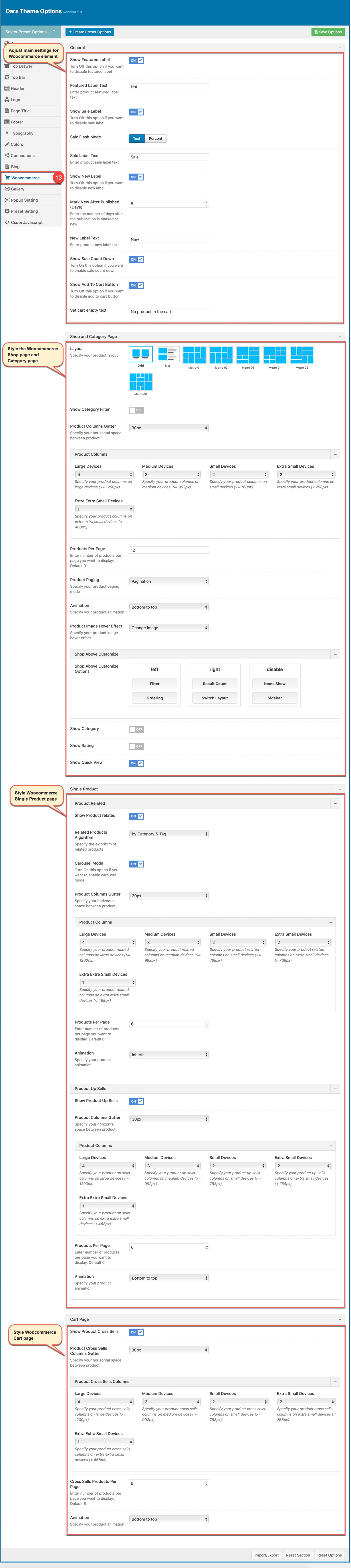
Woocommerce section in Theme Options
Shop page on the frontend
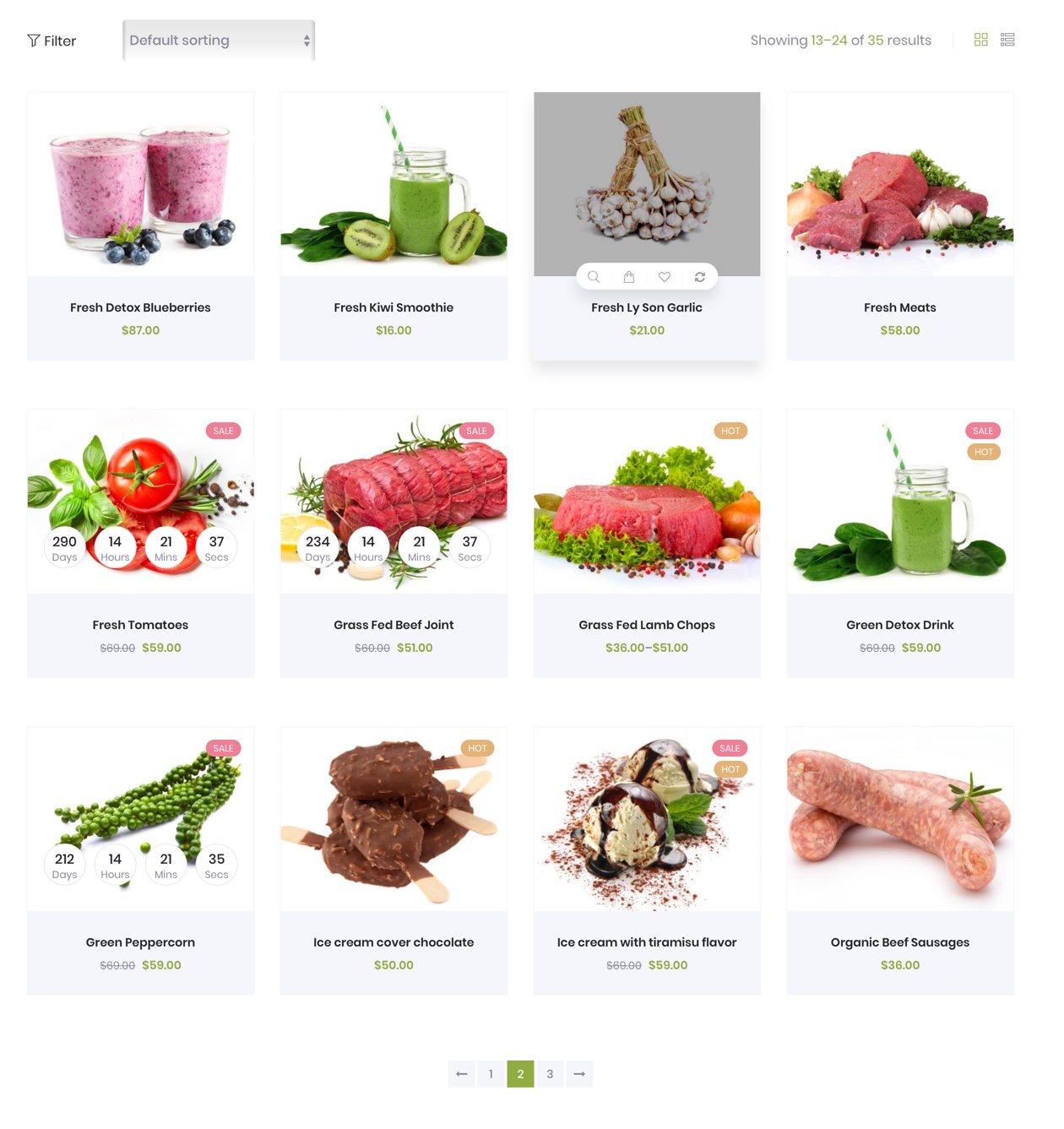
The Woocommerce Shop page on the frontend
Single Product page on the frontend
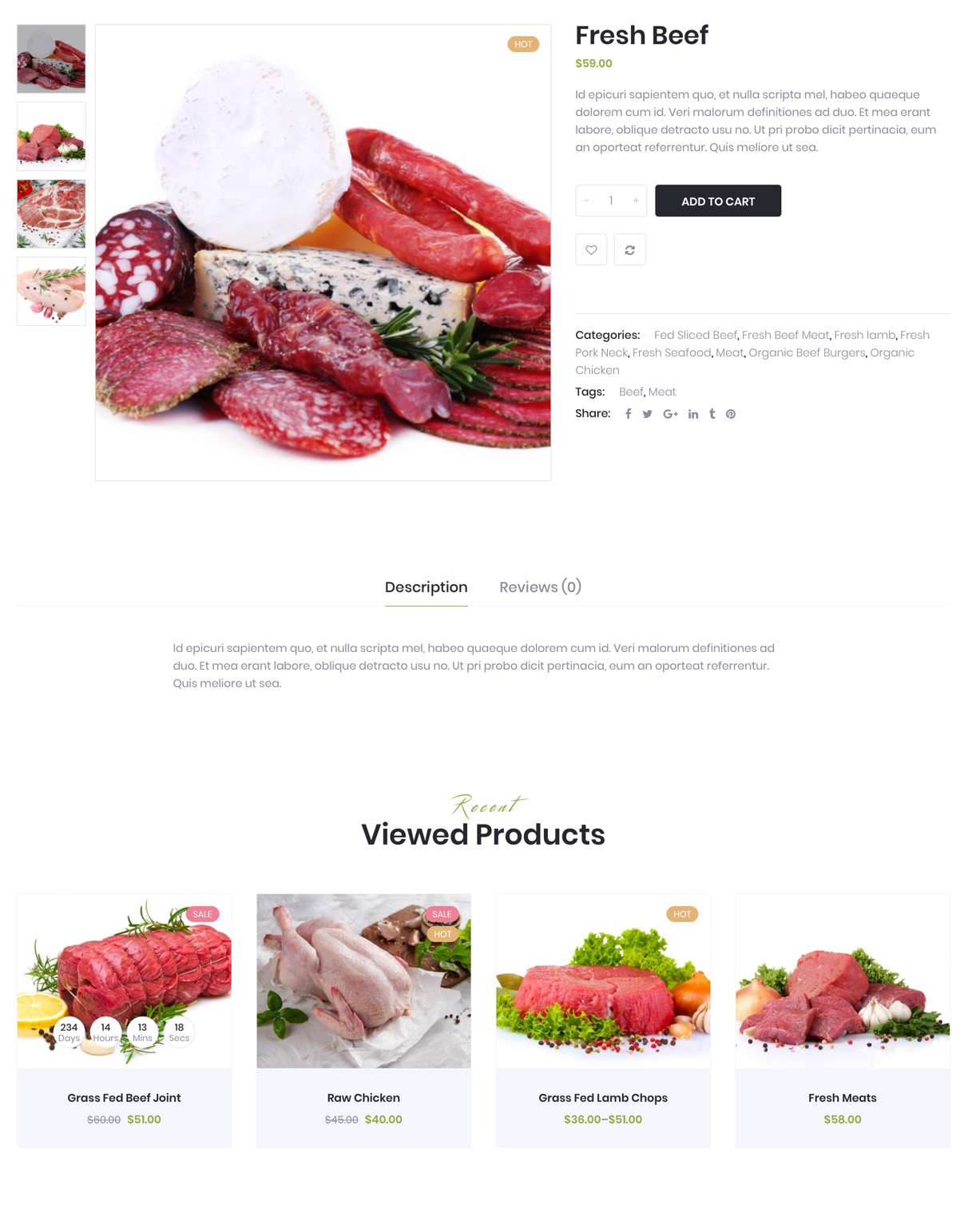
The Woocommerce Single Product page on the frontend
Category Products page on the frontend
The Woocommerce Cart Page on the frontend
Woocommerce Cart Page on the frontend
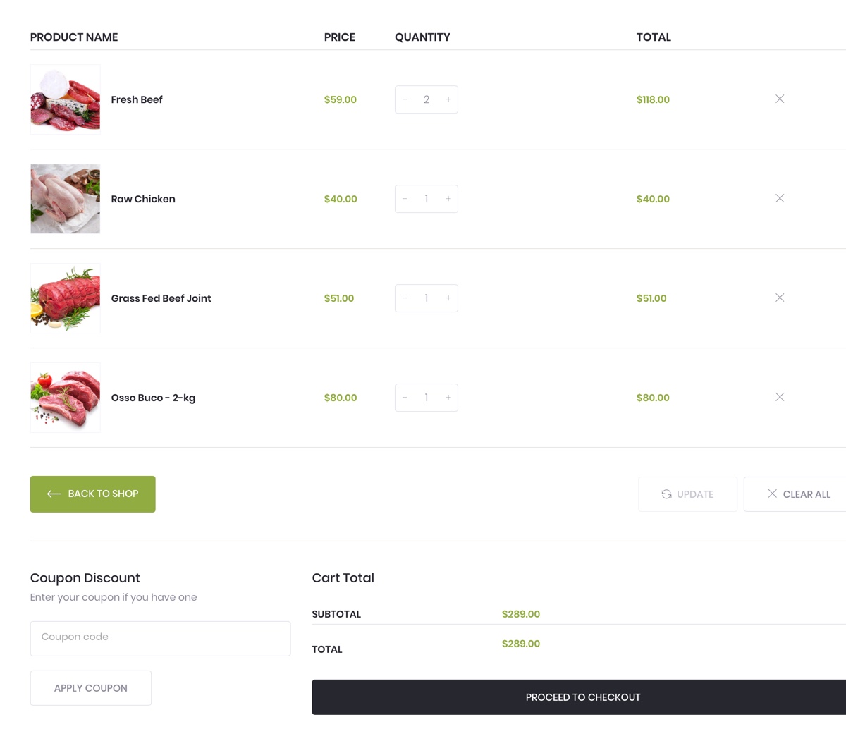
The Woocommerce Cart Page on the frontend
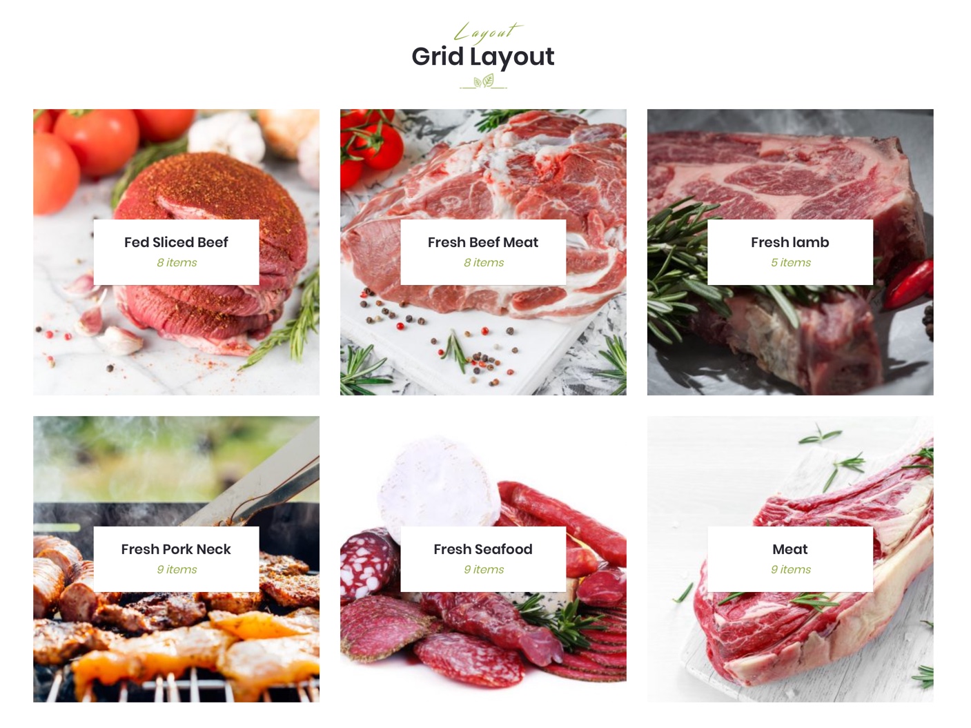
Gallery Options
This options section allows you to style the general appearance of the gallery (please read carefully infomation below each option). You can consult Gallery section for more details.
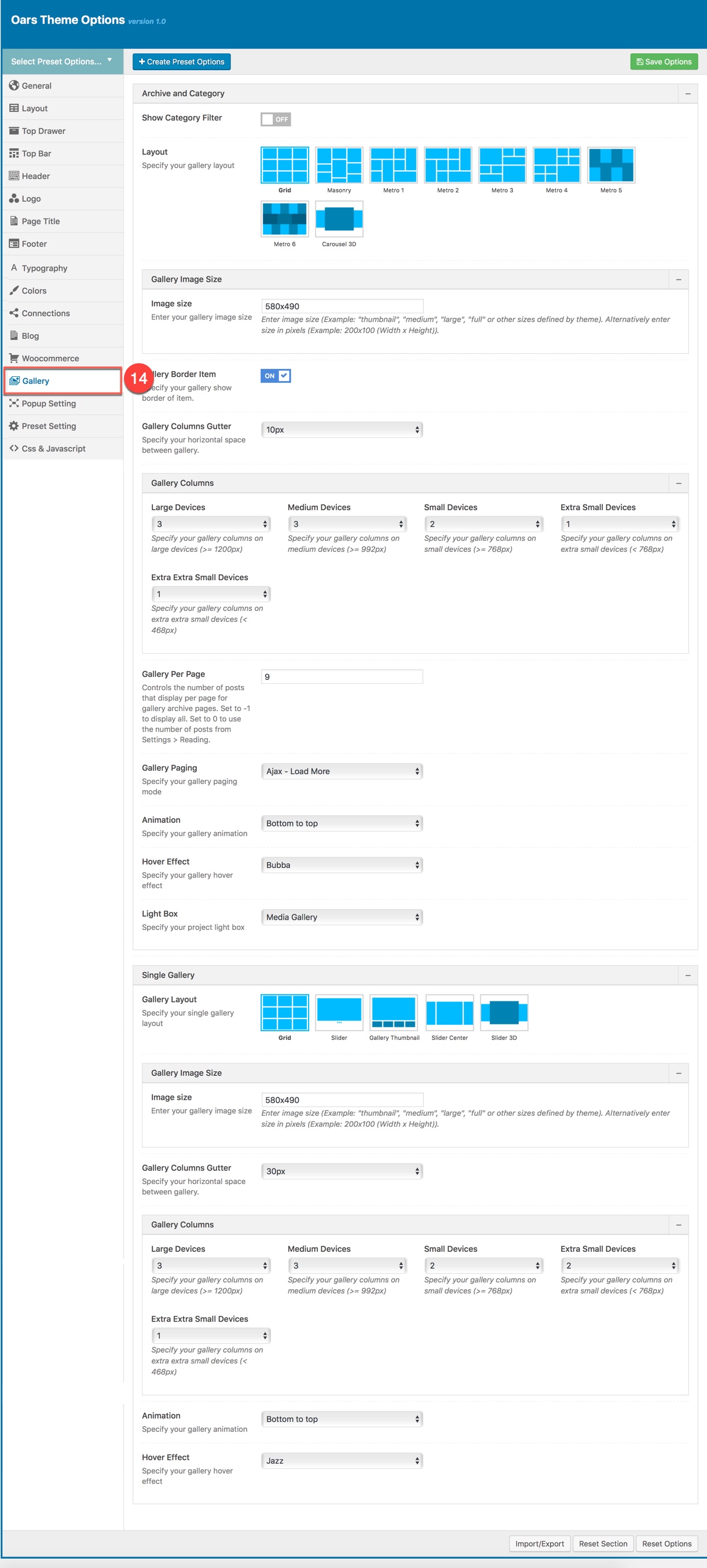
Gallery section in Theme Options
Gallery on the frontend
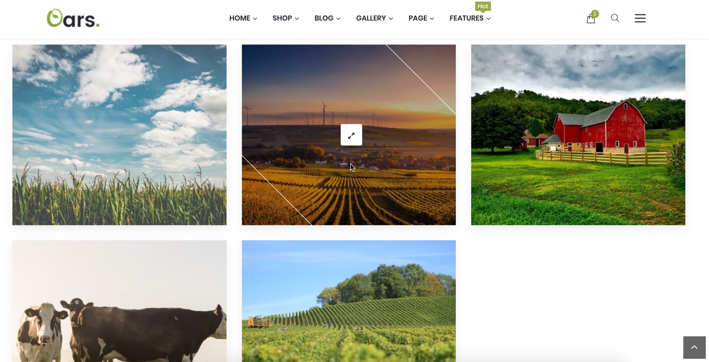
The Portfolio on the frontend
POPUP SETTINGS
Preset Settings allows users to choose preset setting apply for each page type
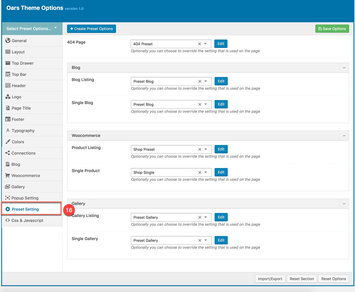
PRESET SETTINGS
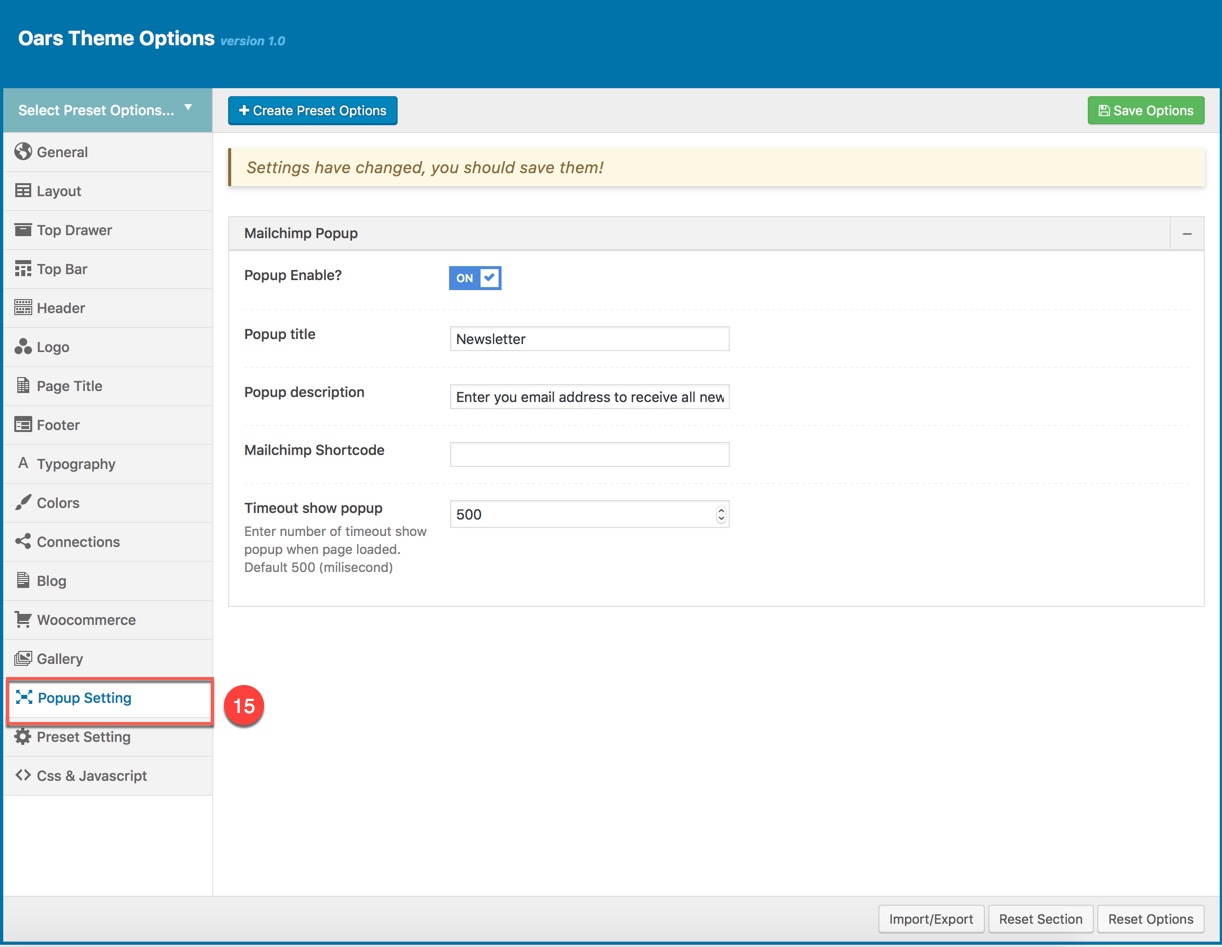
This options section allows you to style appearance of the MailChimp popup (please read carefully infomation below each option for more details). The MailpChimp plugin is required to be installed and activated in order to be able to customize MailChimp popup.
CSS & JAVASCRIPT
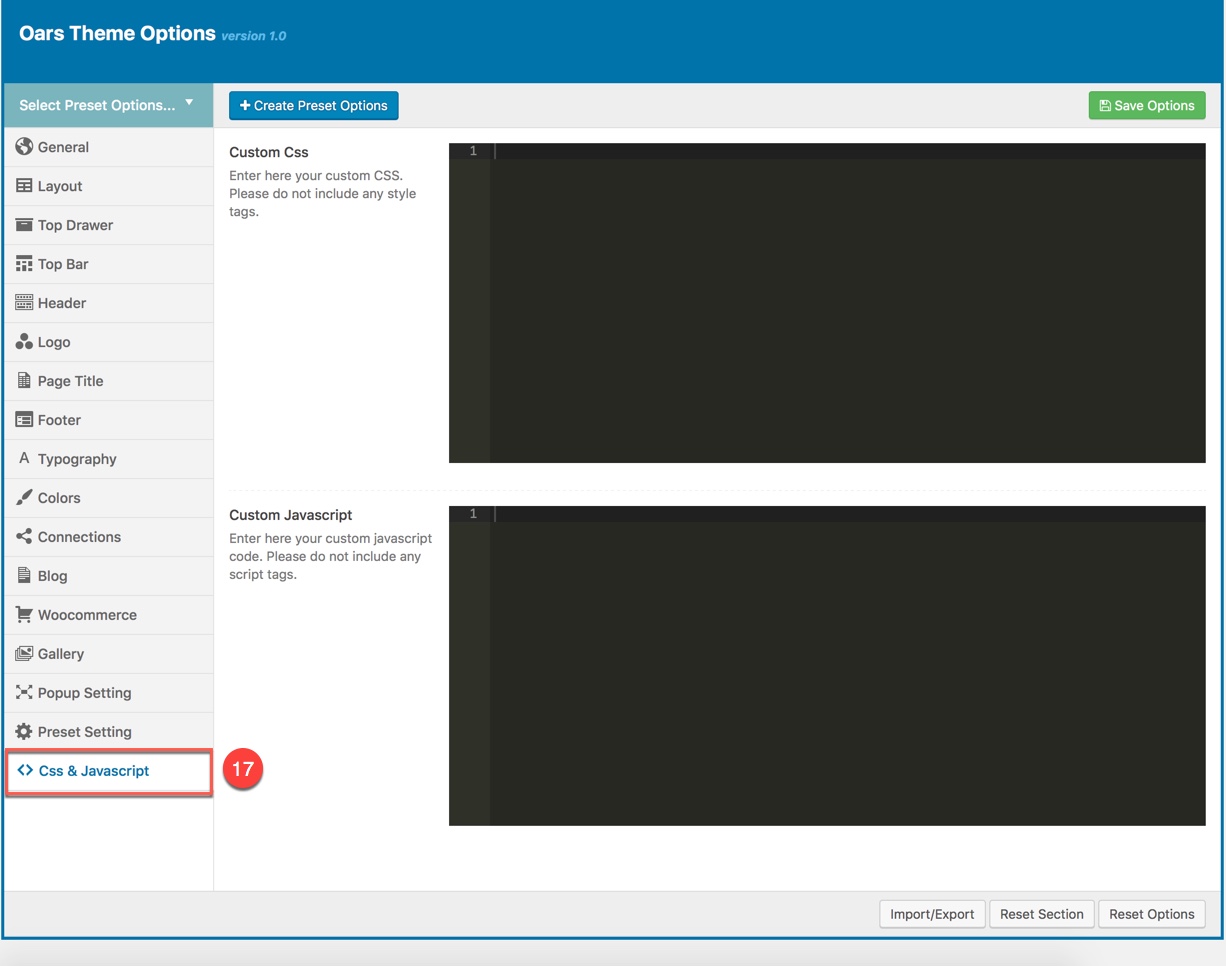
CSS & JavaScript contains text fields in case you want to add new CSS class or JS to your website. Save your new CSS & Script by Save Options button. This will add/overwrite the theme CSS,JS, so please be careful!
WOOCOMMERCE SETTINGS
OARS is fully compatible with Woocommerce so you can start your online shop with it in a matter of minutes. All you need to do is install Woocommerce plugin, setup your products and start selling!
The screenshot below will show you how to setup to have Woocommerce products that display like in OARS demo data.
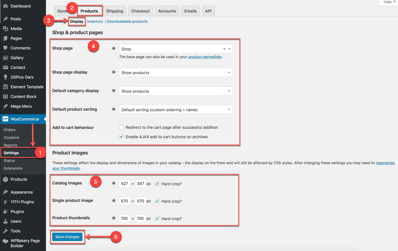
Go to Woocommerce → Settings
Click on Product → Display tab. Then setup Product Images options.
Please consult Woocommerce Documentation for further information in setting up products and Woocommerce shop by this plugin.