located in WP Dashboard → G5Plus Auteur → Theme Options includes all global options that affect your entire website. These options can be overwritten by setting options in Page Settings (or Preset) with any page custom Page Settings (or apply Preset).
By clicking on the Theme Options menu, you'll be able to change all settings that affect to entire your website.
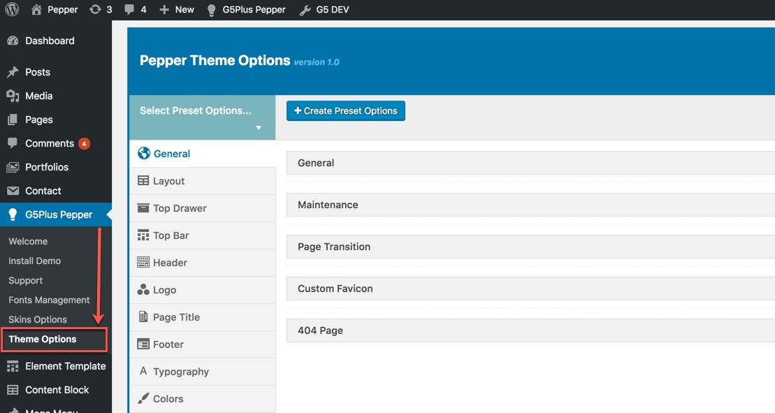
Goto Theme Options from WP dashboard
Theme Options are logically organnized into tabs, each tab contains all the options for that specific area within your site.
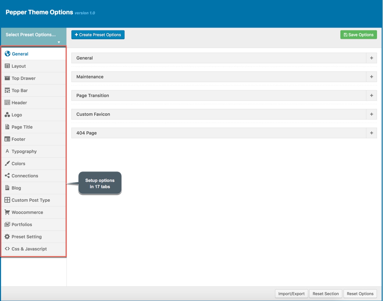
17 tabs to setup in Theme Options
In ‘Theme Options’, there are 4 buttons namely - 'Save Options', 'Import/Export', 'Reset Section' and 'Reset Options'. After making all the changes in Theme Options, you can save everything by clicking on 'Save Options' button. In theme options, all options are in the form of tabs, viz; 'General', 'Header' etc. You can click on 'General' (or any other tab) and make changes therein. Now, if want to get back all default data of specific section i.e: 'General' (or any other section), then you should click on 'Reset Section'. Now, if you want to get back to default data/setting for all the Theme Options, then you need to click on 'Reset Options'.
With auteur, we integrated Preset to Theme Options , so you can also goto WP Dashboard → G5Plus Auteur → Theme Options to manage all Preset by create new or edit/preview/delete any preset from list.
.jpg)
Navigate to Preset Options
We highly encourage you to explore the theme options and experimentwith what all the available options can do.
General
General tab is divided into a few sections. Asides from the Install demo Data section mentioned above, there are a few important sections for you to customize your layout.
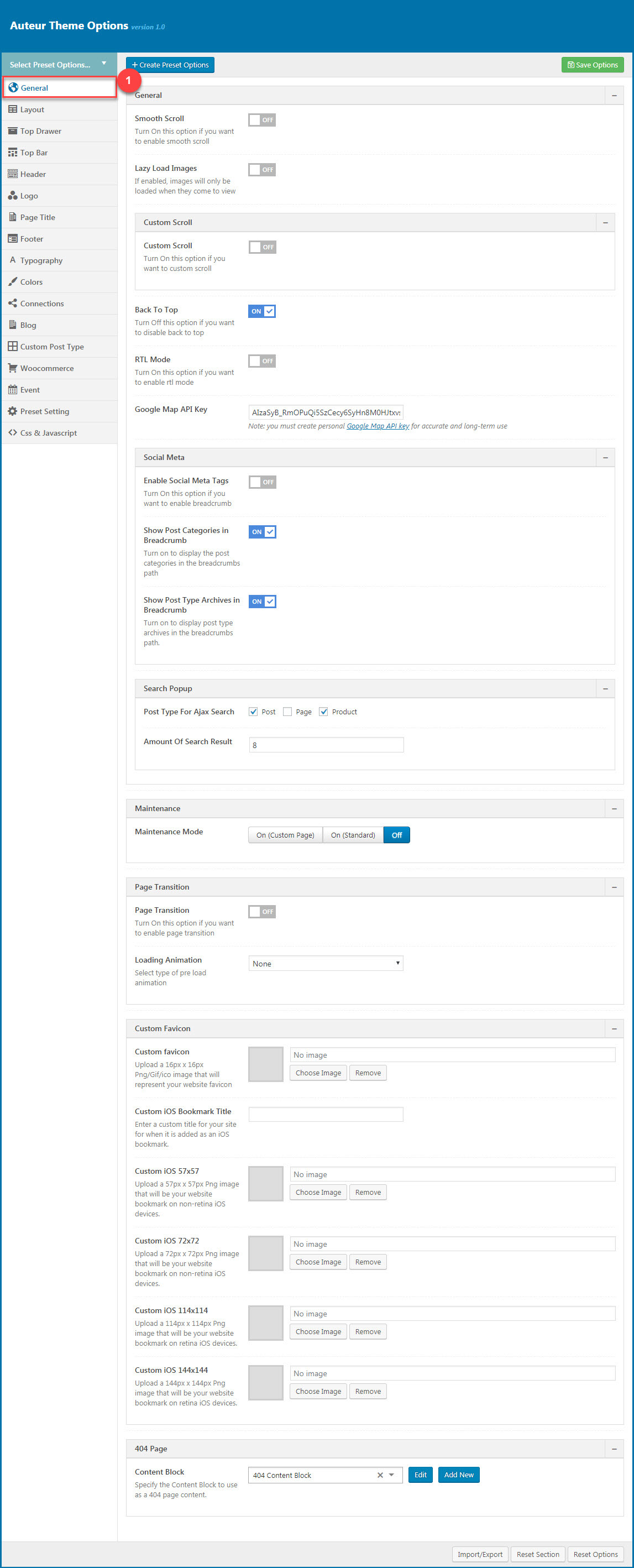
General Options:
| Attribute | Description |
|---|---|
| Smooth scroll | Set Smooth scroll status: on, off |
| Lazy Load Image | Set Lazy Loadd Image status: on, off. If enabled, images will only be loaded when they come to view |
| Custom Scroll | Set Custom Scroll status: on, off |
| Back to Top | Set Back to Top status: on, off |
| RTL Mode | Set RTL Mode status: on, off. For languages that read from right-to-left unlike English which is left-to-right, switch RTL smode, as long as you it's in your language and uses the correct locale. |
| Google Map API Key | Input the Google Map API Key to display the map |
| Menu Transition | Set status: Fade on, Fade off, Fade in Up, Fadein dowwn... |
| Social Meta | Set Social Meta Tags status: on, off |
| Show Breadcrumb | Set Show/Hide the Breadcrumb |
| Show Post Categories in Breadcrumb | Set Show/Hide Post Categories in the breadcrumbs path. |
| Show Post Type Archives in Breadcrumb | Set Show/Hide Post Type Archives in the breadcrumbs path. |
| Search Popup | Set the Post Type For Ajax Search (post/page/product/portfolio) and the amount of Search Result |
| Maintenance | Set Maintenance Mode: On(Custom Page), On(Status Page), Off |
| Page Transition | Set Page Transition status: on, off |
| Custom Favicon | Set Custom Favicon with each screen size |
| 404 Page | Set Content Block and content for 404 page |
You can view more details about General by clicking to view the video:
Video guide on How to config General in Theme option
Page layout
Layout Options has all options for setting site layout (pls read infomation below each option for more details)
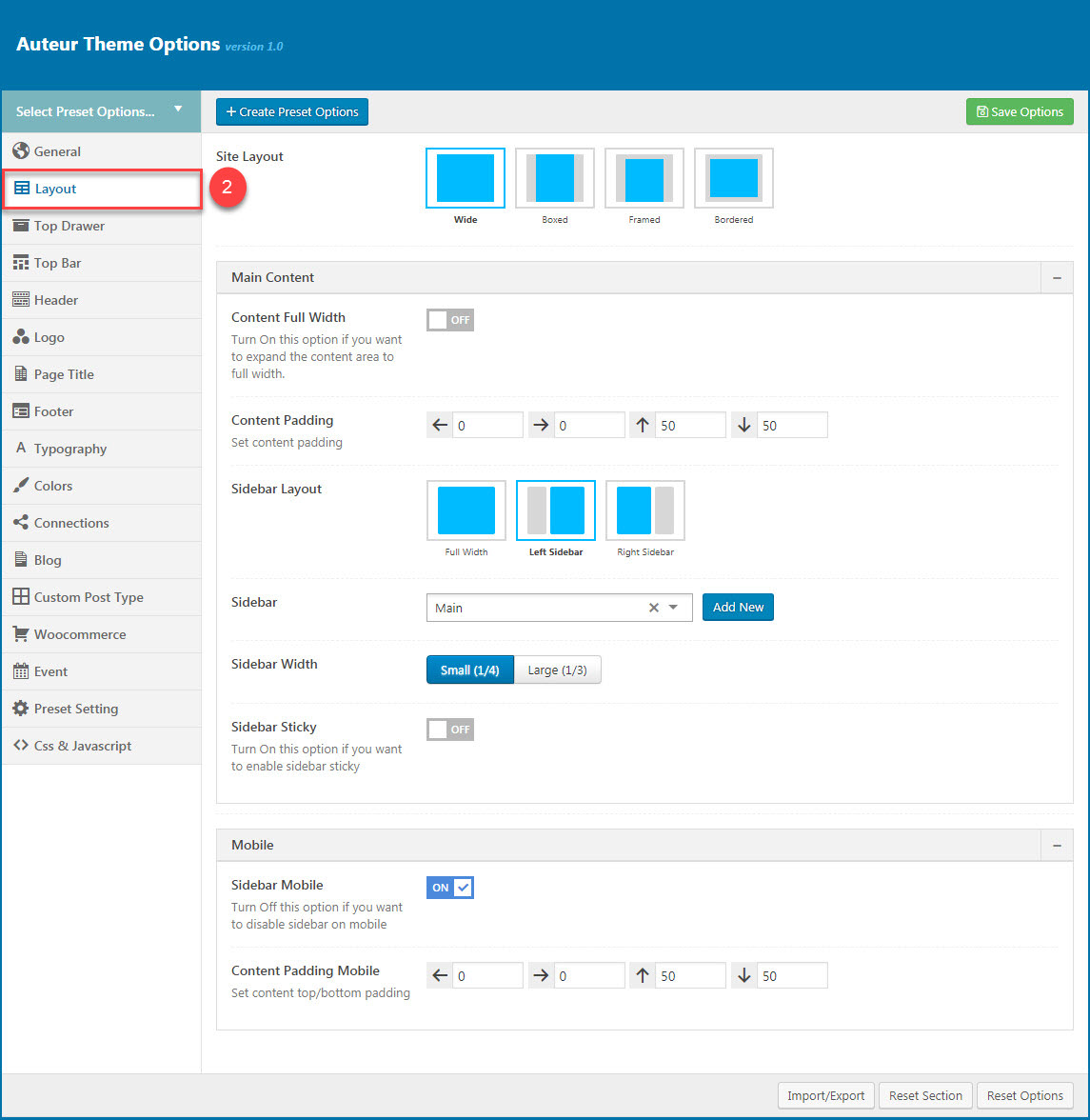
You can set the following Page Layout Options for the Preset you are currently editing:
| Attribute | Description |
|---|---|
| Site Layout | You can select one of 4 layouts: Wide, boxed, framed, bordered |
| Main Content | |
| Content Full width | Enable/Disable option that expand the content area to full width |
| Sidebar layout | Select widget area to display as sidebar |
| Sidebar | Select sidebar to display or add new a sidebar |
| Sidebar width | Set width for the page sidebar: small (1/4) or large (1/3) |
| Sidebar Sticky | Set enable sidebar sticky for the page sidebar |
| Mobile | |
| Sidebar Mobile | Set enable sidebar on the mobile |
| Content Padding Mobile | Set content top/bottom padding mobile. Do not include units (empty to set default) |
You can view more details about Page Layout by clicking to view the video:
Video guide on How to config Page Layout in Theme option
Top Drawer
Top Drawer contains all options for setting Top Drawer area. In auteur demo Data, Top Drawer has been hiden by default and Top Drawer area have had any widget yet. So if you want to enable Top Drawer please read carefully infomation below each option for more details.
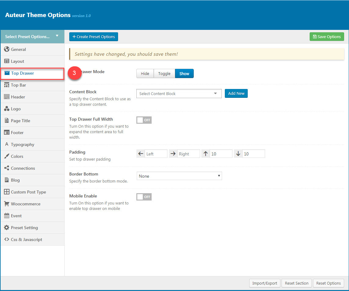
Description of Top Drawer Options
| Attribute | Description |
|---|---|
| Top Drawer Mode | Set type of top drawer: 'Disable', 'Always Show', 'Toggle'. If selected default will take value in Theme Options |
| Content Block | Set type to use as a top drawer content. |
| Top Drawer Full width | Set Page Transition status: on, off |
| Padding | Set Padding space for website include: padding-left, paaging-right... |
| Border bottom | Set the border bottom mode: none, full, container |
| Mobile enable | Set mobile enable:on, off |
You can view more details about Top Drawer by clicking to view the video:
Video guide on How to config Top Drawer in Theme option
Top Bar
Top Bar contains all options for setting Top Bar area. You can use Content Block to display as Top Bar
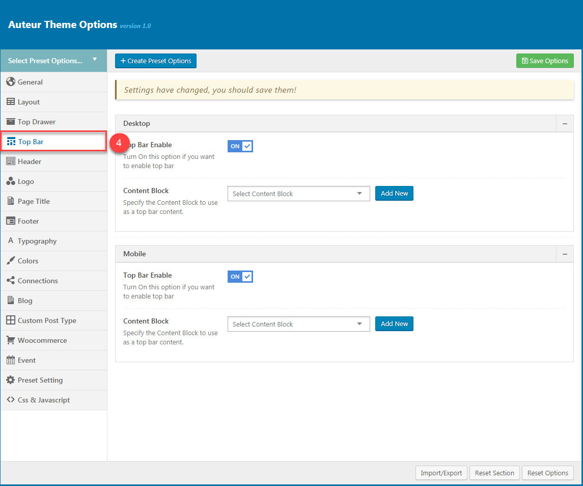
Descriptions of Top Bar Options:
| Desktop | |
| Top Bar Enable | Enable/Disable Top Bar |
| Content Block | Specify the content block to use as a top bar content on Desktop. |
| Mobile | |
| Mobile enable | Set mobile enable:on, off |
| Content Block | Specify the content block to use as a top bar content on Mobile. |
You can view more details about Top Bar by clicking to view the video:
Video guide on How to config Top Bar in Theme option
Header
Header contains all options for setting Header Area such as Layout, Header Top/Bottom Padding.. and customize Header Area (pls read carefully infomation below each option for more details).
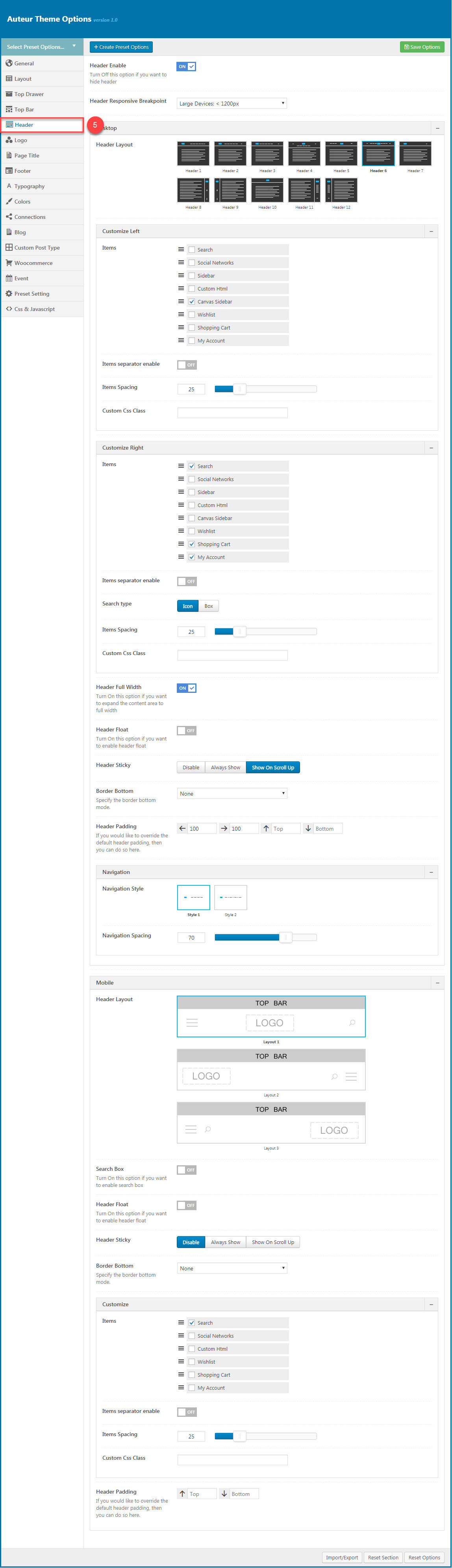
Description of Header Options
| Attribute | Description |
|---|---|
| Header Enable | Set enable of header |
| Header Responsive Breakpoint | You can response with 3 screens of devide |
| Desktop | |
| Header Layout | Set layout of header in Desktop |
| Customize Navigation | Set navigation, space between them and you can add CSS if you want |
| Header Full Width | Set enable of full width header |
| Header Float | Set enable float for header |
| Header Sticky | Set sticky mode for header:on, off |
| Border bottom | Select Header border bottom, include: None, Full Border, Container Border |
| Header Above Border Bottom | Select Header Above Border Bottom , include: None, Full Border, Container Border |
| Header padding | Set Padding top/bottom for Header area. If selected default will take value in Theme Options |
| Navigation Style | Set Navigation style by selecting between 2 styles. |
| Navigation Spacing | Set Navigation Spacing(px) by draging scroll bar . |
| Page Header Mobile | |
| Header Mobile Layout | Set layout fot header mobile. |
| Mobile Header Search Box | Set visible for search box. |
| Header mobile float | Turn On this option if you want to enable header float |
| Header mobile sticky | Set sticky mode for mobile header. |
| Customize | Add items, search type, space between them and custom CSS (if you want) |
| Border bottom | Set the border bottom mode: Full, container, none. |
| Header padding | Set header padding space |
You can view more details about Header by clicking to view the video:
Video guide on How to config Header in Theme option
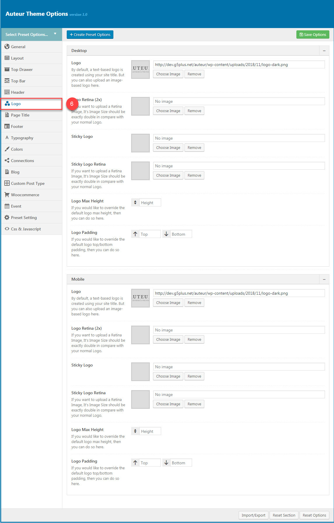
Logo
Logo contains all options for setting how logo display on page (pls read carefully infomation below each option for more details).
Description of Logo Options
| Attribute | Description |
|---|---|
| Logo Desktop | |
| Logo | Upload header logo if you want custom header logo for page used this preset. |
| Logo Retina | Upload Header Logo Retina for retina if you want custom Header Logo Retina for page used this preset |
| Sticky Logo | Upload logo sticky if you want custom logo for page used preset. |
| Sticky Logo Retina | Upload logo sticky for retina if you want custom logo retina for page used this preset |
| Logo max height | Set max height for logo, if leave empty will take value in Theme Options |
| Logo padding | Set padding for logo, if leave empty will take value in Theme Options |
| Logo Mobile | |
| Logo | Upload logo if you want custom logo mobile for page used this preset. |
| Logo Retina | Upload logo mobile for retina if you want custom logo retina for page used this preset |
| Mobile Logo Max Height | Set max height for logo mobile, if leave empty will take value in Theme Options |
| Mobile Logo Padding | Set padding top/bottom for logo, if leave empty will take value in Theme Options |
You can view more details about Logo by clicking to view the video:
Video guide on How to config Logo in Theme option
Page Title
Page Title has options for setting Page Title. You can select the Content Block to displays as a page title content.
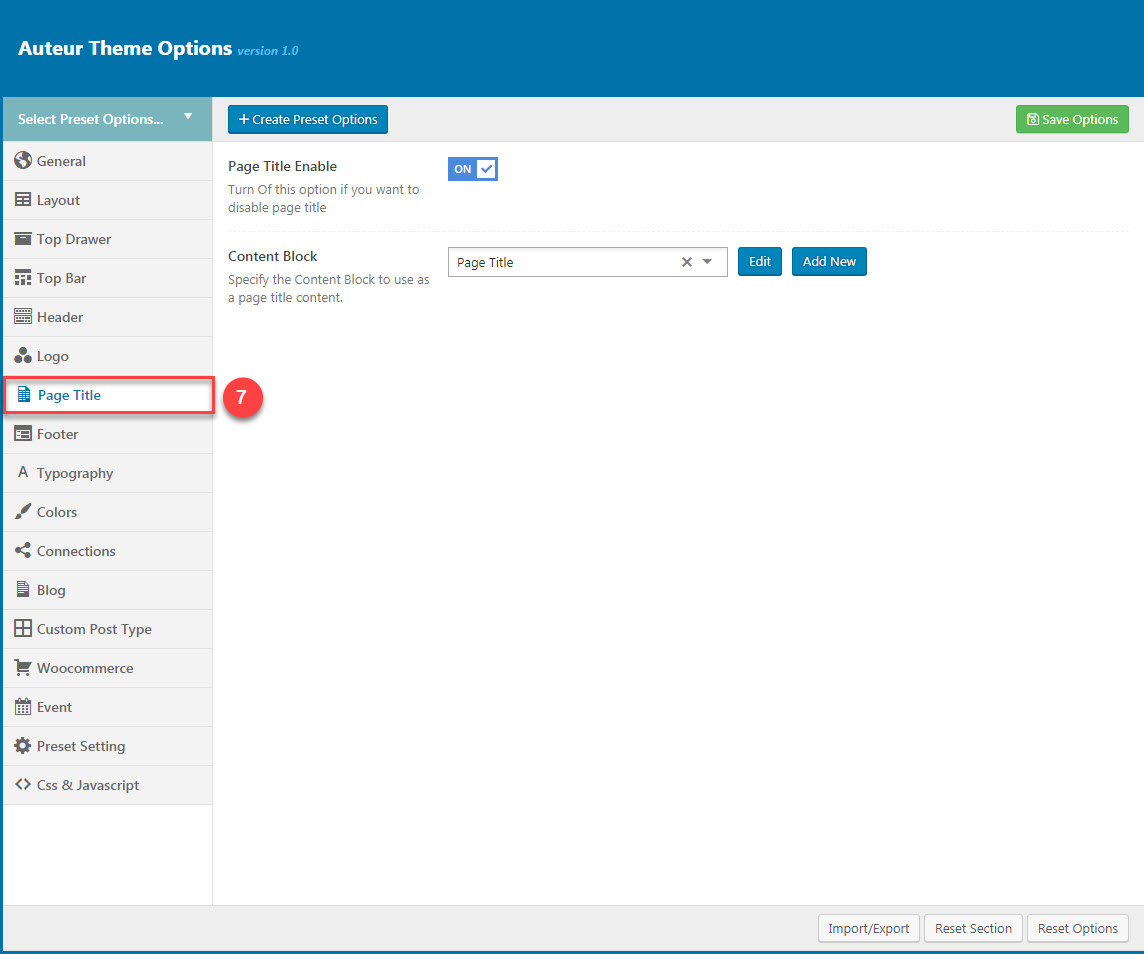
You can set the following Page Title Options for the Preset you are currently editing:
| Attribute | Description |
|---|---|
| Show/Hide Page Title? | Set visible of Page Title, if selected default will take value in Theme Options |
| Content Block | Set Content Block have been built for Page Title from list |
You can view more details about Page Title by clicking to view the video:
Video guide on How to config Page Title in Theme option
Footer
Footer panel contains all options for setting Footer Area (pls read infomation below each option for more details).
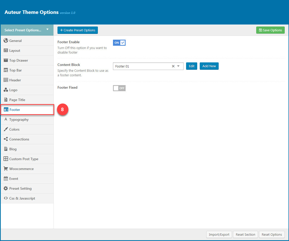
| Attribute | Description |
|---|---|
| Footer Enable | Set visible of footer, if selected default will take value in Theme Options |
| Footer Fixed | Set Footer Fixed: On or Off |
| Content Block | Select content block for footer |
You can view more details about Footer by clicking to view the video:
Video guide on How to config Footer in Theme option
Typography
typography allows users to specify font properties to display as body font, primary font, menu font... All fonts are managed in Fonts Management custom/upload fonts on website.
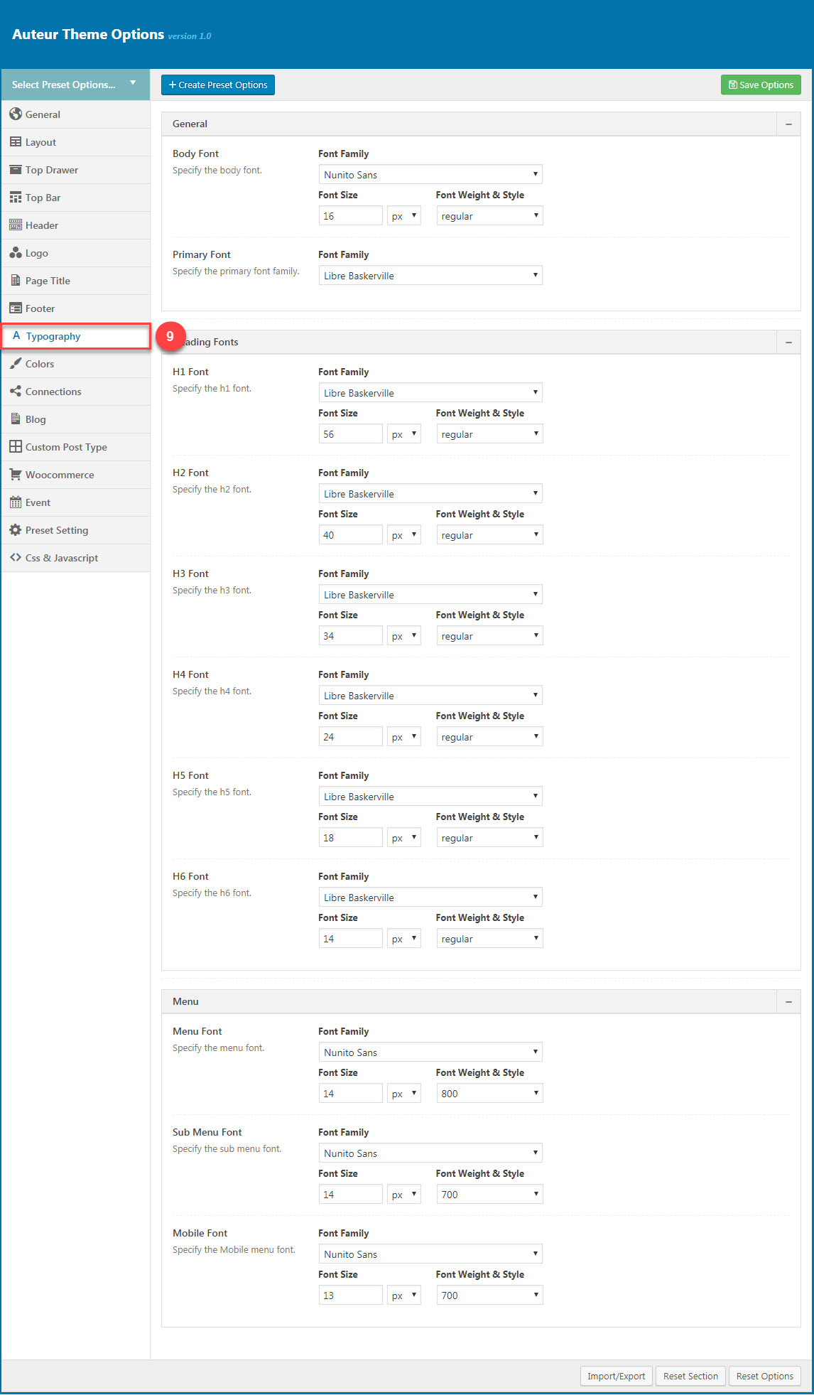
| Attribute | Description |
|---|---|
| General | |
| Body font | Included: Font Family(name of font), Font Size, Font Weight. |
| Primary font | Included: Font Family(name of font) |
| Heading Font | |
| H1 Font | Specify the H1 font (Font family, Font size, Font Weight & Style) |
| H2 Font | Specify the H2 font (Font family, Font size, Font Weight & Style) |
| H3 Font | Specify the H3 font (Font family, Font size, Font Weight & Style) |
| Menu | |
| Menu Font | Specify Font Family(name of font), Font Size, Font Weight for the menu |
| Sub Menu Font | Specify Font Family(name of font), Font Size, Font Weight for the sub menu |
| Mobile Font | Specify the Font Family(name of font), Font Size, Font Weight for the menu on mobile |
You can view more details about Typography by clicking to view the video:
Video guide on How to config Typography in Theme option
Color
Color panel allows users to custom and change color options for each area on page. You can custom and choose custom color skin to display here. Please consult Skin Options section for more details.
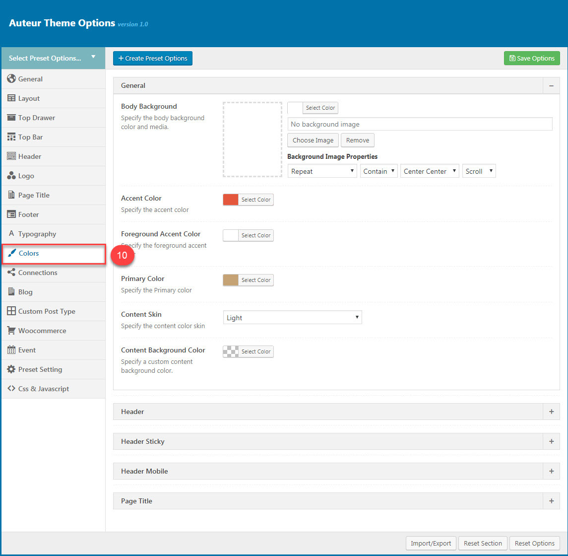
You can set color for each area on page :
| Attribute | Description |
|---|---|
| General | |
| Body Background | Customize the body background color and media |
| Accent Color | Customize color for Accent Area |
| Foreground Accent color | Customize Foreground Accent color |
| Primary Color | Specify the Primary Color |
| Content Skin | Select the content color skin |
| Content Background color | Select Background color |
| Header | |
| Preset Skin | Specify the header color between Light or Dark |
| Header Background Color | Specify a custom header background color |
| Border Color | Select the border color |
| Text Color | Select the color for text in the header |
| Text Hover Color | Specify the header text hover color |
| Sub Menu | |
| Preset Skin | Specify the header color between Light or Dark |
| Background Color | Specify a custom background color for submenu |
| Text Color | Select the color for text in the submenu |
| Text Hover Color | Specify the header text hover color for submenu |
| Heading Color | Specify the color for submenu heading color |
| Border Color | Select the border color |
| Header Sticky | |
| Preset Skin | Specify the sticky header color between Light or Dark |
| Header Sticky Background Color | Specify a custom background color for submenu |
| Text Color | Select the color for text in the Header Sticky |
| Text Hover Color | Specify the sticky header text hover color |
| Menu Customize | Specify the color for text in menu customize of Header mobile |
| Header Mobile | |
| Preset Skin | Specify the mobile header color between Light or Dark |
| Header Mobile Background Color | Specify a custom background color for submenu |
| Border Color | Select the border color |
| Menu | Specify color for the menu in Header mobile |
| Menu Customize | Specify the color for text in menu customize of Header mobile |
| Page Title | |
| Page Title Skin | Select the Page Title color skin from skins list |
| Page Title Background Color | Specify a custom Page Title background color |
You can view more details about Colors by clicking to view the video:
Video guide on How to config Colors in Theme option
Connection
Connection contains all options that allows user to share on various social networks which automatically shows up under the content post, an important function that helps promoting your site. You can check the options to decide which network are allowed to share the content of your website on. You can also turn off all options if you don't want your content to be shared at all.
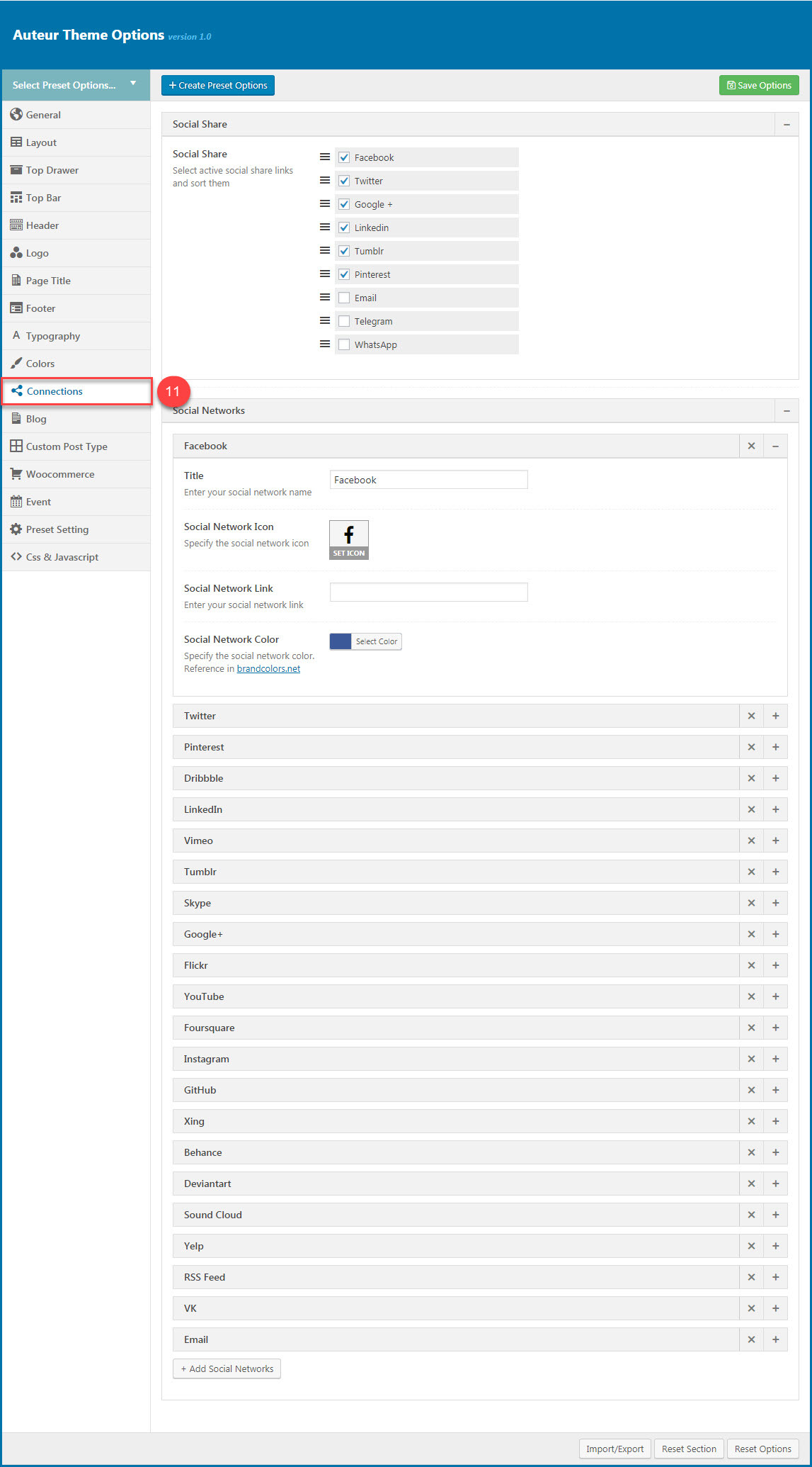
You can set connection for each area on page :
| Attribute | Description |
|---|---|
| Social Share | |
| Social Share | You can select active social share links and sort them |
| Social Network | |
| You can add title, icon, link ad color for icon | |
| You can add title, icon, link ad color for icon | |
| And other similar social networks | |
You can view more details about Connection by clicking to view the video:
Video guide on How to config Connection in Theme option
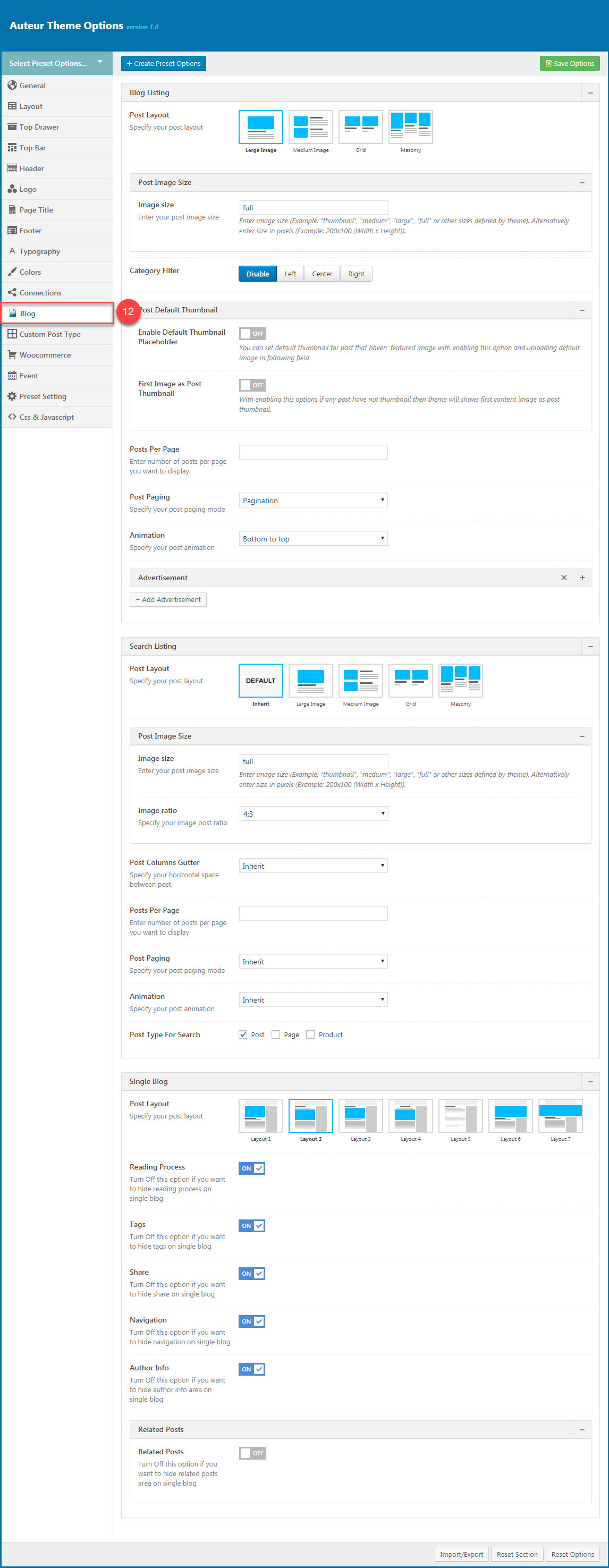
Blog
Blog panel has all options to customize post layout, animation, advertisement... in Blog Listing, Search Listing, Single Blog.
| Attribute | Description |
|---|---|
| Blog Listing | |
| Post Layout | You can select post layout from 5 styles. |
| Post Image Size | You can enter the image size of the posts that you want to display. Enter image size (Example: "thumbnail", "medium", "large", "full" or other sizes defined by theme). Alternatively enter size in pixels (Example: 200x100 (Width x Height)). |
| Category Filter | Select how the Category Filter show (disable/left/center/right) |
| Enable Default Thumbnail Placeholder | Enable/Disable the default thumbnail image. You can set default thumbnail for post that do not have featured image. Uploading the image to display as Default Thumbnail Image. |
| First Image as Post Thumbnail | Turn On or Off the option to set the First Image as Post Thumbnail. Turn Off this options if any post have not thumbnail then theme will shows first content image as post thumbnail. |
| Post Per Page | You can enter number of posts per page you want to display. It's 10 by default. |
| Post Paging | You can select post paging mode here |
| Animation | You can select post animation |
| Advertisement | Manage advertisement in Blog listing |
| Search Listing | |
| Post Layout | You can select select post layout for Search Listing page |
| Post Image Size | You can enter number of post image size. Enter image size (Example: "thumbnail", "medium", "large", "full" or other sizes defined by theme). Alternatively enter size in pixels (Example: 200x100 (Width x Height)). |
| Post Columns Gutter | Specify your horizontal space between post as None/10px/20px/30px/50px/75px |
| Post Per Page | You can enter number of posts per page you want to display. It's 10 by default. |
| Post Paging | You can select post paging mode here |
| Animation | You can select post animation for Search Listing |
| Post type for search | Select Post Type for search is "Post" or "Page" |
| Single Blog | |
| Post Layout | You can select your post layout |
| Reading Process | if you want to hide reading process on single blog, you can click "off" |
| Tags | if you want to hide tags on single blog, you can click "Off" |
| Share | if you want to hide share on single blog, you can click "Off" |
| Navigation | If you want to hide share on single blog, you can click "Off" |
| Author Info | if you want to hide Author info area on single blog, you can click "Off" |
| Related Post | |
| Related Post | If you want to hide share on single blog, you can click "off" |
| Related Post Algorithm | You can select algorithm by different ways |
| Carousel Mode | If you want to hide share on single blog, you can click "off" |
| Post per page | You can select posts per page by entering th number of posts per page you want to display |
| Post Columns Gutter | You can specify the horizontal space between post |
| Post Columns | You can select Large Devices, Medium Devices, Small Devices, Extra Small Devices |
| Post Paging | you can select your post paging mode |
| Amination | you can select your post amination |
You can view more details about Blog by clicking to view the video:
Video guide on How to config Blog in Theme option
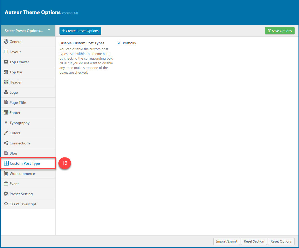
Custom post type
This options section allows you to disable /enable the custom post type (Portfolio) used within the theme. If you’re hoping to use your WordPress.com site to show off your portfolio separate from your blog posts and pages, the Portfolio content type will let you manage all your portfolio projects in one place. It also gives you a number of different ways to display them on your site.
| Attribute | Description |
|---|---|
| Disable Custom Post Types | You can disable the custom post type (Portfolio) used within the theme by checking the corresponding box. |
When you do not check the box, it means that the custom post type named Portfolio is enable then you can see the Portfolio tab appears in the left menu of Theme Options. From here, you will be able to style appearance of the Portfolios (please read carefully infomation below each option for more details).
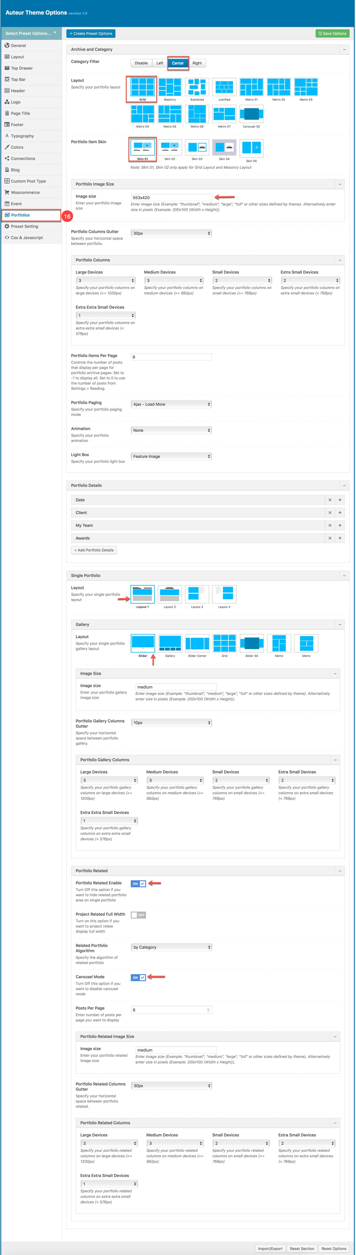
Portfolio tab in the Theme Options
Portfolio is built-in Auteur theme allows you to show off your portfolio separate from your blog posts and pages. The Portfolio post type will let you manage all your portfolio projects in one place. Portfoilo shortcode also gives you a number of different ways to display them on your site.
Add a new Portfolio
We can add a new Portfolio and setup how it displays on the front-end (this settings will override Portfolio settings in Theme Options). Similar to the way you add new blog posts, you can add a new project under Portfolio → Add New .
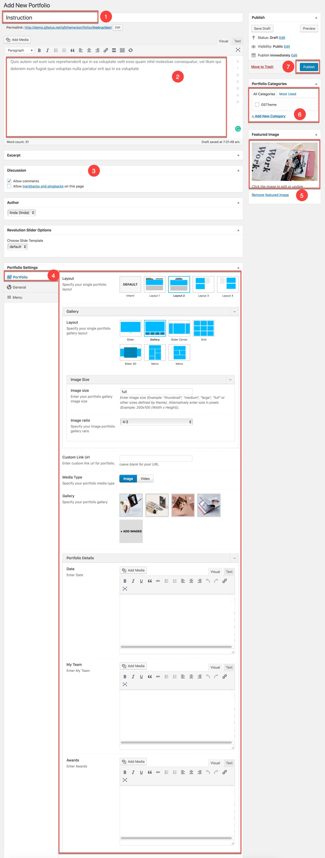
Add new Portfolio
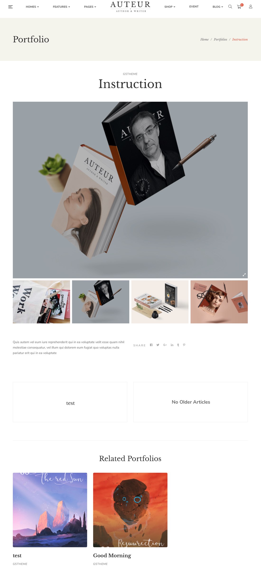
The new Portfolio on the front-end
Manage all Portfolios
The screenshot below is all demo Portfolios in auteur demo data. Portfolio projects are ordered by the date they’re created, with the most recent project displayed first.You can manage all portfolios here by edit/delete or add a new galery.
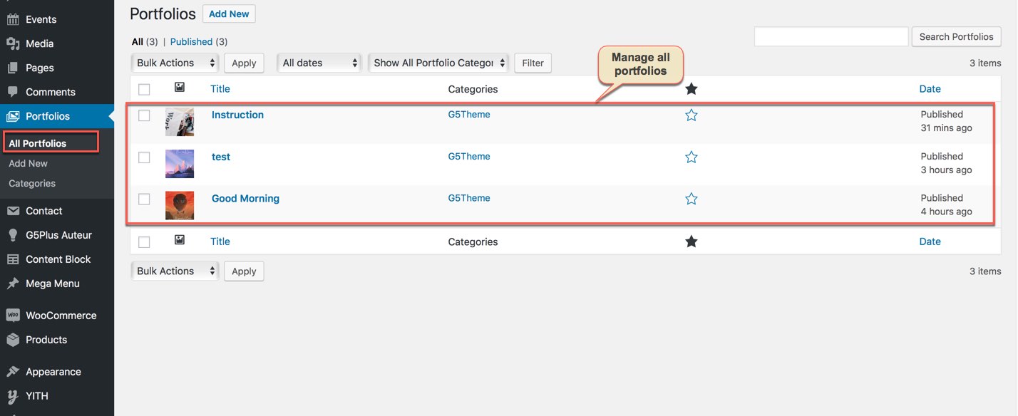
Manage all portfolios
Portfolio shortcode
Portfolio shortcode is built-in Auteur theme that help you add any Portfolio to your page/post. Understanding how to create a portfolio is the first step — now, you have to figure out what to include and how to organize and describe your work for maximum impact.
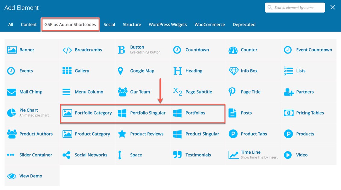
Portfolio shorcode in WPBakery Page Builder
Woocommerce options
This options section allows you to style the general appearance of the WooCommerce elements on the site (please read carefully infomation below each option for more details). The Woocommerce plugin is required to be installed and activated in order to be able to customize Woocommerce elements.
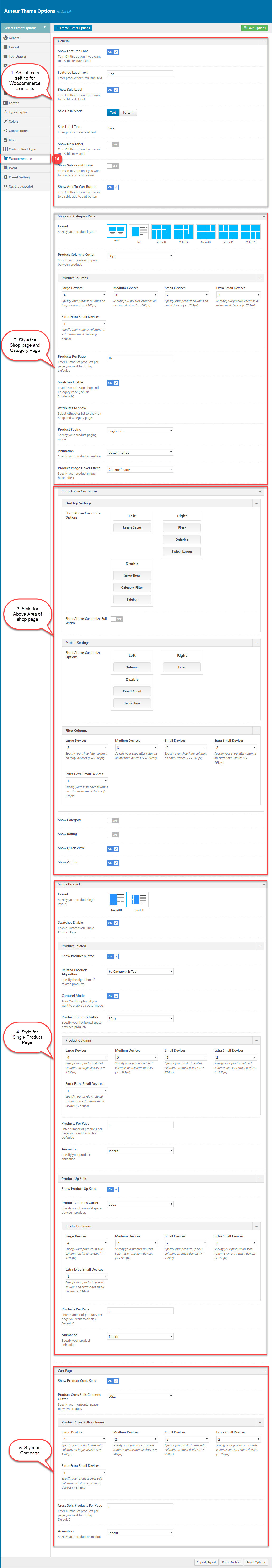
Woocommerce section in Theme Options
| Attribute | Description |
|---|---|
| General | |
| Show Featured Label | Show/Hide the Featured Label |
| Featured Label Text | Enter the text to display in the product featured label |
| Show Sale Label | Show/Hide the Sale Label |
| Sale Flash Mode | Set the Sale Flash mode as 'text' or 'percent'. If you setup the Sale Fash mode as 'text', insert the text in the below field. |
| Show Sale Count Down | Show/Hide the Sale Count Down |
| Show Add To Cart Button | Show/Hide the 'Add To Cart' Button |
| Shop and Category Page | |
| Layout | Specify your product layout on the Shop and Category page by seclecting between 7 layout styles. |
| Product Columns Gutter | Specify your horizontal space between product as 'None' '10px' '20px' or '30px' |
| Product Columns | Specify your product columns on each device (>= 1200px/992px/768px and < 768px/576px) |
| Products Per Page | Specify the products per page by entering the number of products per page you want to display. |
| Swatches Enable | Enable Swatches on Shop and Category Page (include Shodecode) |
| Attributes to show | Select Attributes list to show on Shop and Category page (Color or Size) |
| Product Paging | Specify your product paging mode as 'Pagination', 'Ajax Pagination', 'Ajax - Next Prev', 'Ajax - Load More' or'Ajax - Infinite Scroll' |
| Animation | Specify your product animation |
| Product Image Hover Effect | Specify your product image hover effect as 'None' or 'Change Image' or 'Flip Back' |
| Shop Above Customize | Customize the "Shop Above" area on the Desktop and mobile. Specify your shop filter columns on each device |
| Show Category | Show/Hide the Category on the Shop page and Category page |
| Show Rating | Show/Hide the Rating on the Shop page and Category page |
| Show Quick View | Show/Hide the Quick View on the Shop page and Category page |
| Single Product | |
| Layout | Specify your product single layout by seclecting between 2 layout styles. |
| Swatches Enable | Enable Swatches on Single Product Page |
| Product Related | |
| Show Product related | Show/Hide Product related |
| Related Products Algorithm | Specify the algorithm of related products |
| Carousel Mode | Turn On this option if you want to enable carousel mode |
| Product Columns Gutter | Specify your horizontal space between product. |
| Product Columns | Specify your related product columns on each device (>= 1200px/992px/768px and < 768px/576px) |
| Products Per Page | Enter number of products per page you want to display on the Related Product area. |
| Animation | Specify your product animation you want to display on the Related Product area in the single product page |
| Product Up Sells | |
| Show Product Up Sells | Show/Hide Product Up Sells |
| Product Columns Gutter | Specify your horizontal space between product. |
| Product Columns | Specify your product up sell columns on each device (>= 1200px/992px/768px and < 768px/576px) |
| Products Per Page | Enter number of products up sell you want to display. |
| Animation | Specify your product animation you want to display on the Product Up Sell area in the single product page |
| Cart Page | |
| Show Product Cross Sells | Show/Hide Product Cross Sells |
| Product Cross Sells Columns Gutter | Specify your horizontal space between product on the Cart page |
| Product Cross Sells Columns | Specify your product cross sells columns on each device (>= 1200px/992px/768px and < 768px/576px) |
| Cross Sells Products Per Page | Enter number of products cross sells you per page want to display on the Cart page. |
| Animation | Specify your product animation you want to display on the cart page |
Shop page on the frontend
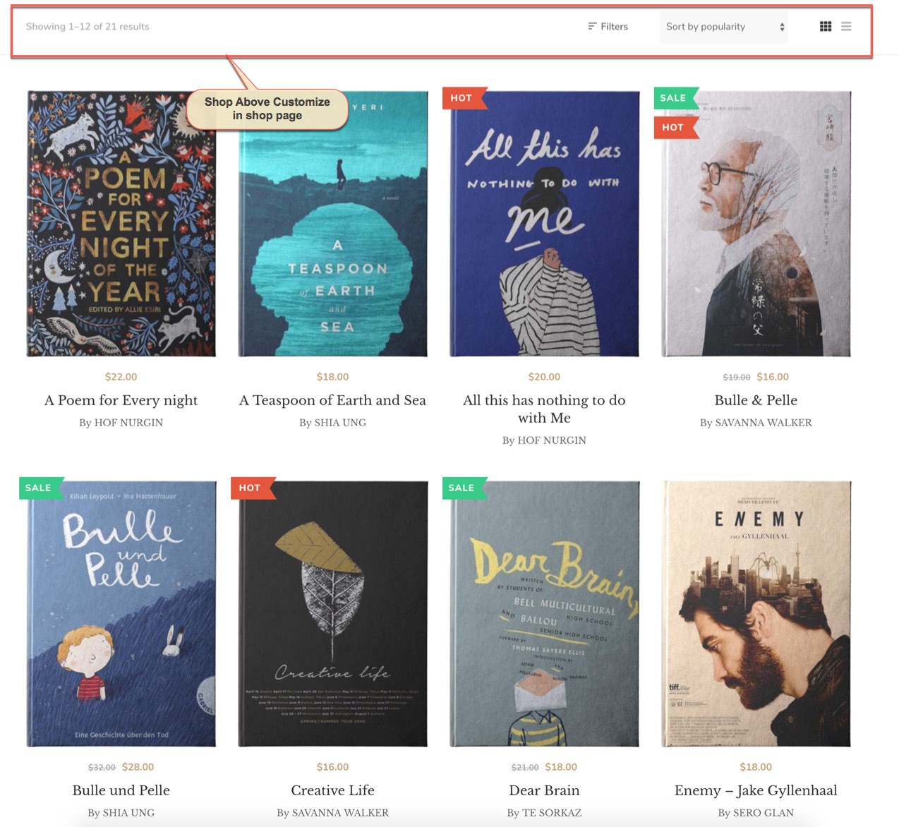
The Woocommerce Shop page on the frontend
Single Product page on the frontend
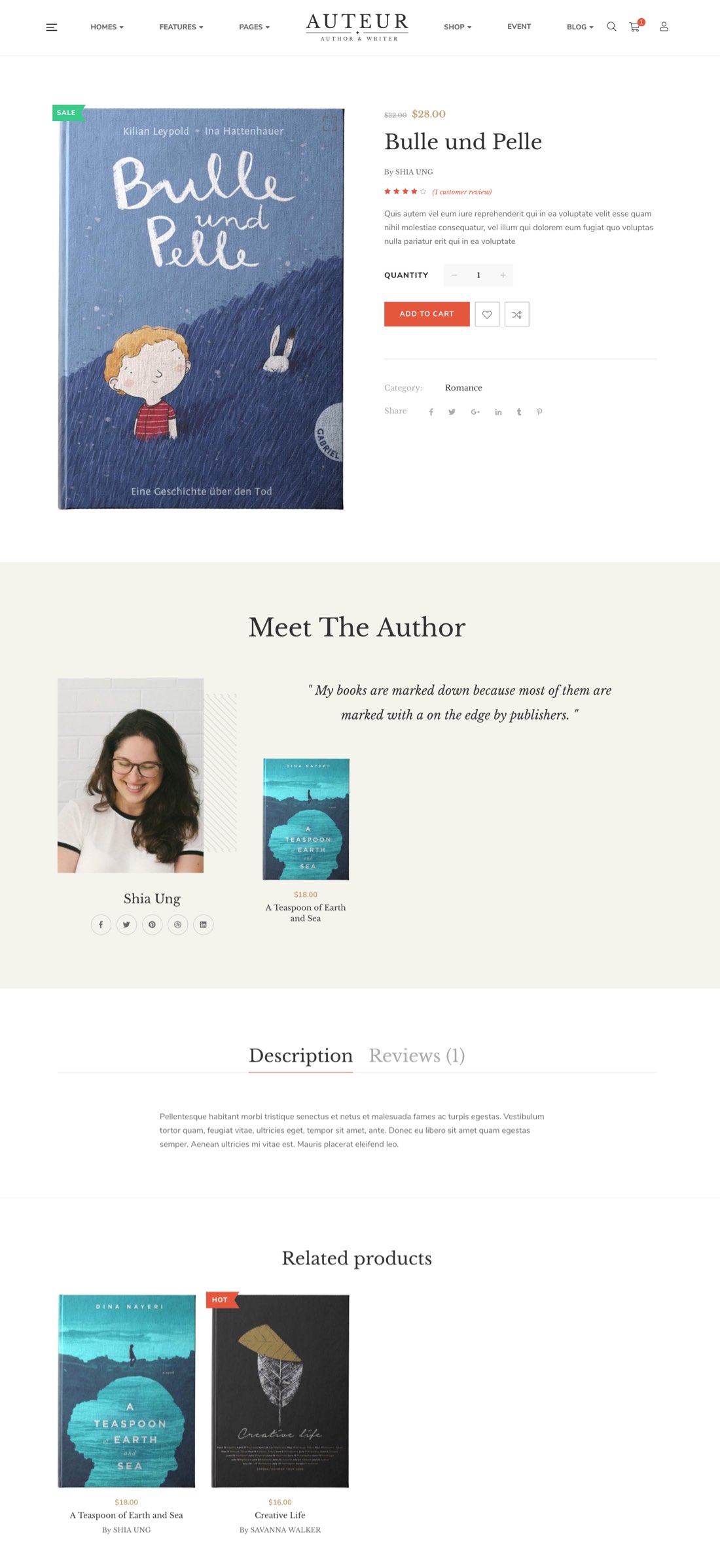
The Woocommerce Single Product page on the frontend
Woocommerce Cart Page on the frontend
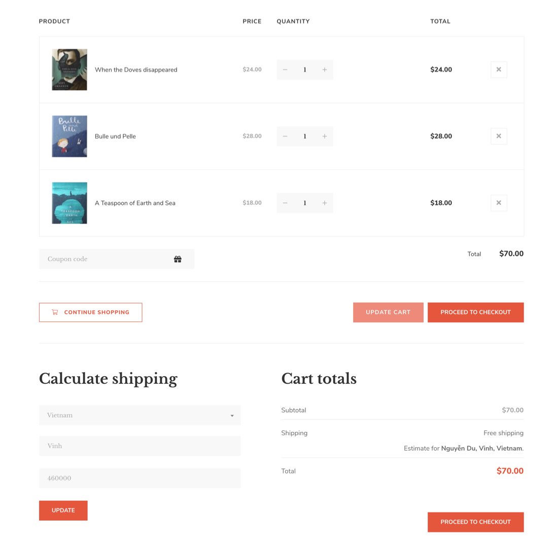
The Woocommerce Cart Page on the frontend
You can view more details about Woocommerce by clicking to view the video:
Event Options
If you’re hoping to use your WordPress.com site to show off your portfolio separate from your blog posts and pages, the Portfolio content type will let you manage all your portfolio projects in one place. It also gives you a number of different ways to display them on your site. Portfolios section in the Theme Options allows you to style the general appearance of the Porfolio (please read carefully infomation below each option). You can consult Event for more details.
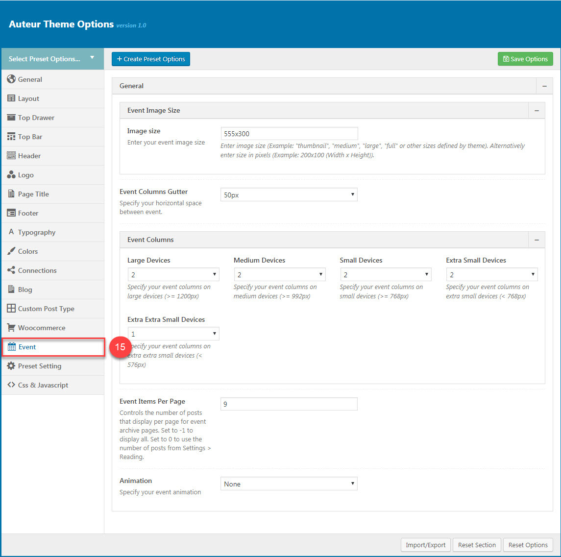
Portfolios section in Theme Options
Portfolio on the frontend
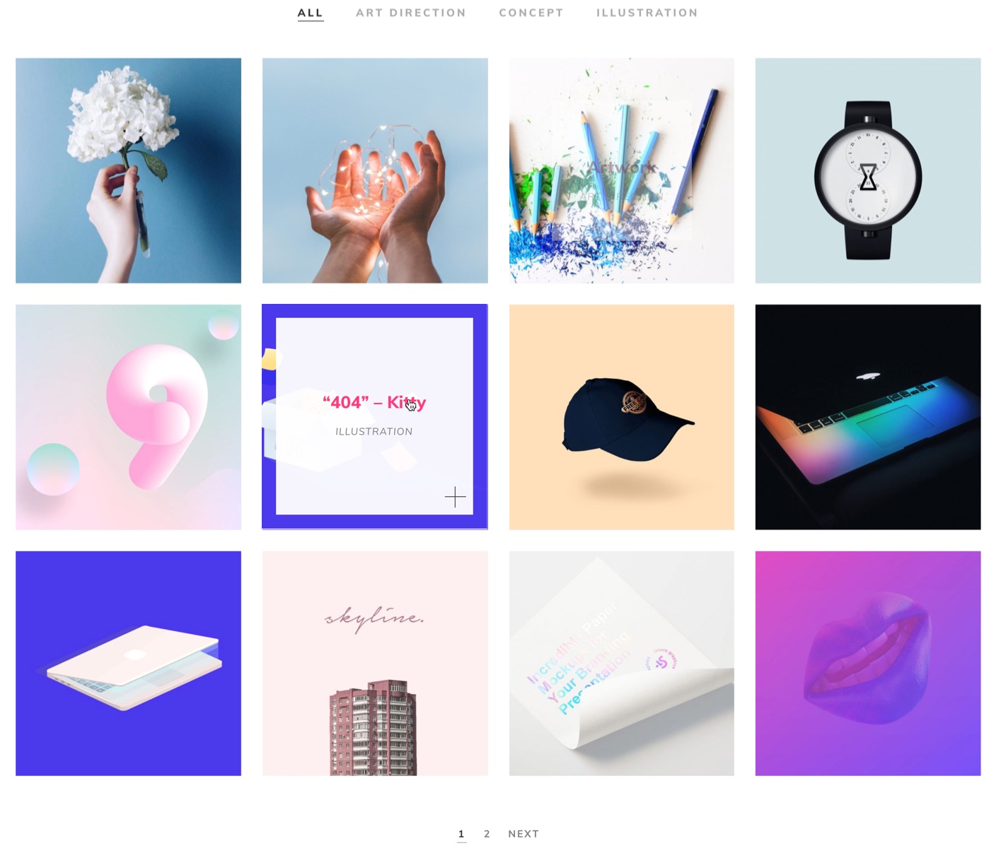
The Portfolio on the frontend
You can view more details about Event by clicking to view the video:
Video guide on How to config Event in Theme option
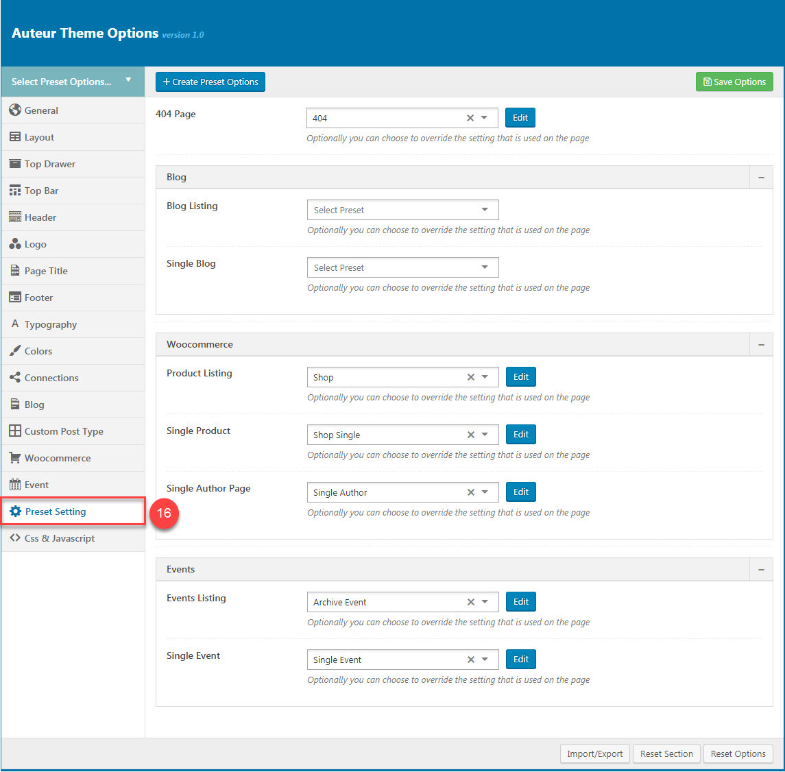
Preset Settings
Preset Settings allows users to choose preset setting apply for each page type
You can view more details about Preset by clicking to view the video:
Video guide on How to config Preset in Theme option
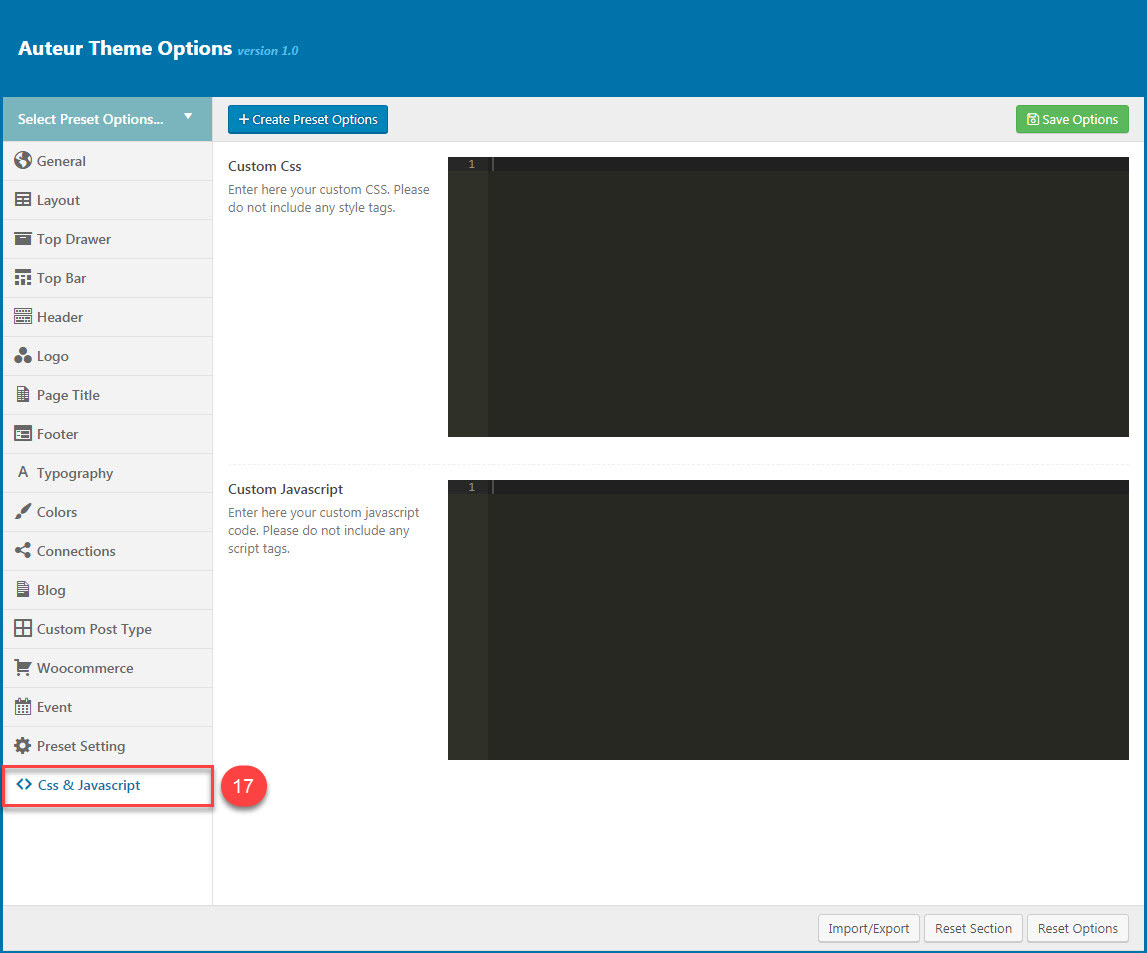
CSS & JavaScript
CSS & JavaScript contains text fields in case you want to add new CSS class or JS to your website. Save your new CSS & Script by Save Options button. This will add/overwrite the theme CSS,JS, so please be careful!
You can view more details about Page Title by clicking to view the video:
Video guide on How to config Page Title in Theme option