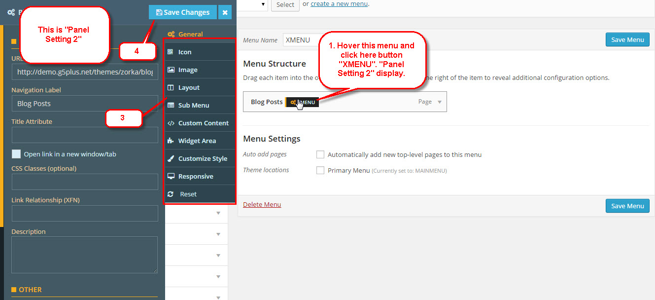
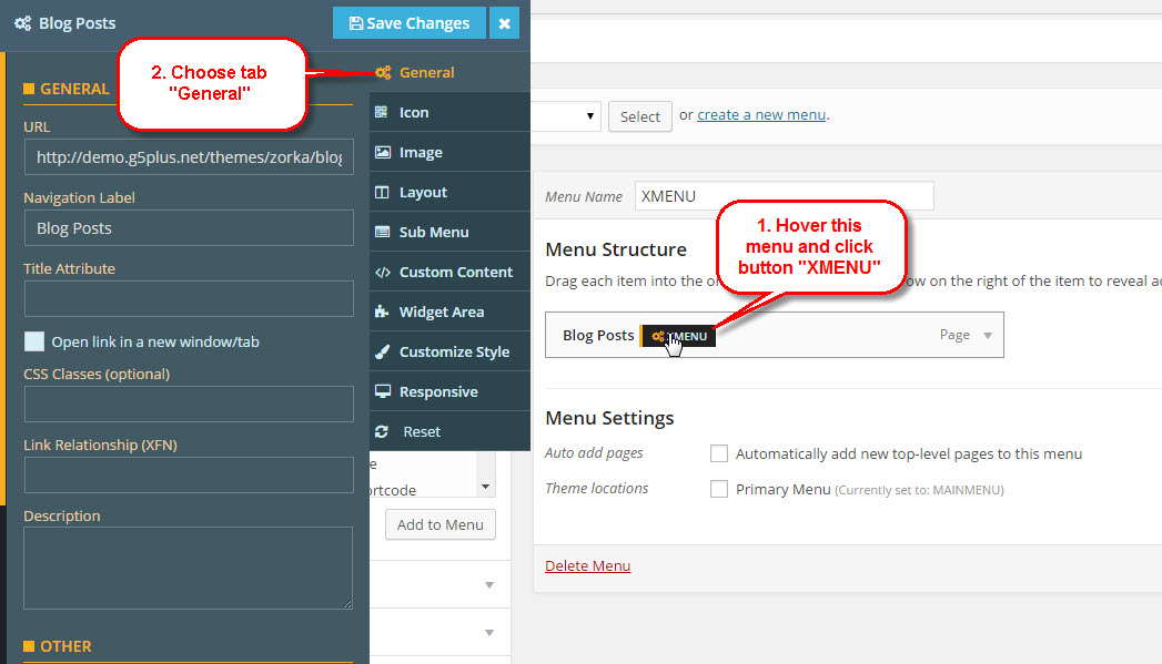
To configure settings for individual menu items or submenus, visit Appearance > Menus, hover over the menu item you want to configure, and click the XMENU button that appears. The Menu Item Settings Panel will display from left.
These settings control a specific menu item, with options including:
- General link settings
- Icon & position
- Image (source, size, etc)
- Item layout(width, content alignment, padding, etc)
- Submenu (type, width, custom width, position, child item default width, sub menu animation, etc)
General
Choose menu item to change, hover on that and click "XMENU" button.
1. URL url go to when user click this menu
2. Navigation Label title of menu
3. Title Attribute title for a tag
4. CSS Classes use for add advance custom css
5. Link Relationship (XFN) value for attribute rel
6. Description value description of menu item
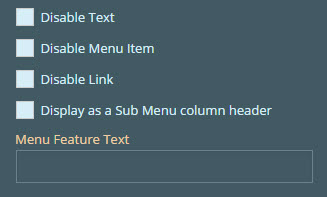
7. Other
- Disable Text: not display text of menu
- Disable Menu Item: not display text and link of menu
- Disable Link: remove link of menu
- Display as a Sub Menu column header: menu display as a column header
8. Menu Feature Text text introduce menu, can display left, right, top position of menu, text look like: NEW, HOT, LATEST..etc
Icon
Choose menu item to change, hover on that and click "XMENU" button. Choose Tab on the right Panel Settings.
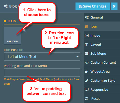
Padding Icon and Text Menu set value padding between icon and text menu. Ex: 10 10 5 15
Image
Choose menu item to change, hover on that and click "XMENU" button. Choose Image tab on the right Panel Settings.
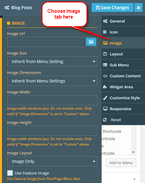
Image Url click button image on the right so can choose image from your media/gallery website or any location over the world(via paste url here)
Image Size
- Inherit from Menu Setting: inherit value from global Setting at "Appereance >> XEMNU Settings"
- Full Size: image display full
- Others: get list image size from Settings >> Media
Image Dimension
- Inherit from Menu Setting: inherit value from global Setting at "Appereance >> XEMNU Settings"
- Custom: image will get value Image Width and Image Height attribute below
Image Width value width of image when Image Dimension set Custom
Image Height value height of image when Image Dimension set Custom
Image Layout
- Image Only: only image display for this menu
- Image Left: image display on the left description of menu(if have)
- Image Right, Image Above, Image Below: the same with Image Left, only difference position
Use Feature Image use for posts and any postype support feature image
Layout
Choose menu item to change, hover on that and click "XMENU" button. Choose Layout tab on the right Panel Settings.
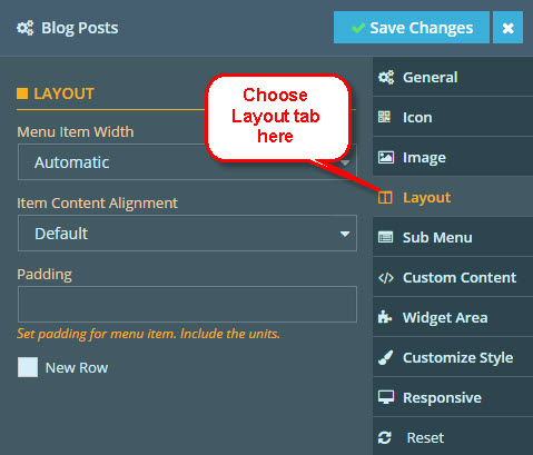
Menu Item Width
- Automatic: width of item menu automatic increase or decrease by content
- Full Width: width of item menu full width of menu bar
- Other values: width of item menu will have value as you choose. Please view LAYOUT for more details.
Item Content Alignment set align for content of item menu.
Padding set value padding for item menu. Ex: 5px 10px 15px 5px
New Row please view LAYOUT for more details
Submenu
Choose menu item to change, hover on that and click "XMENU" button. Choose Submenu tab on the right Panel Settings.
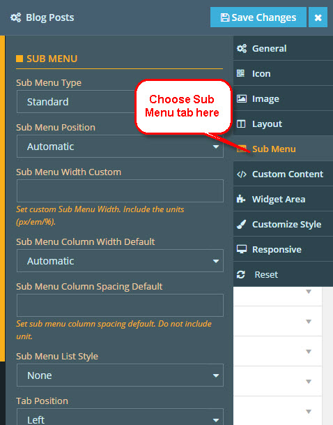
Sub Menu Type
- Standard: default
- Multi Column: submenu of item will multi-column
- Tab: submenu of item will tab
Sub Menu Position
- Automatic: default
- Left of Menu Parent: display left of parent
- Right of Menu Parent: display right of parent
- Center of Menu Parent: display center of parent
- Left of Menu Bar: display left of menu
- Right of Menu Bar: display right of menu
- Full Size: display full menu
Sub Menu Width Custom set custom width of sub menu
Sub Menu Column Width Default set default width of sub menu
Sub Menu Column Spacing Default set default column spacing width of sub menu
Sub Menu List Stylestyle for sub menu list
Tab position When "Sub Menu Type" is "TAB", submenu will display left or right
Sub Menu Animation
- None: no use animation
- Slide Up: submenu display from down to up
- Slide Down: submenu display from up to down
- Slide Left: submenu display from right to left
- Slide Right: submenu display from left to right
- Sign Flip: submenu display with Flip animation
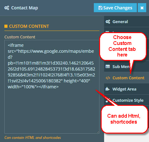
Custom content
Choose menu item to change, hover on that and click "XMENU" button. Choose "Custom Content" tab on the right Panel Settings.
Widget area
Choose menu item to change, hover on that and click "XMENU" button. Choose "Widget Area" tab on the right Panel Settings.
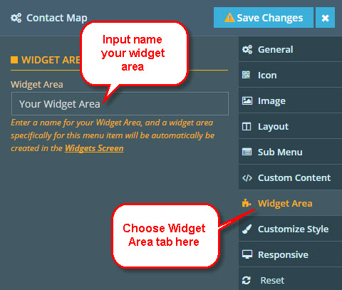
Widget Area Your Widget Area will create on "Appearance >> Widgets". Then add content from Widgets manager, these content will display on this menu.
Custom style
XMENU provide many options for user can change/setting menu as they want(style, background, color, active color...etc), so advance options on this tab. Choose menu item to change, hover on that and click "XMENU" button. Choose "Customize Style" tab on the right Panel Settings.
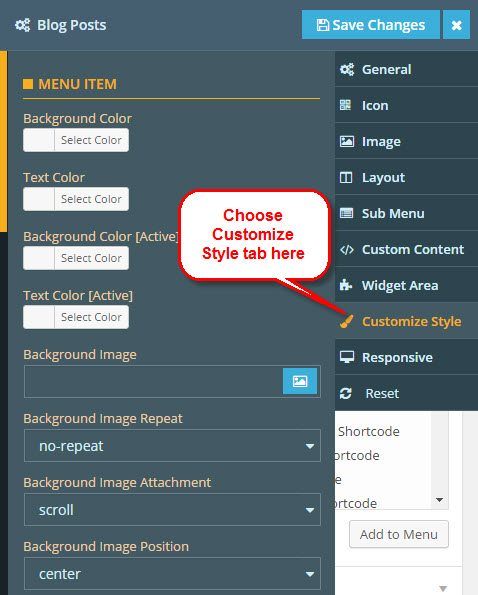
Menu item
This settings for menu item
Background Color choose background color for menu item.
Text Color choose text color for menu item.
Background Color[Active] choose background color active.
Text Color[Active] choose text color active.
Background Image background image for item, can get from gallery or paste image url here.
Background Image Repeat, Background Image Attachment, Background Image Position, Background Image Size support for Background Image attribute
Sub menu
This settings for submenu of menu item
Background Color choose background color for submenu.
Text Color choose text color for submenu.
Background Image background image for submenu, can get from gallery or paste image url here.
Background Image Repeat, Background Image Attachment, Background Image Position, Background Image Size support for Background Image attribute
Column Min Width set value min-width for submenu.
Padding set value padding for submenu. Ex: 5px 10px 15px 5px
Menu feature text
This settings for Feature Text of menu item
Feature Menu Type
- Standard: can set position top, left
- Not Float: always display right on menu text
Background Color choose background color for feature text
Text Color choose color for feature text
Position Top when Feature Menu Type set "Standard", this value effect to set position for feature text
Position Left the same Position Top above
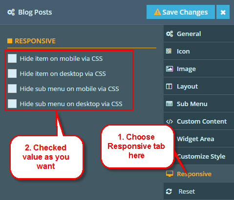
Responsive
Choose menu item to change, hover on that and click "XMENU" button. Choose "Responsive" tab on the right Panel Settings.
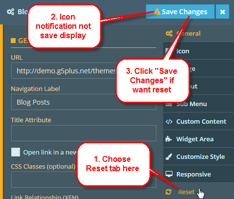
Reset
When you choose Reset tab, no options to choose, only notification display need save. If you Save Changes, value default will reset.